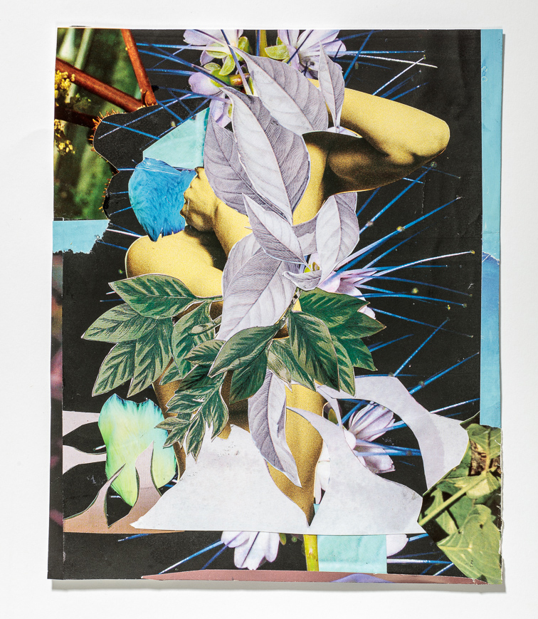
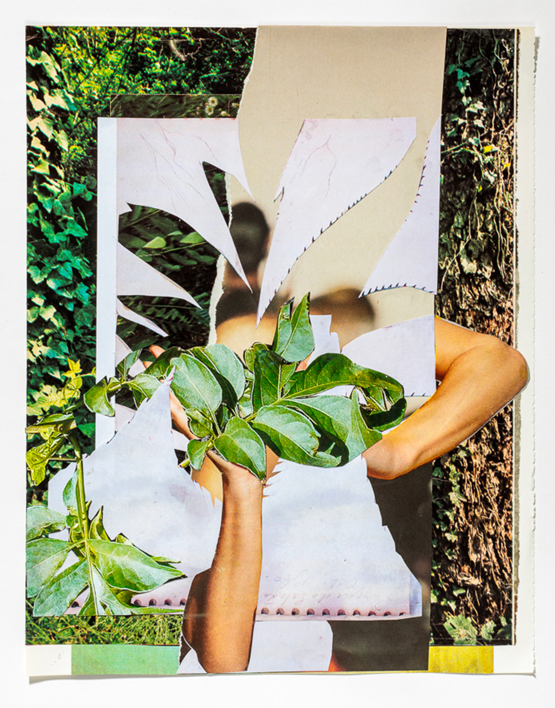
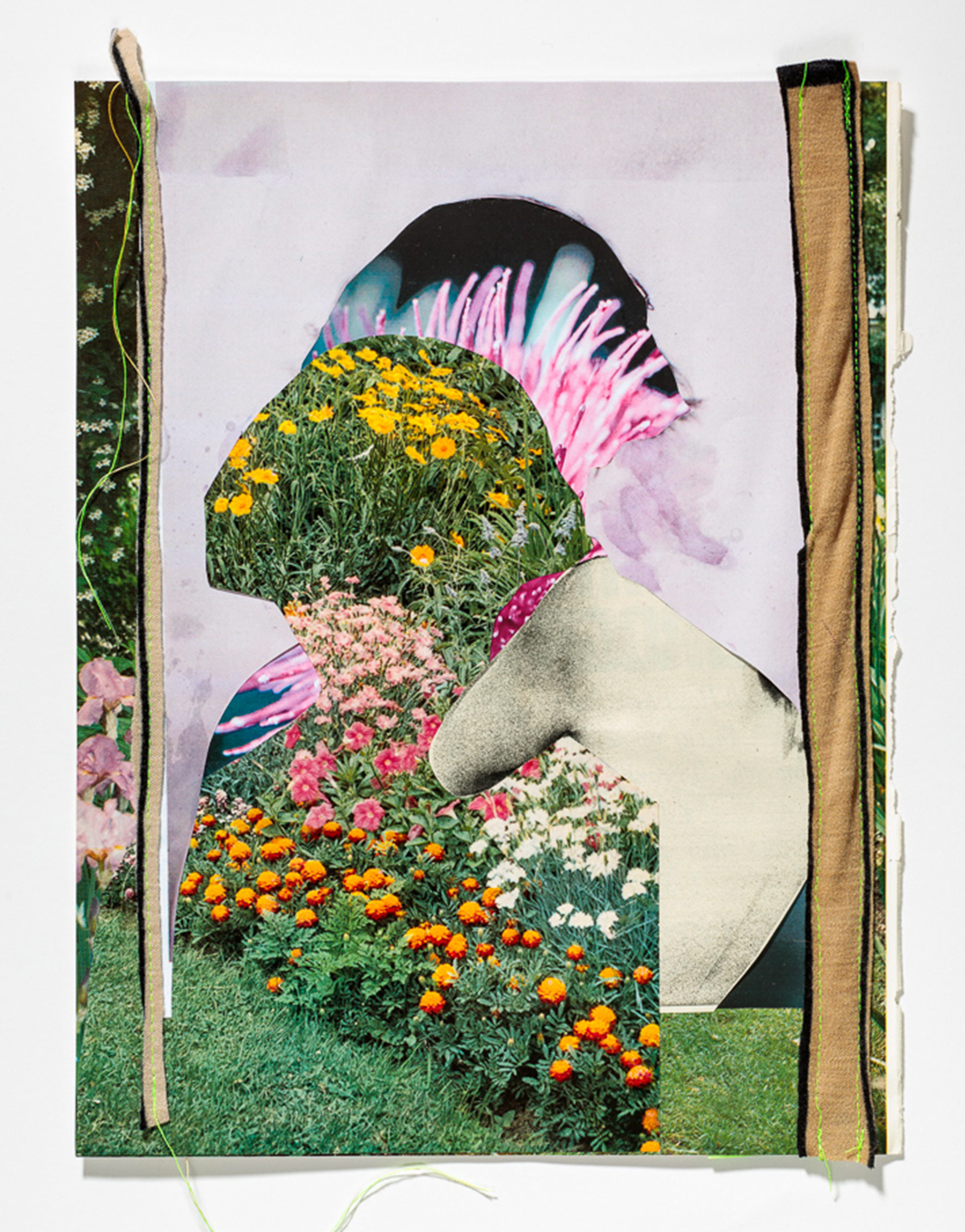
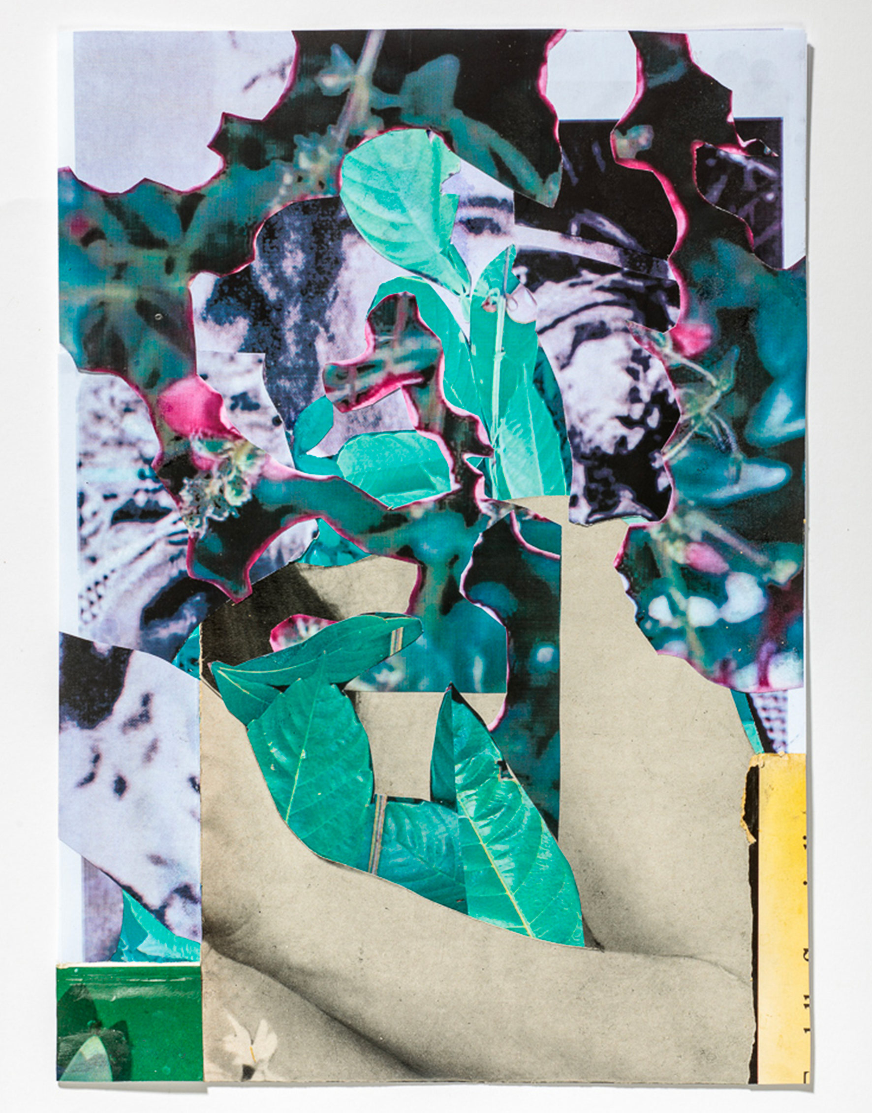
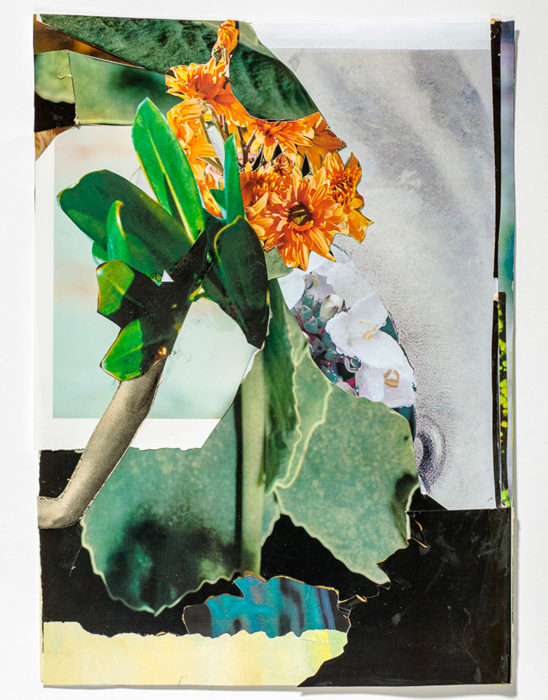
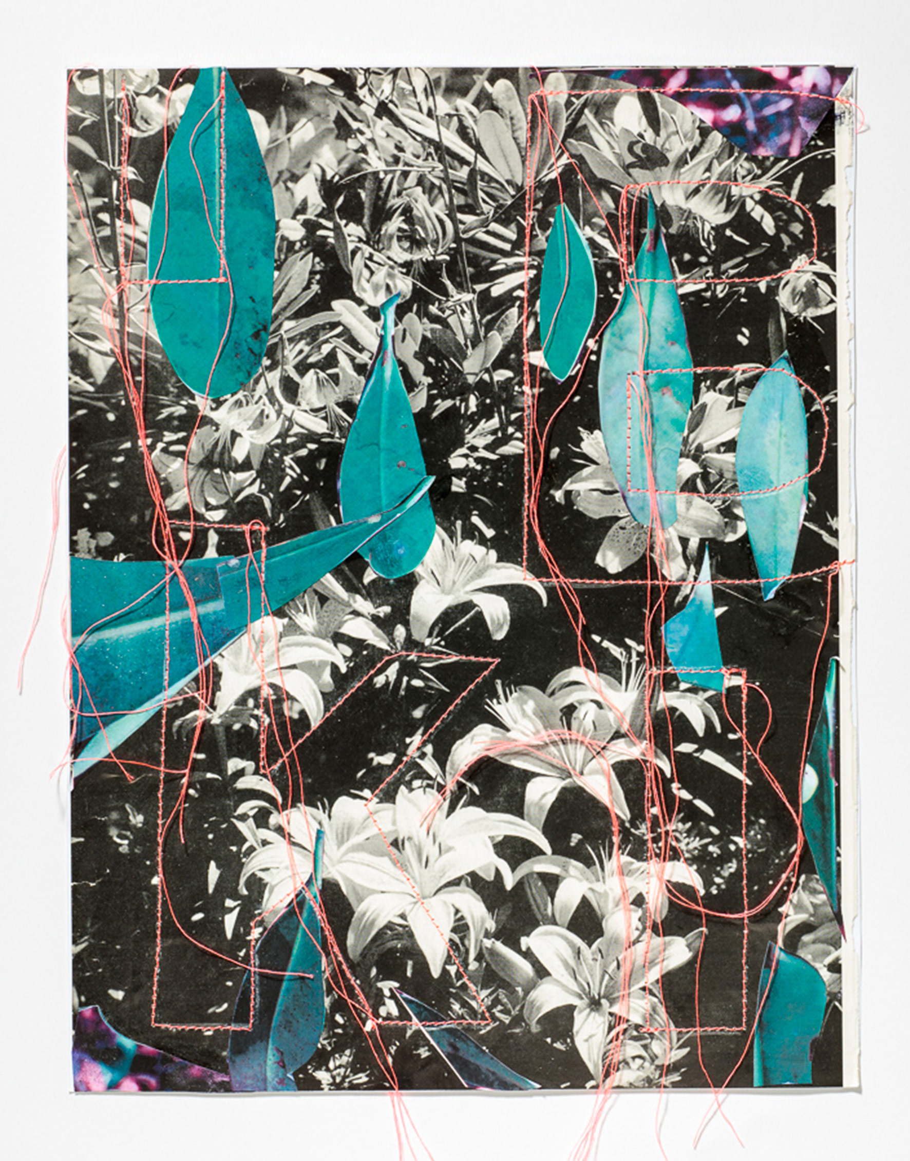
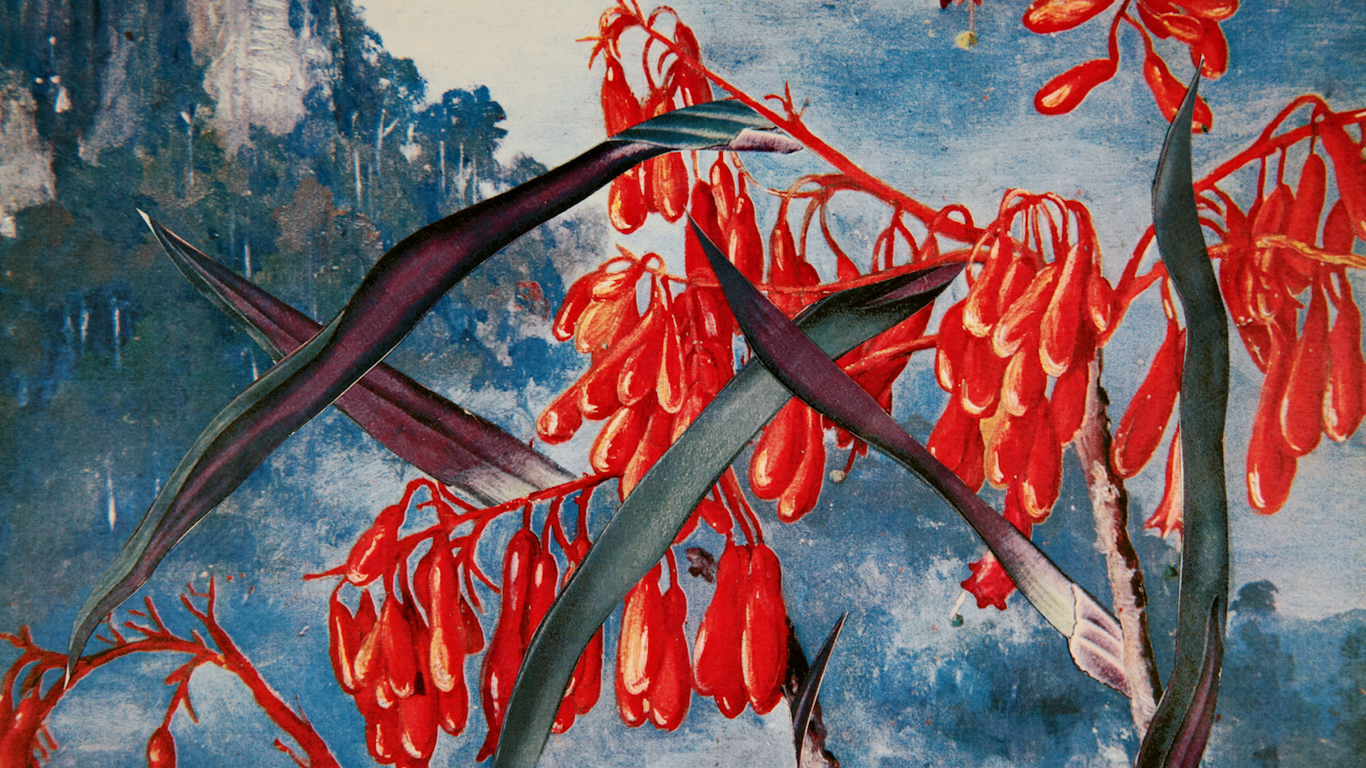
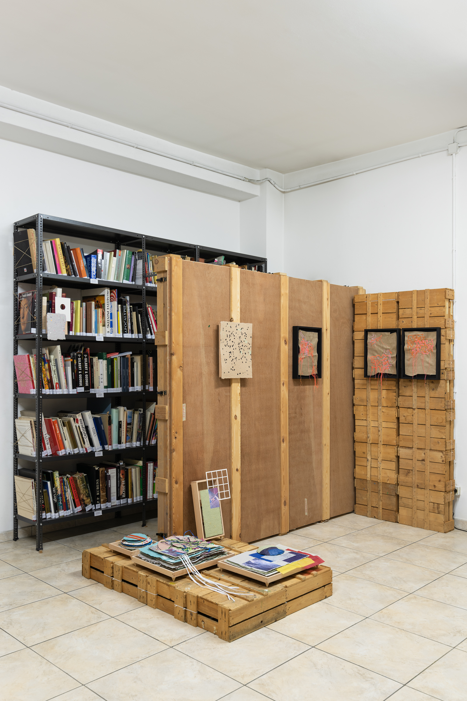
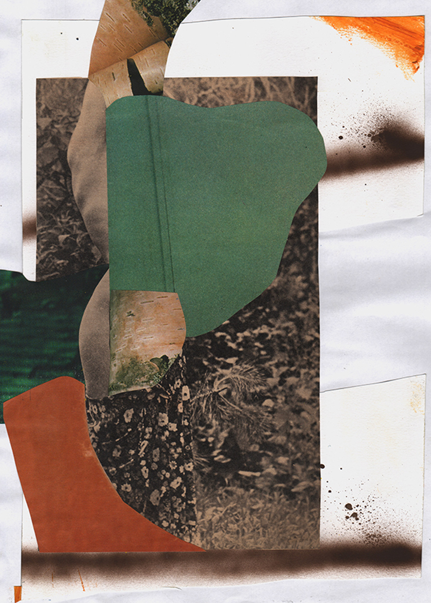
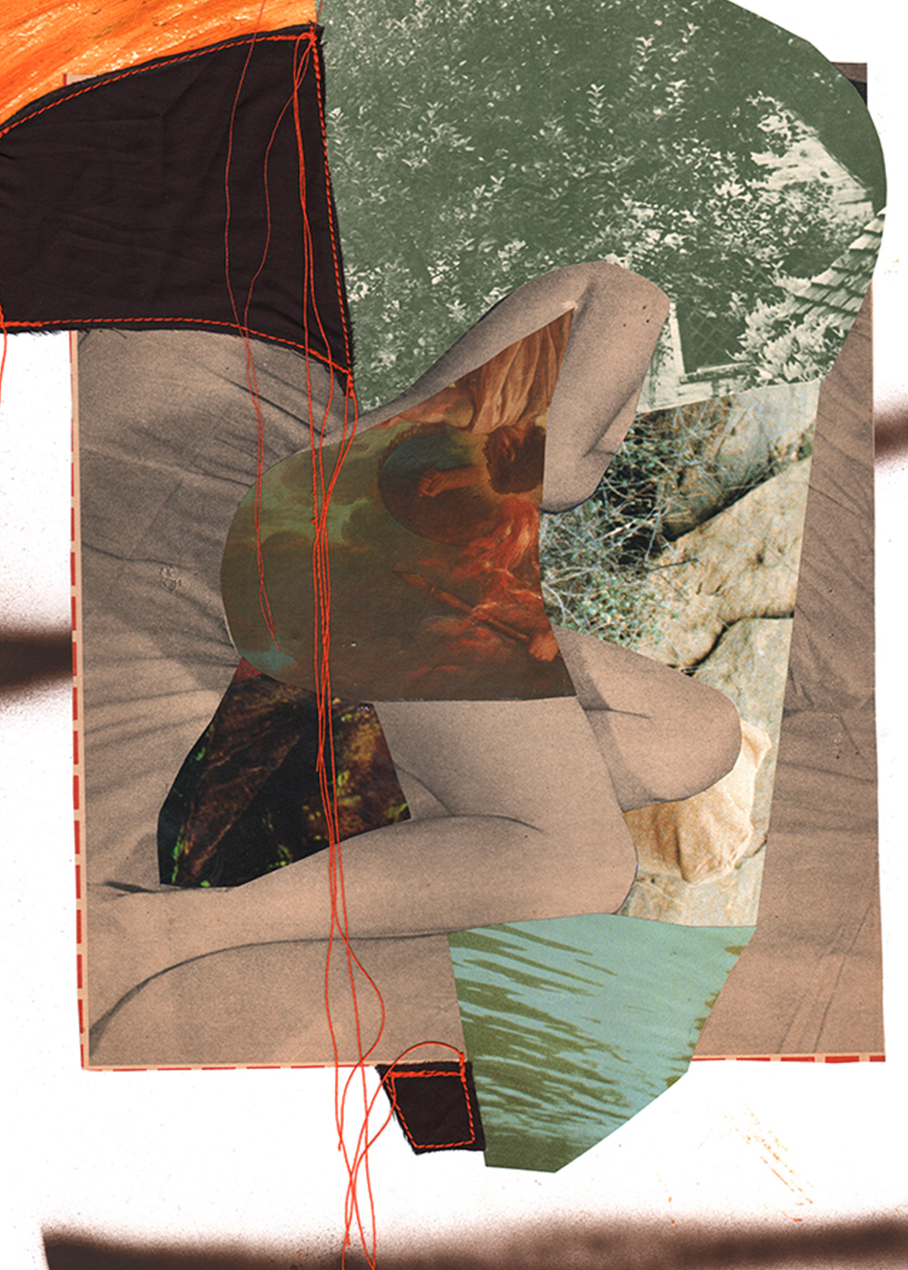
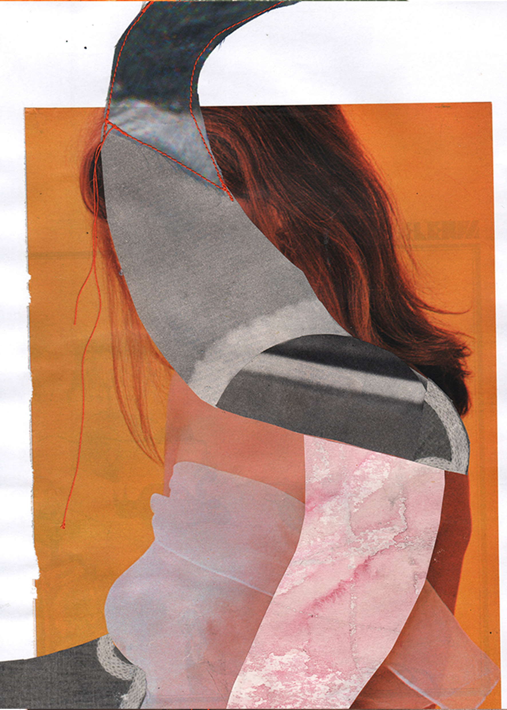
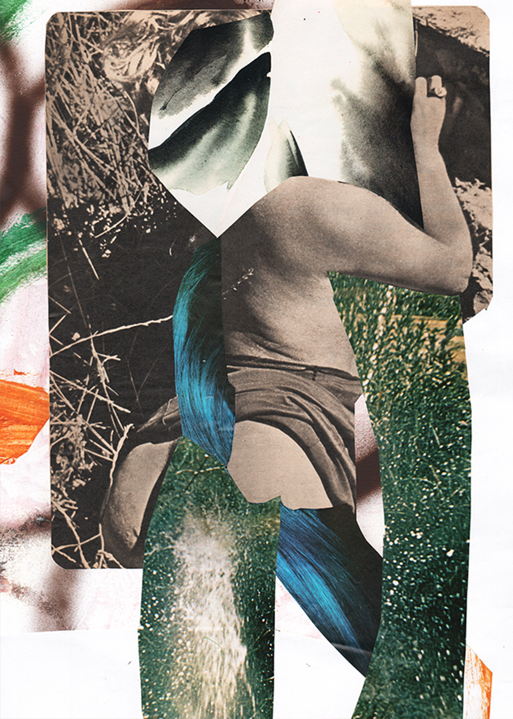
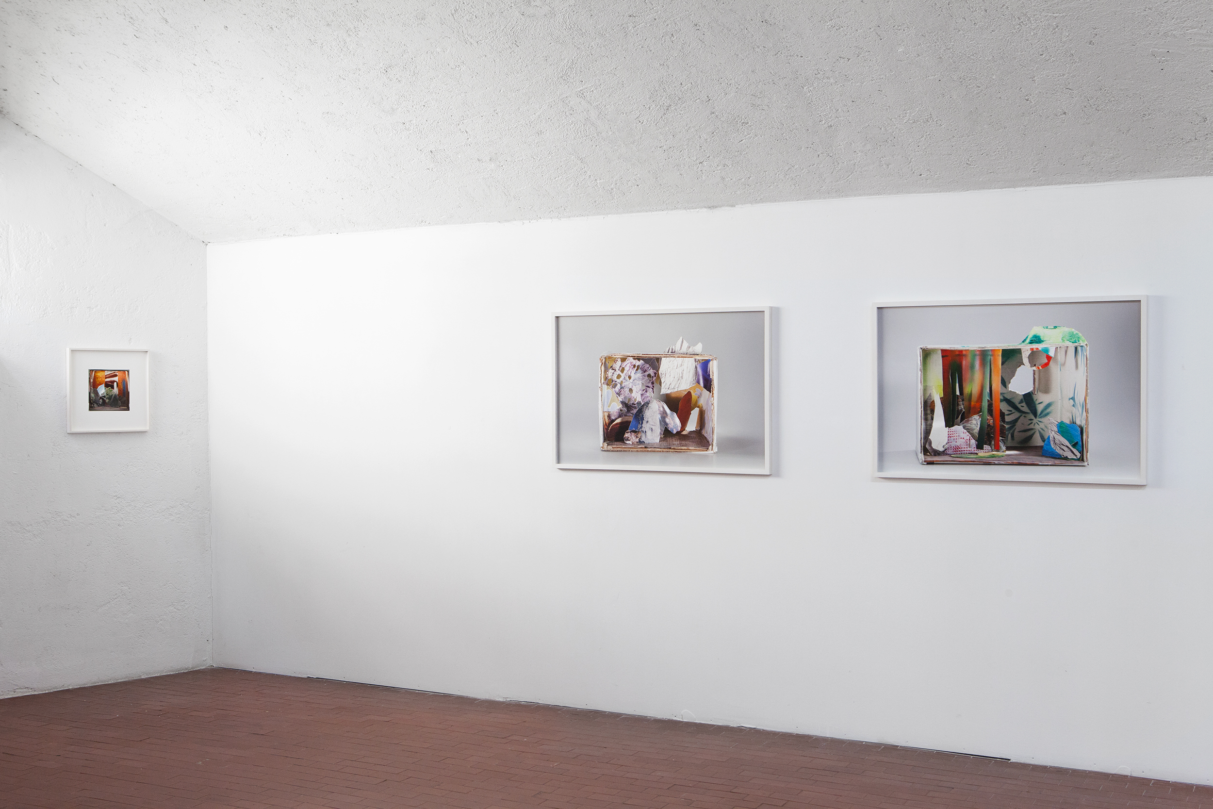
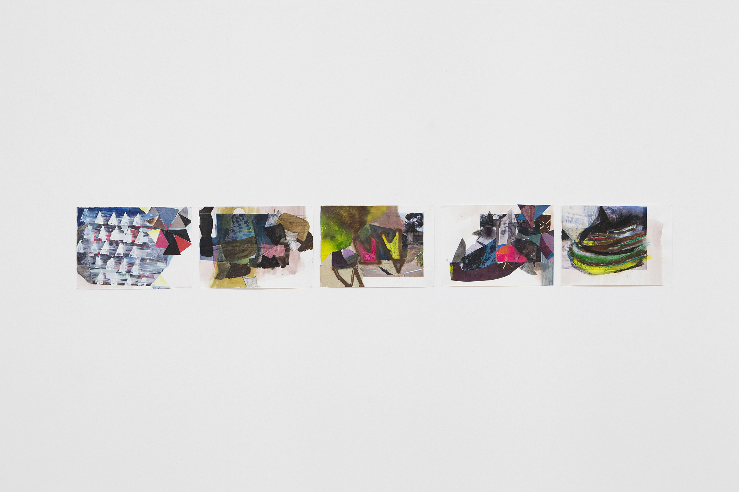
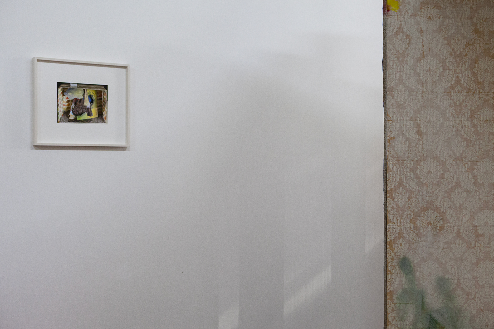
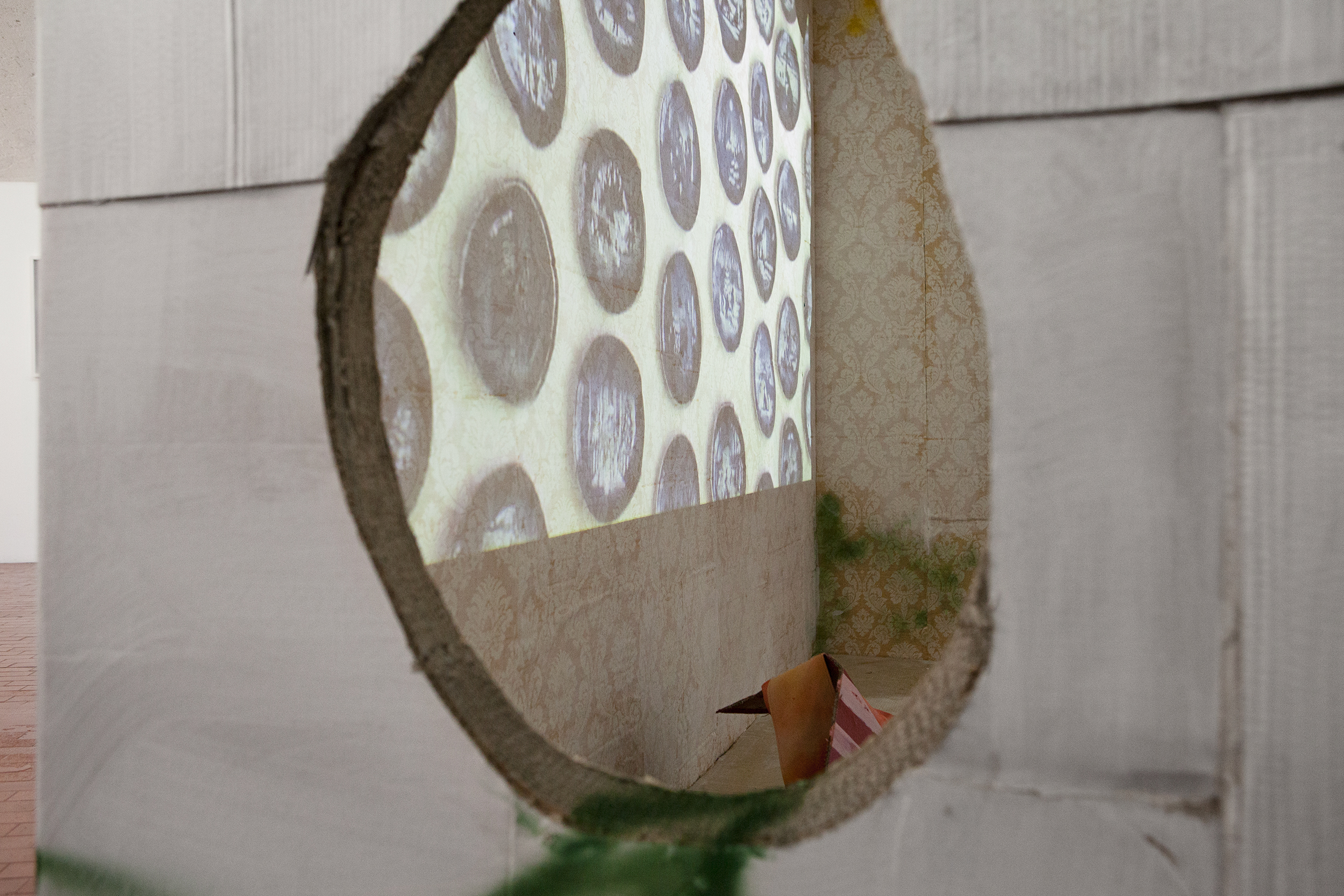
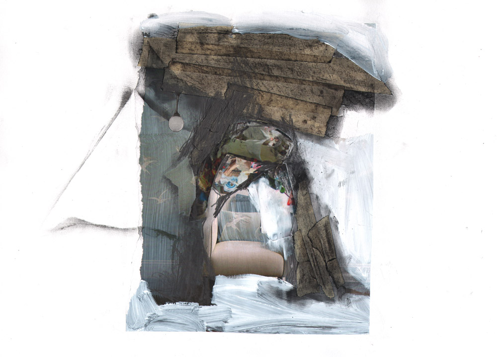
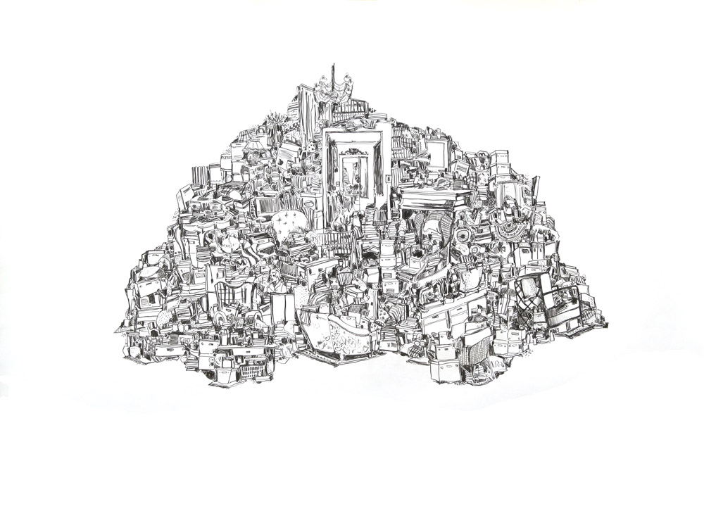
Bio
Mantua, Italy 1976, lives and works in Venice
Co-founder of Spazio Punch,Venice, Italy. Artistic Director from 2011 to 2015
www.spaziopunch.com
Contributor of Yellow artists run space www.yellowyellow.org
Contributor of Atrii_Sezione Piani www.atrii.it
lucia.veronesi@gmail.com
mob.+ 39 3495927812
EDUCATION
2003
Master in Organization and Comunication of Visual Arts, Accademy of Fine Arts, Brera, Milan
2000
Painting degree, Accademy of Fine Arts, Brera, Milan
1999
Erasmus/Socrates project, LUSAD, Loughborough University, UK
GRANTS
2023
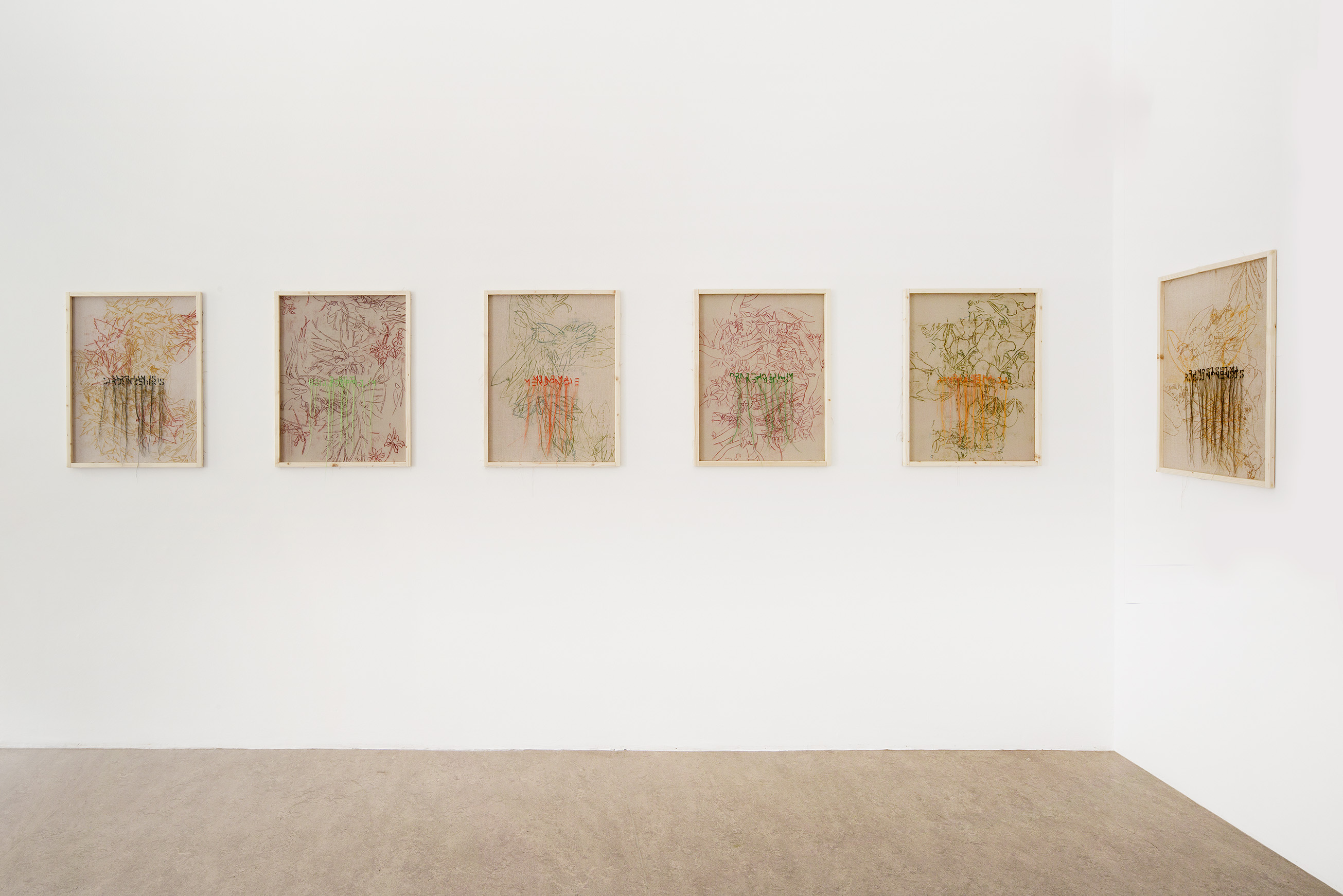
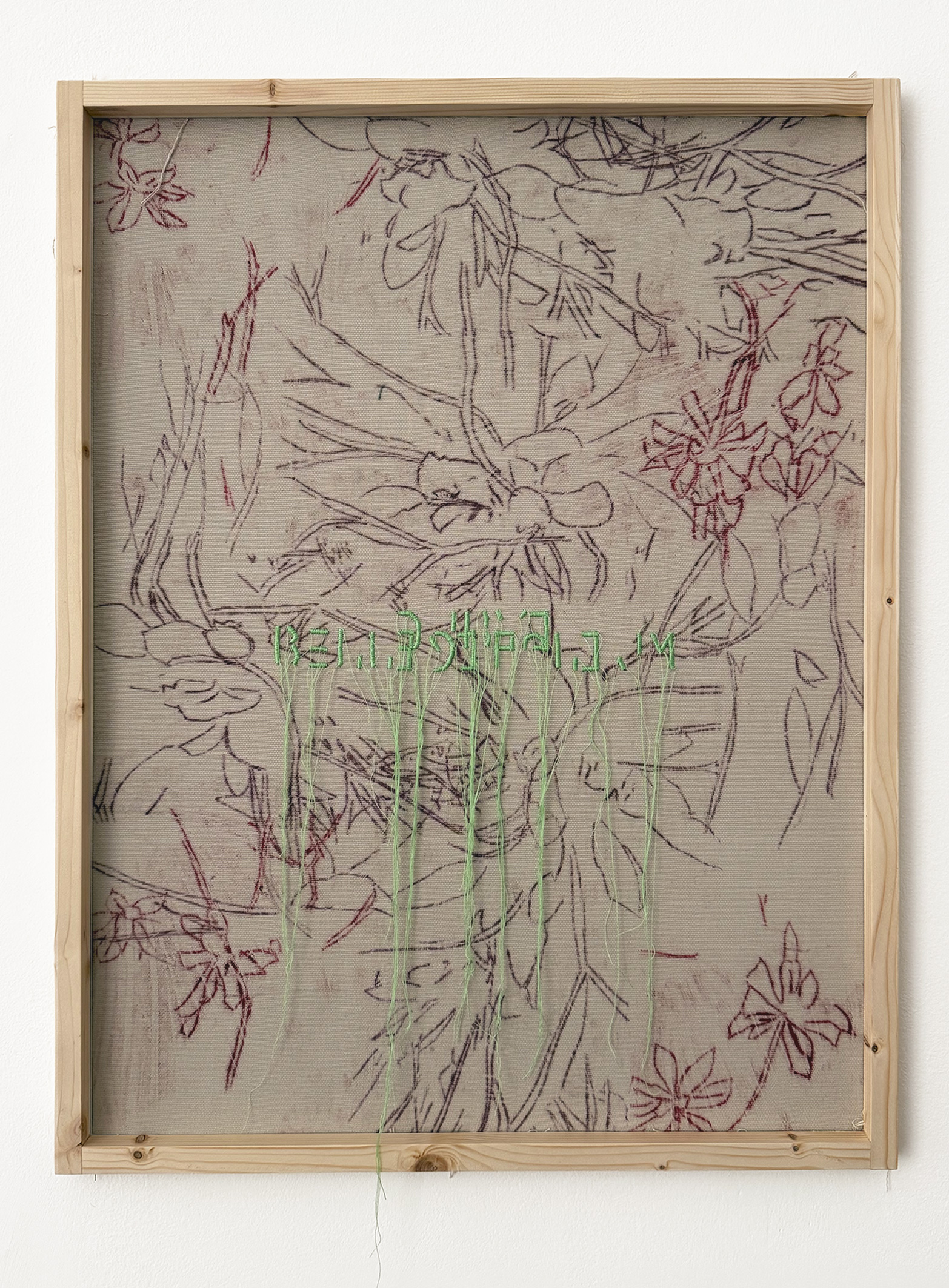
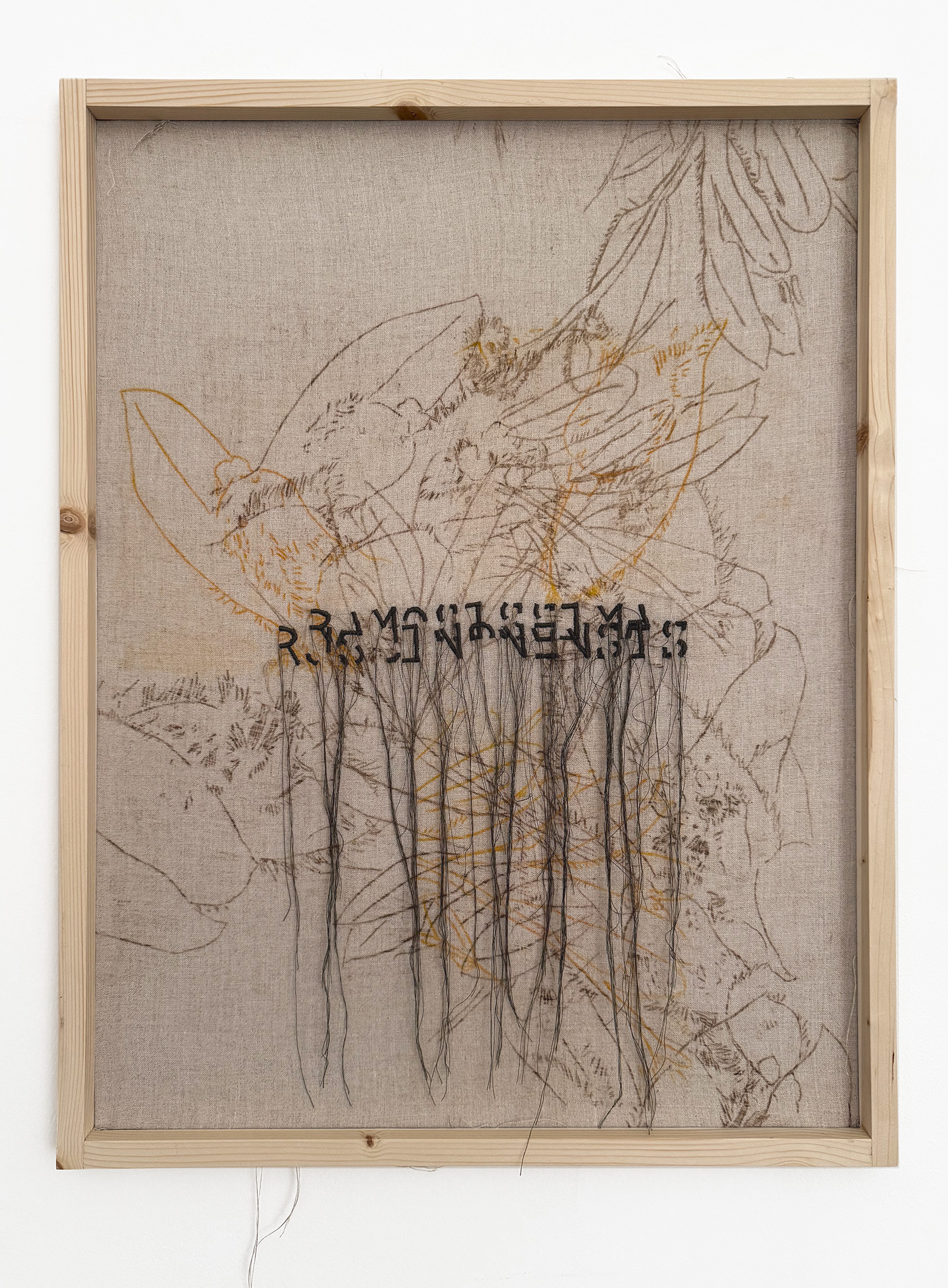
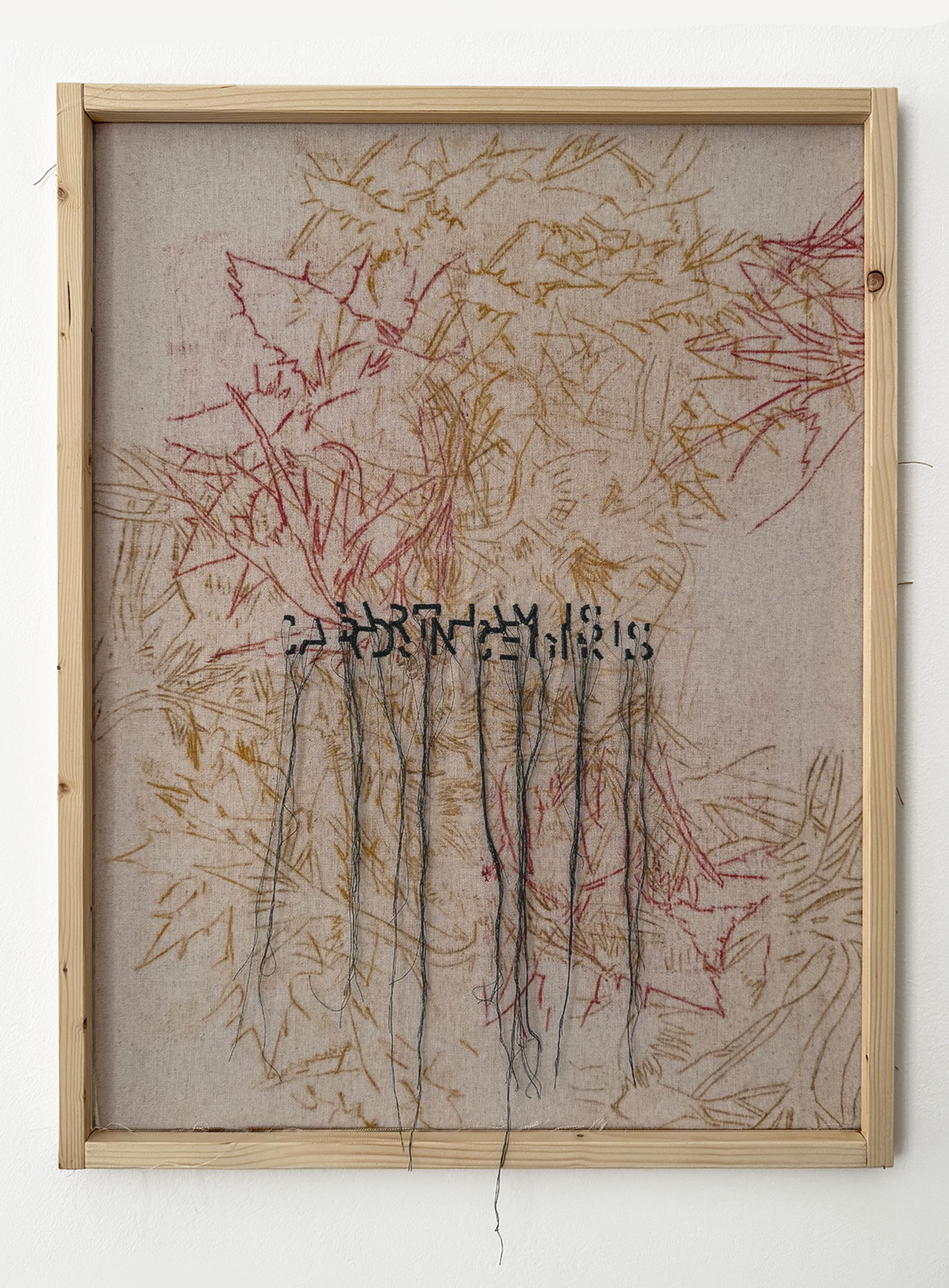
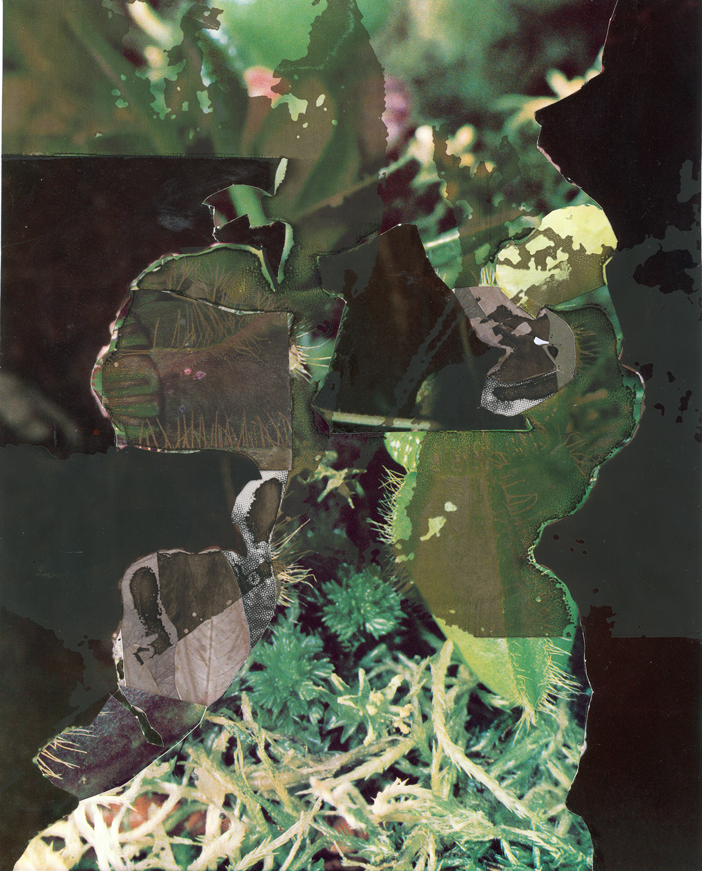
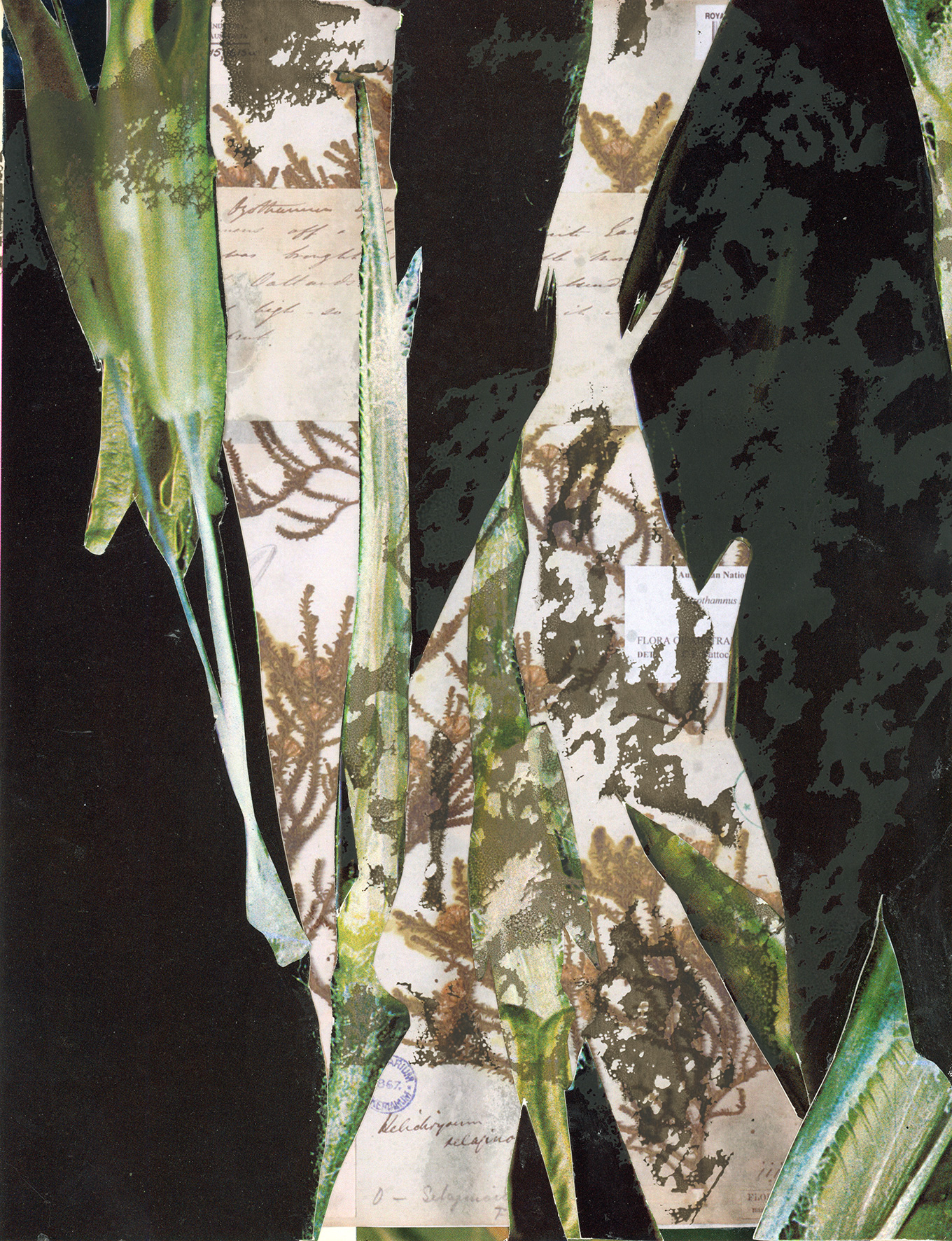
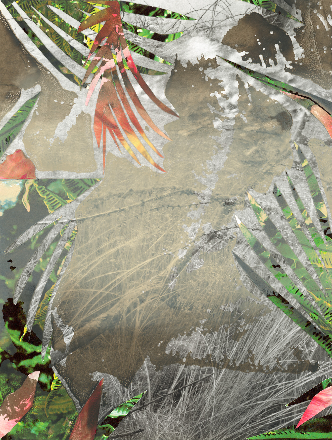
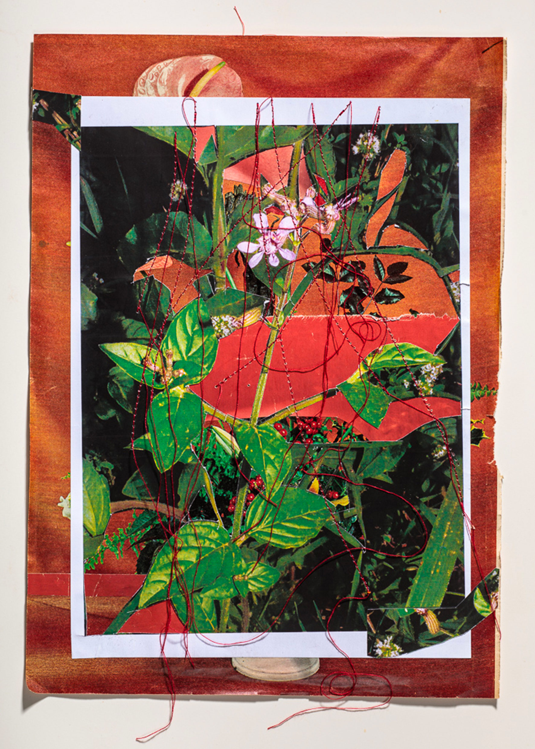
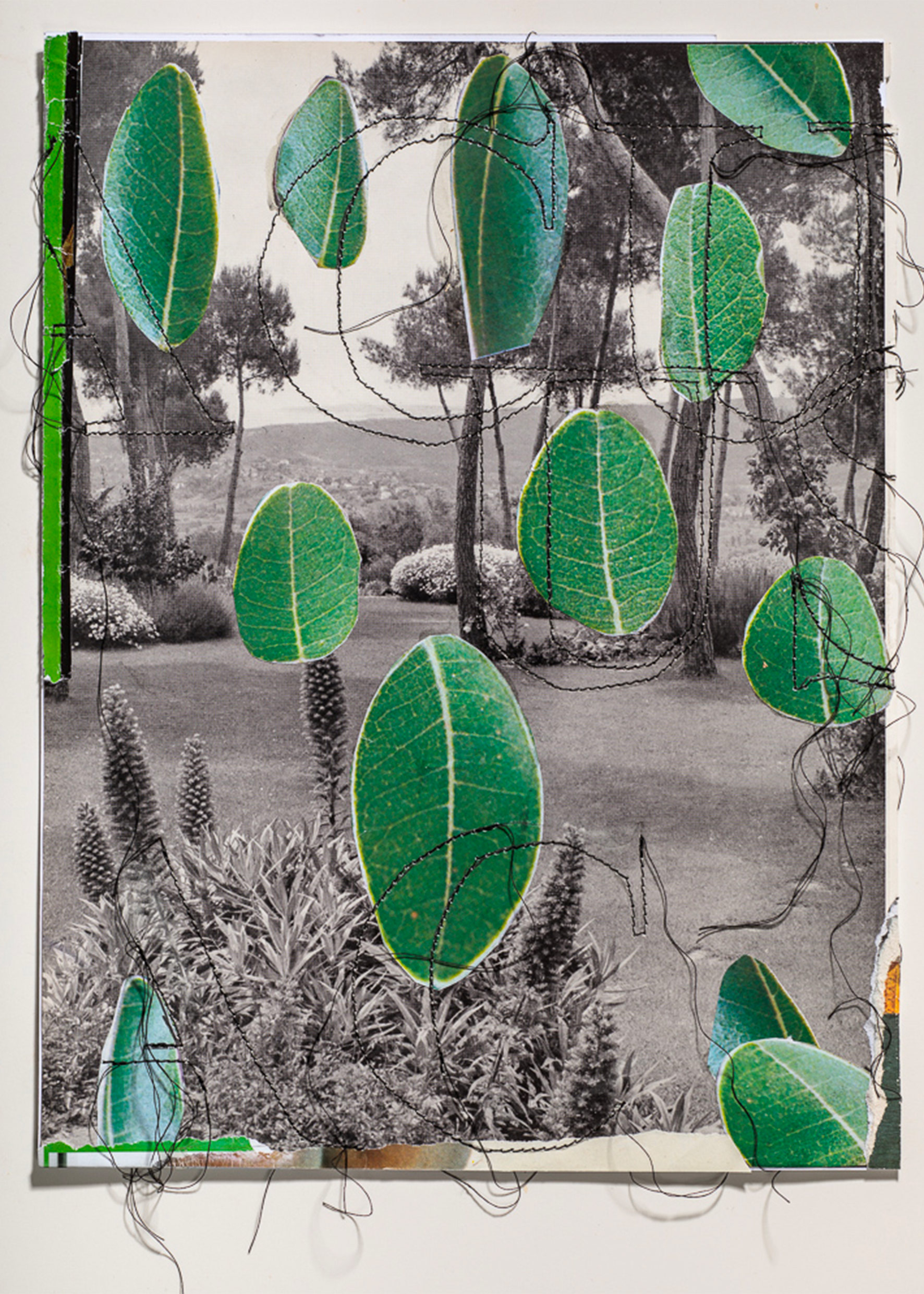
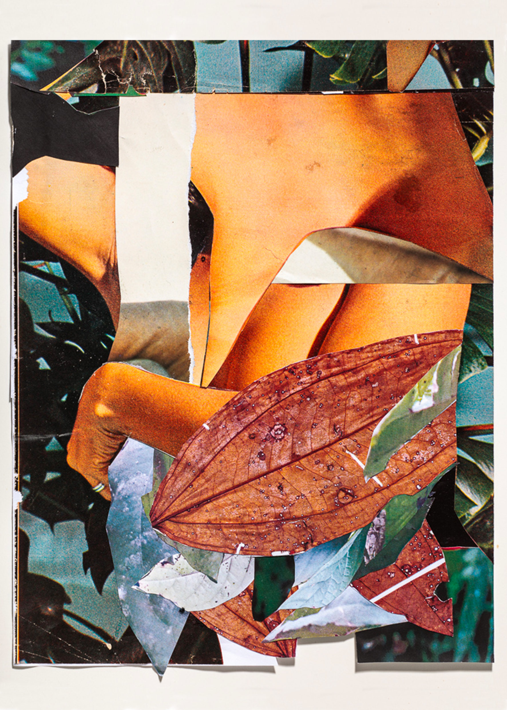
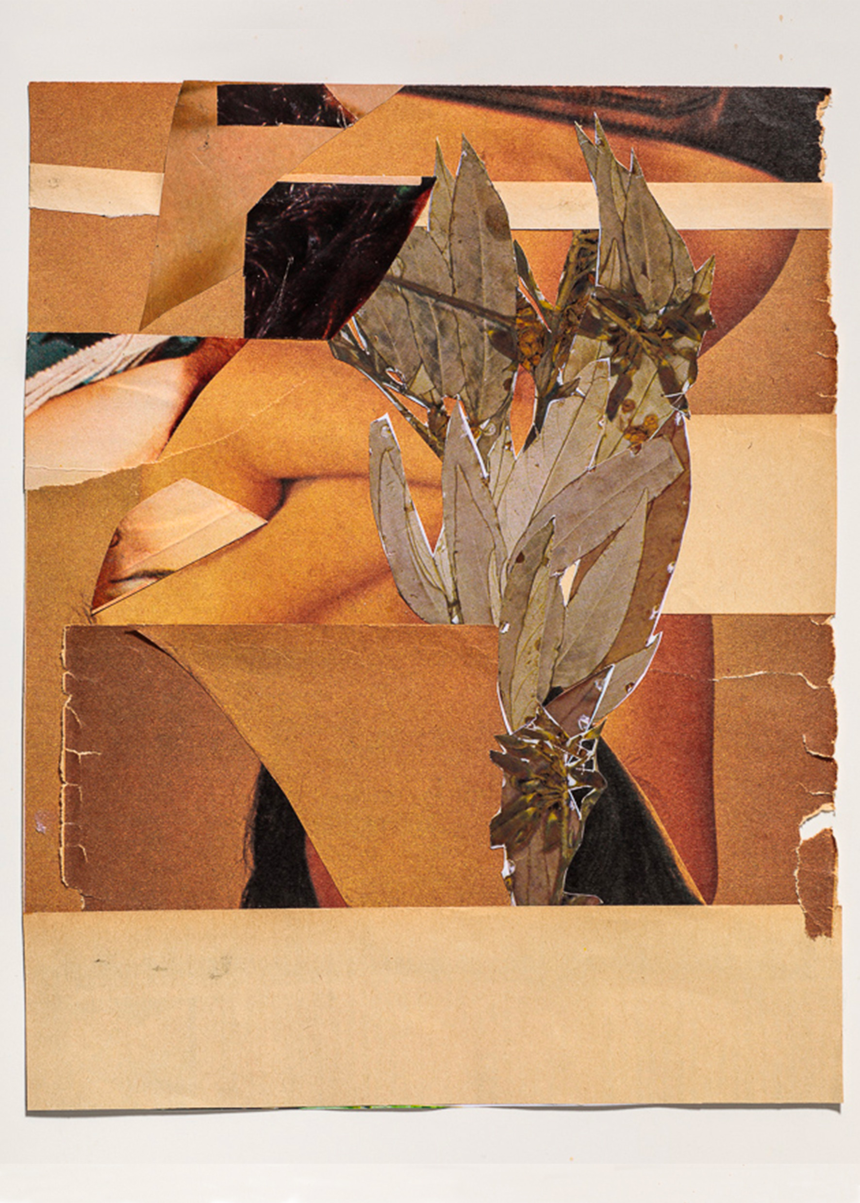
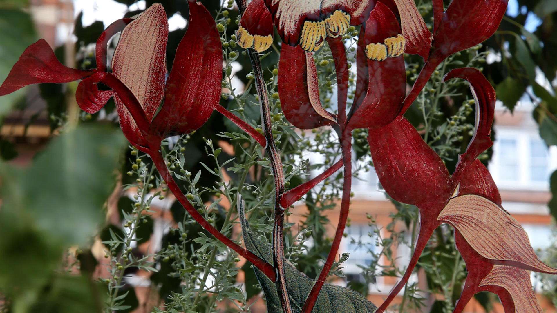
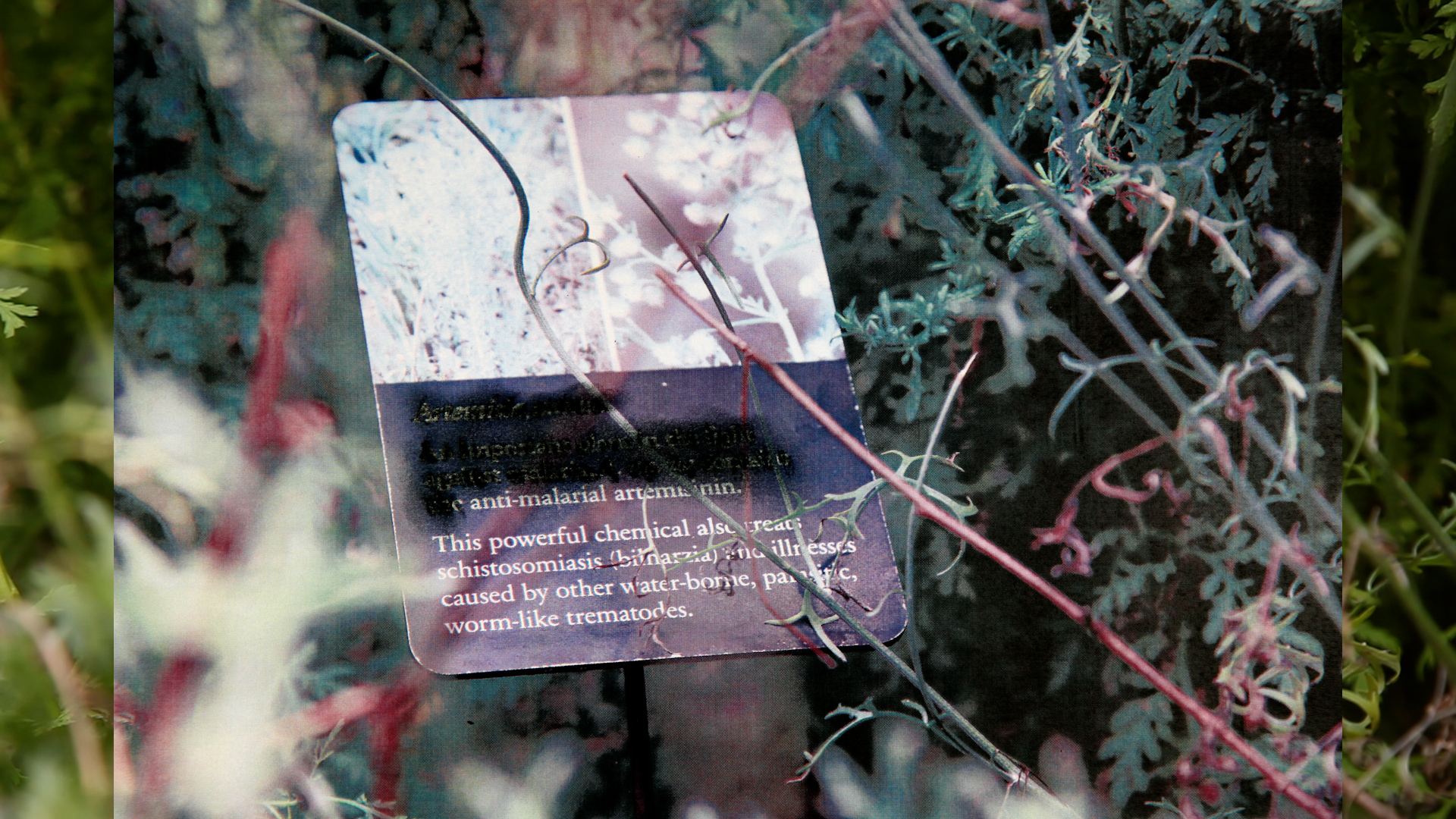
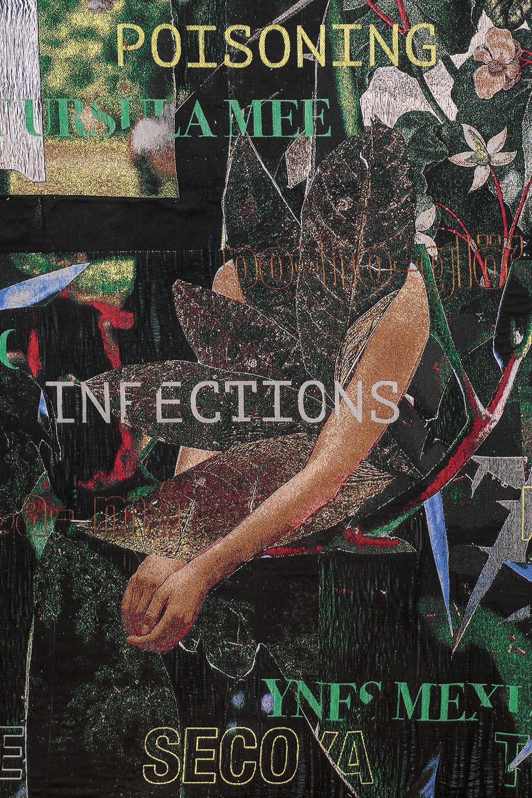
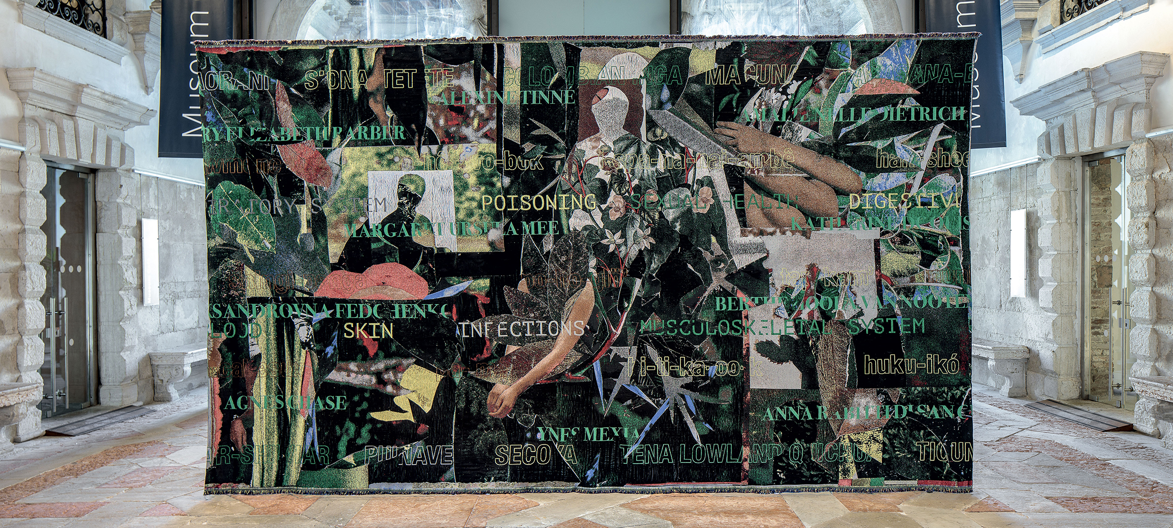
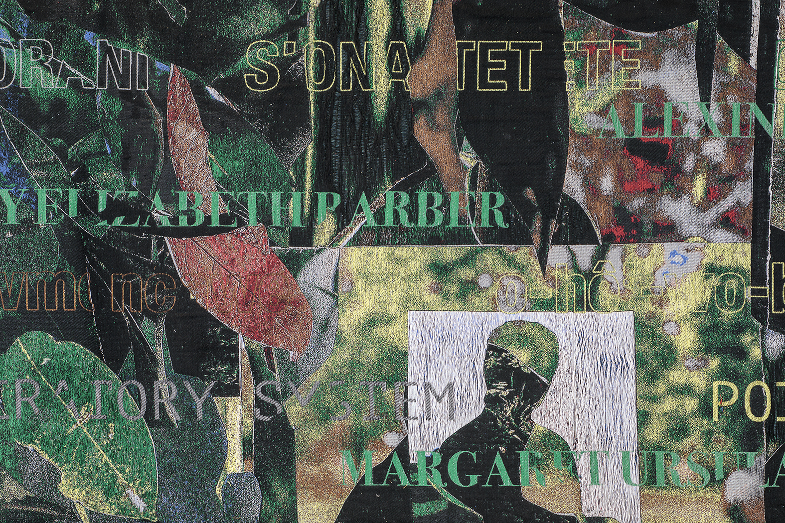
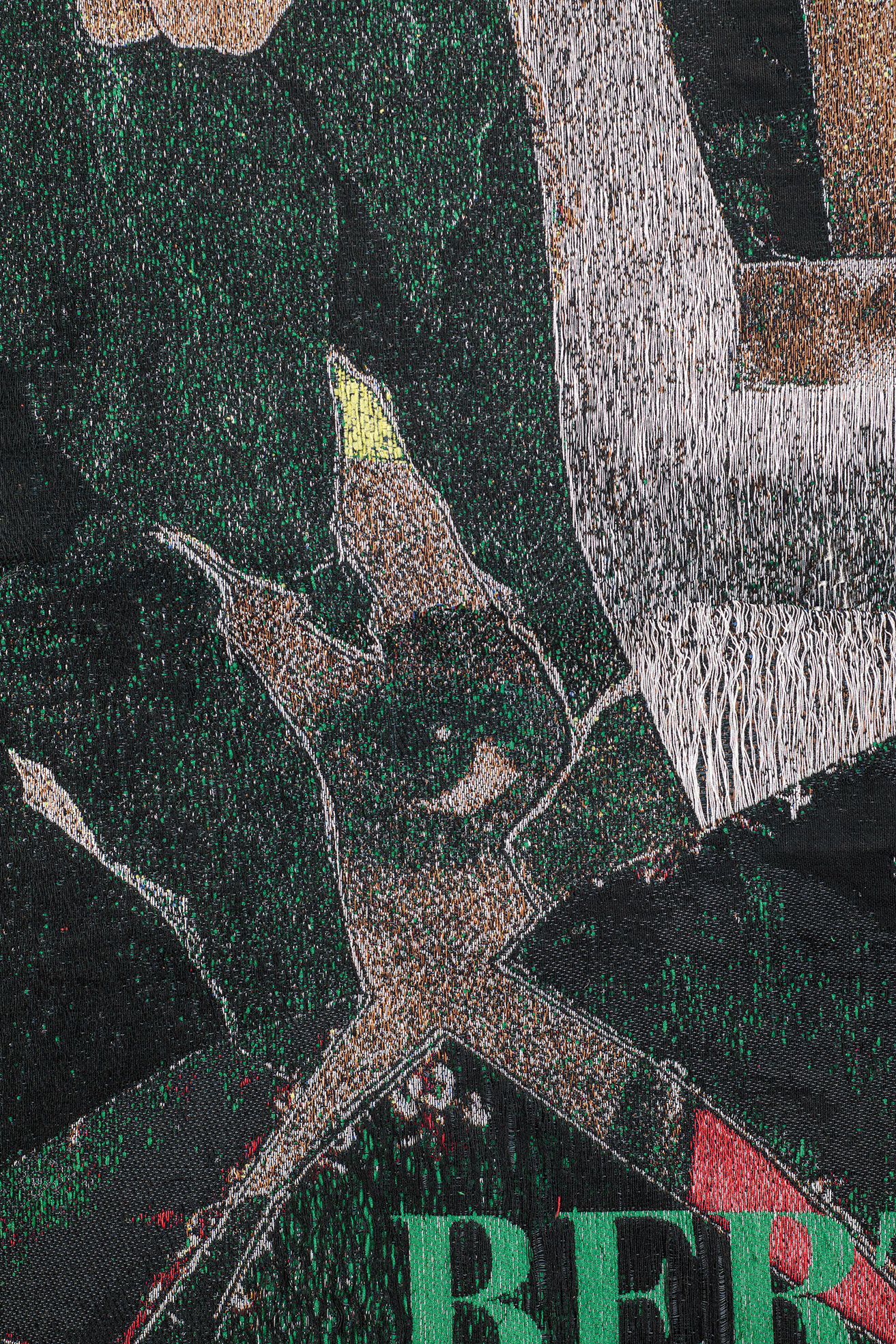
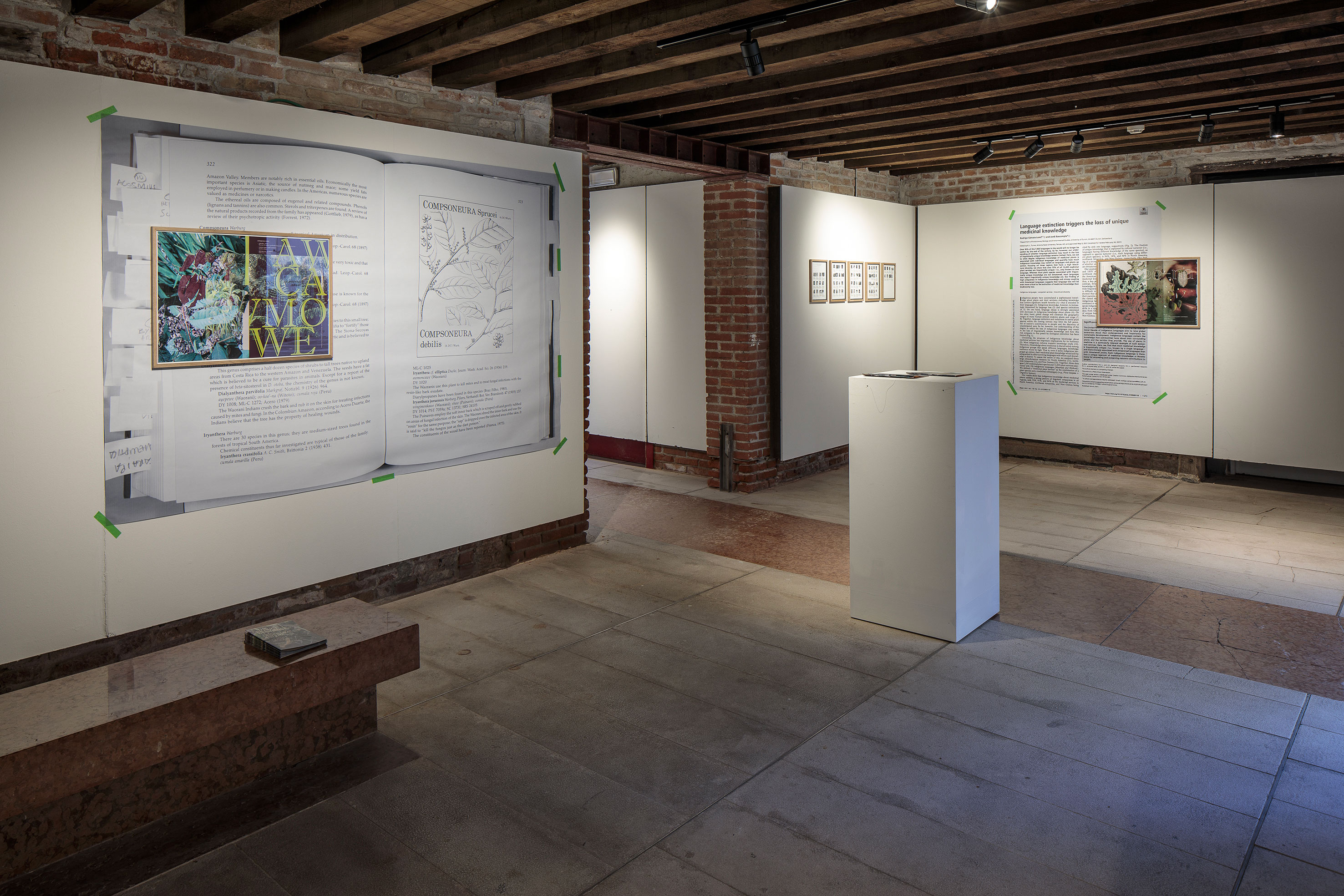
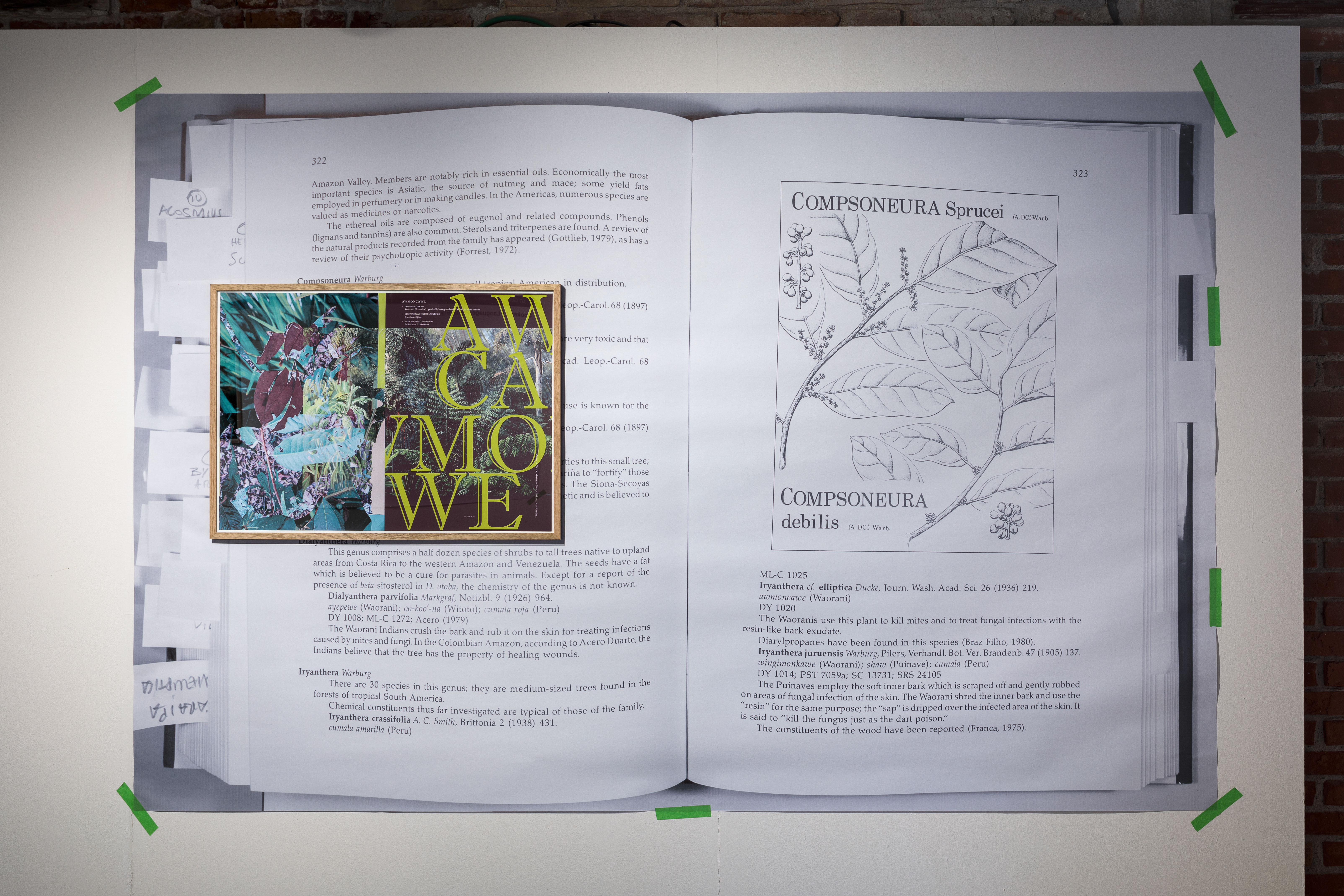
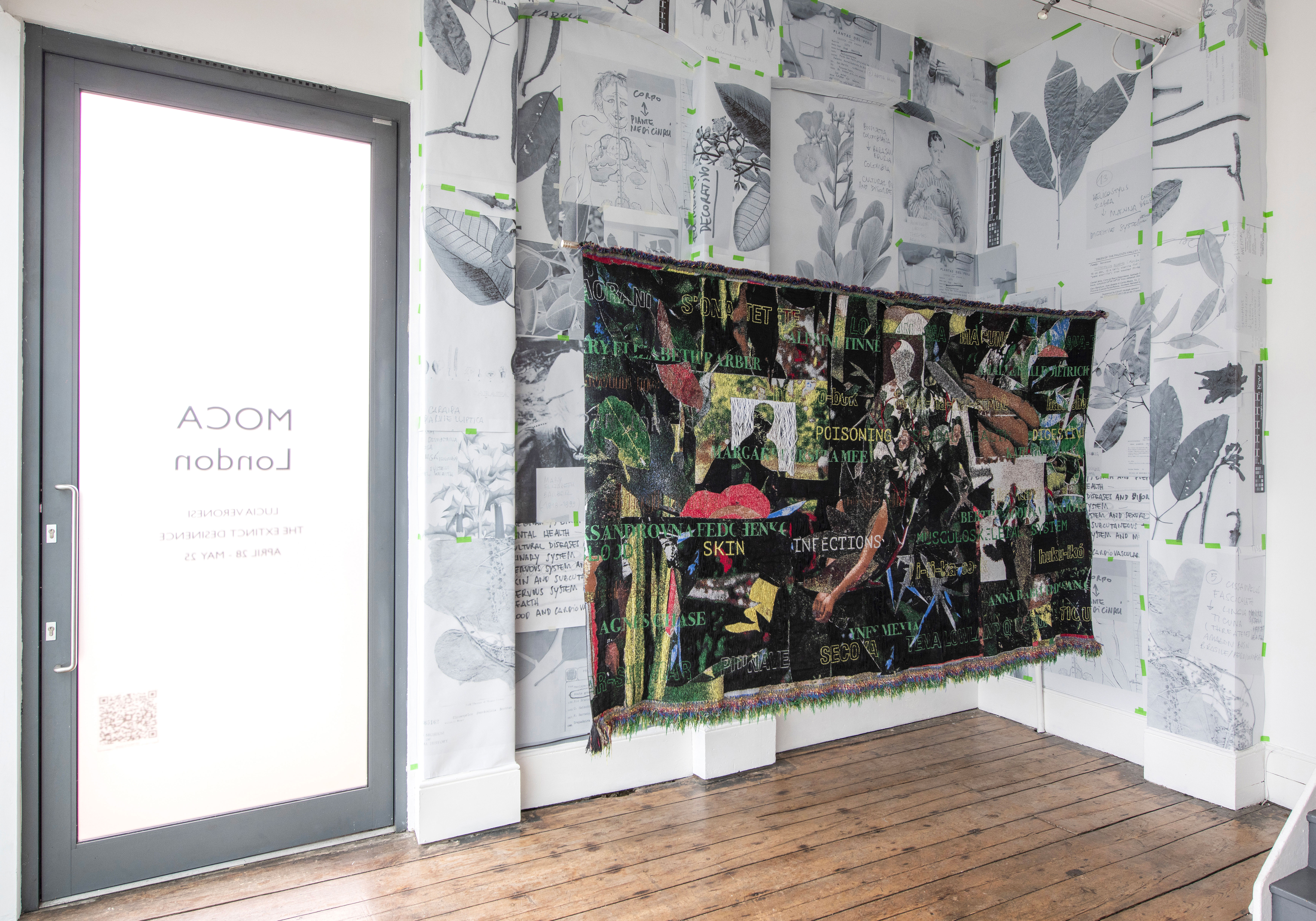
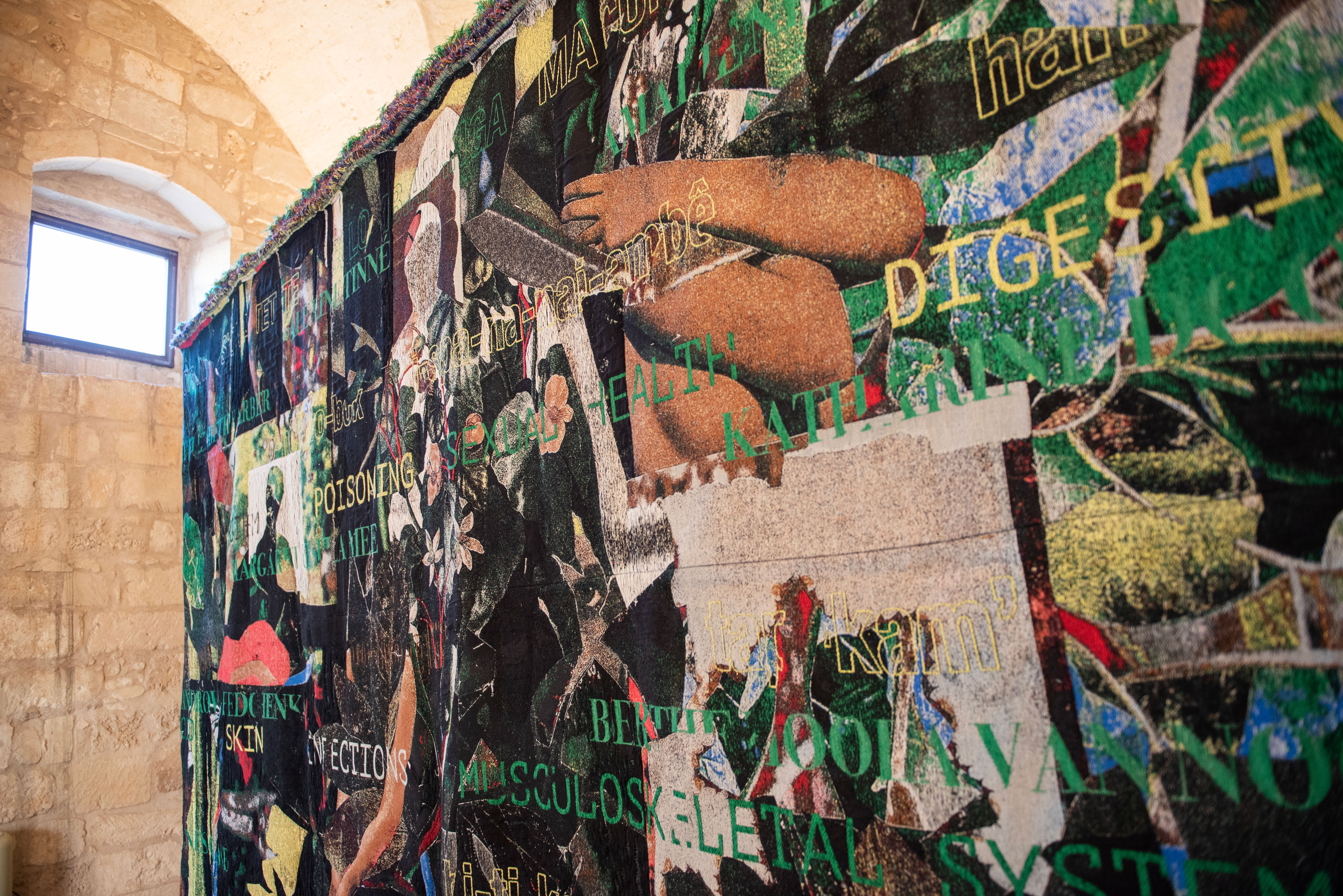
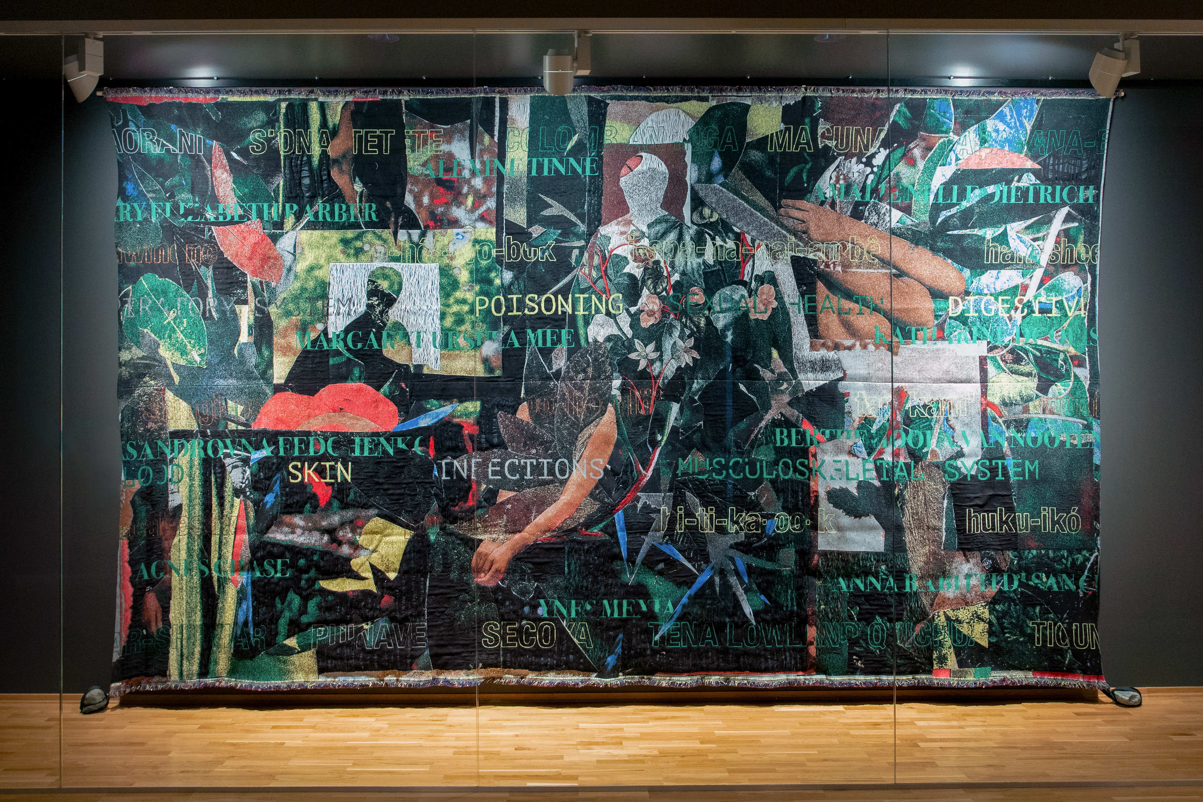
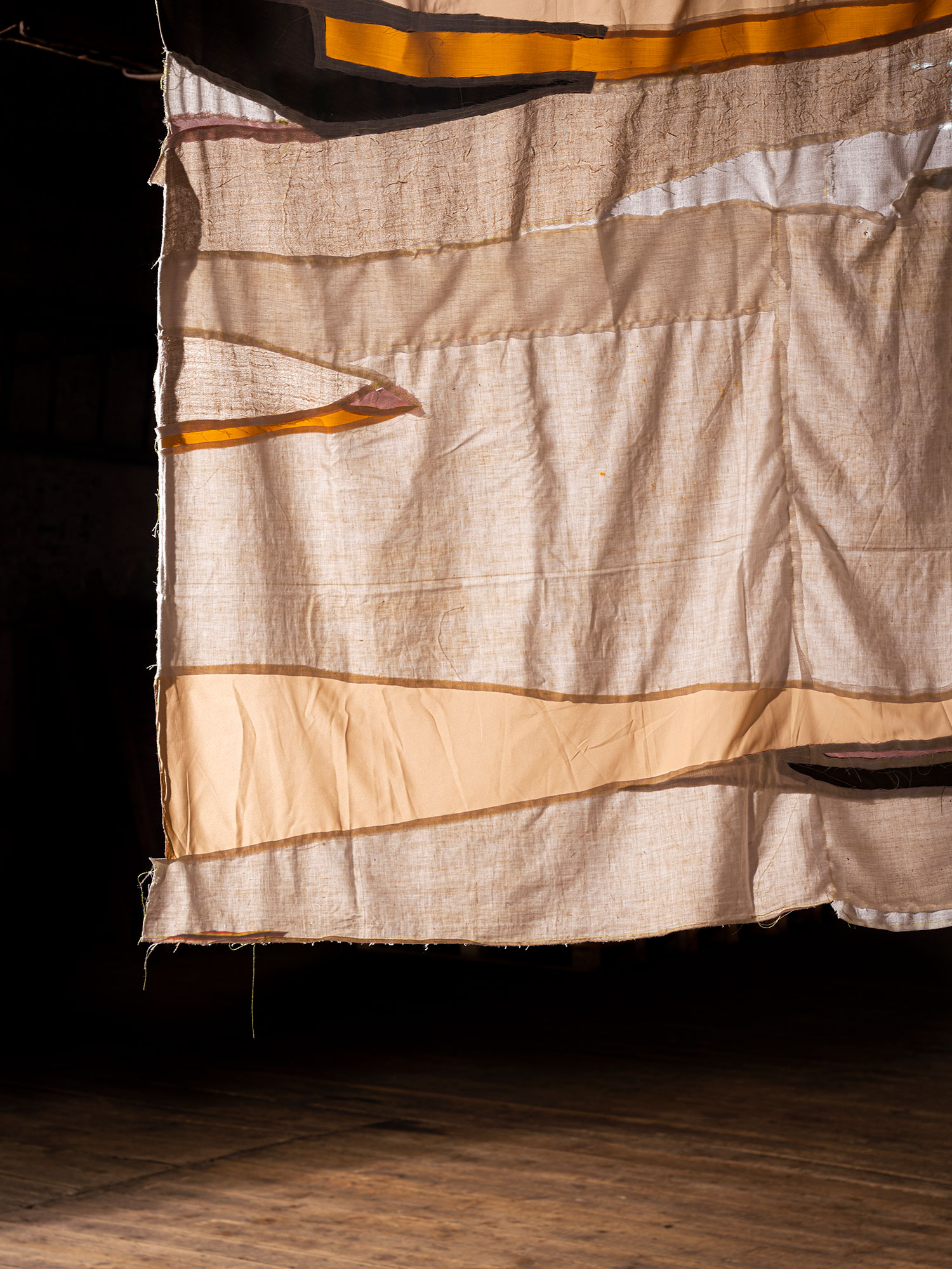
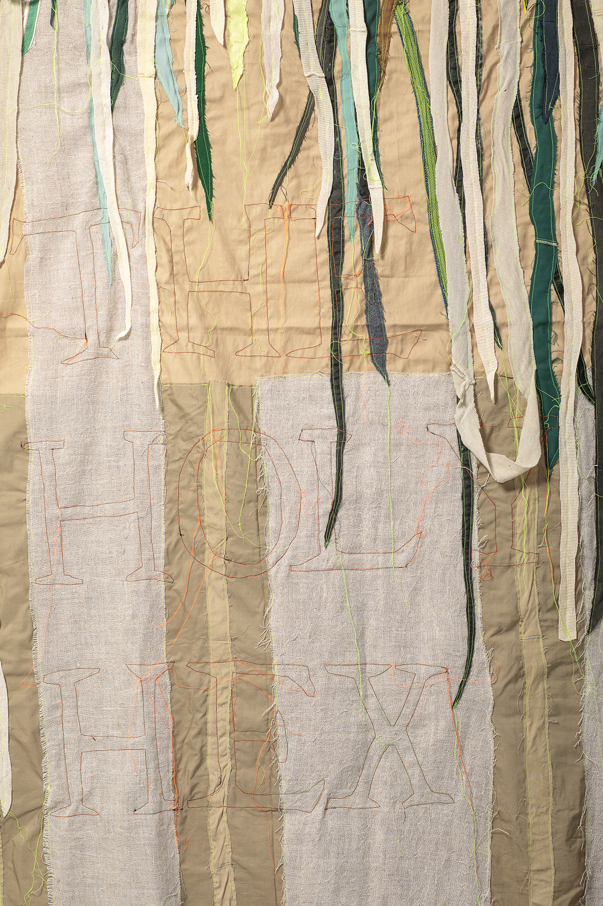
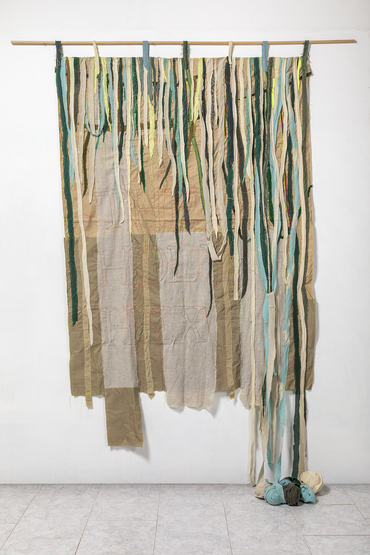
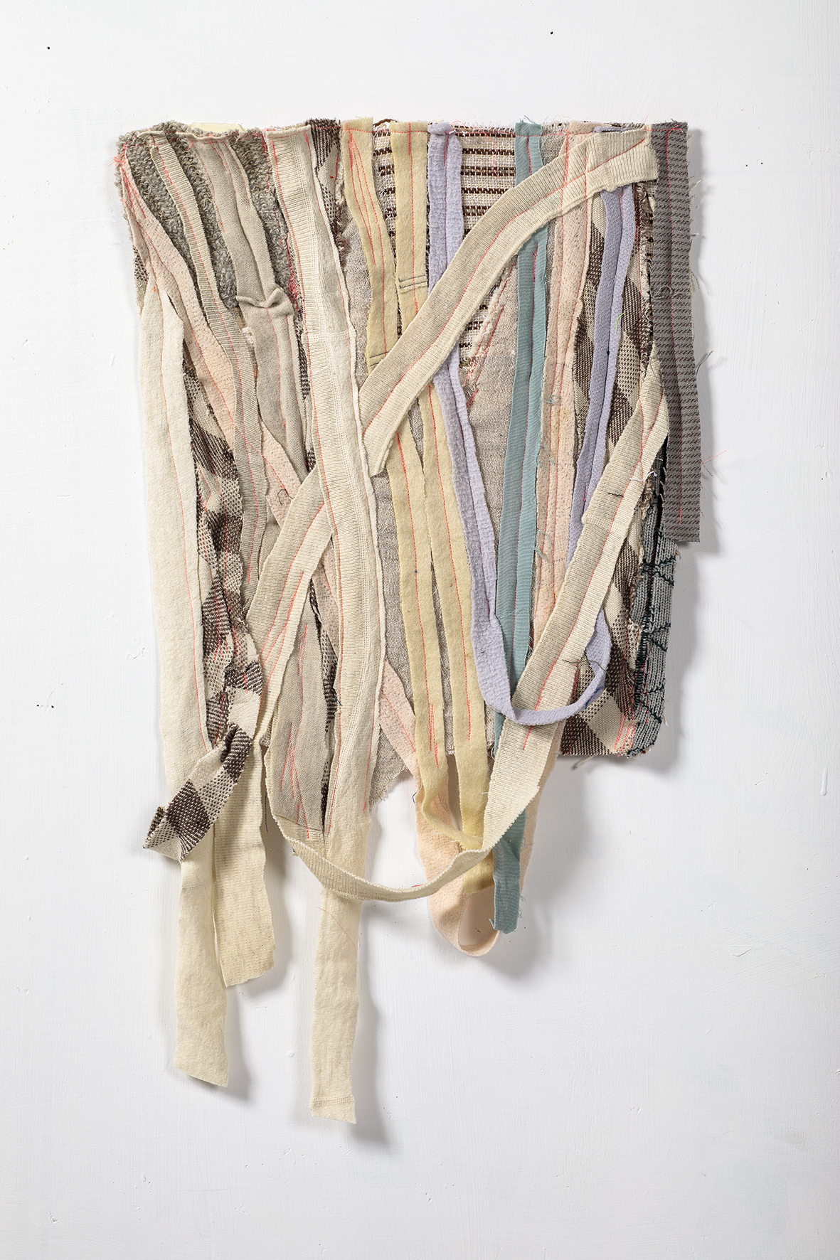
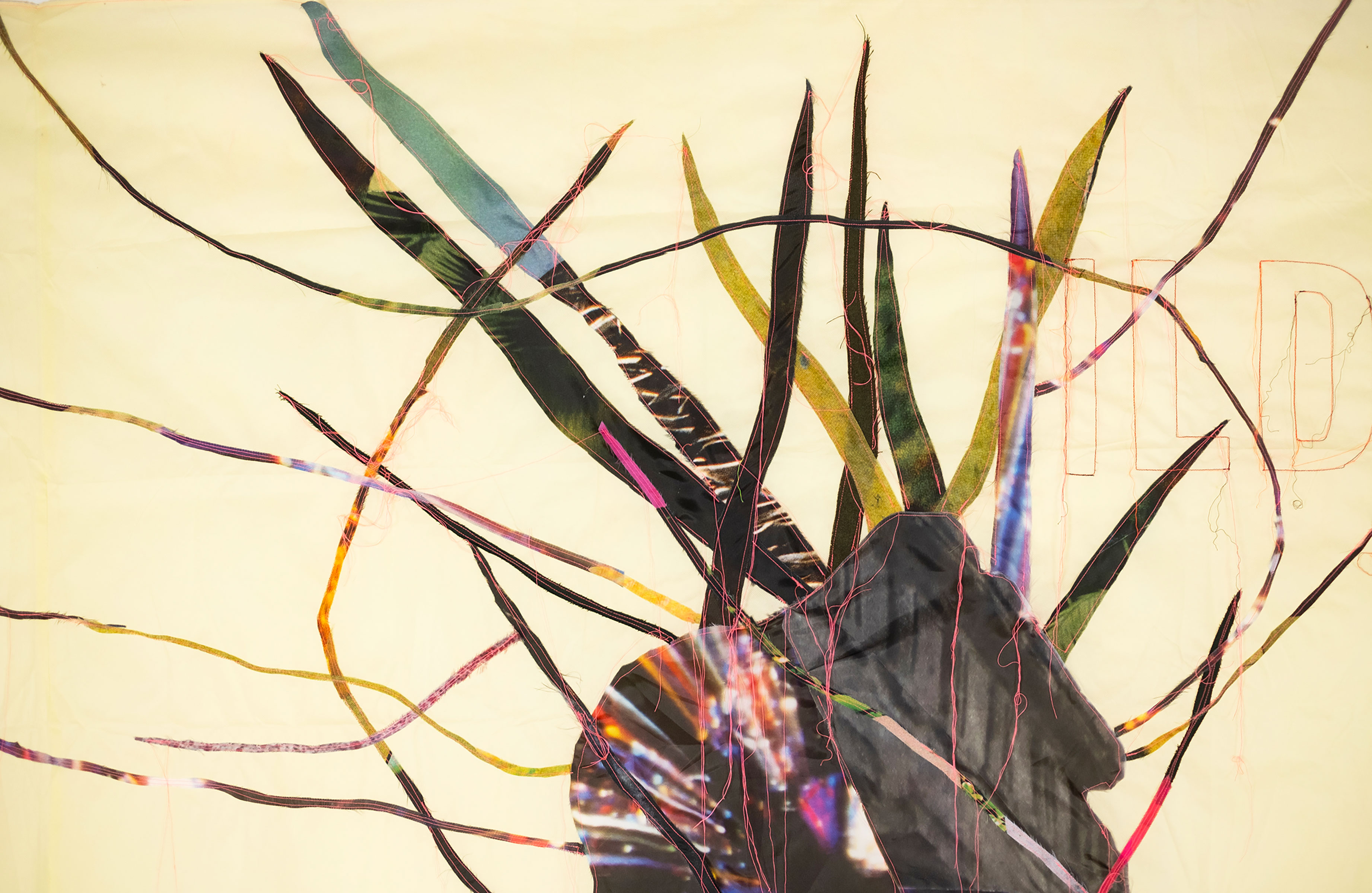
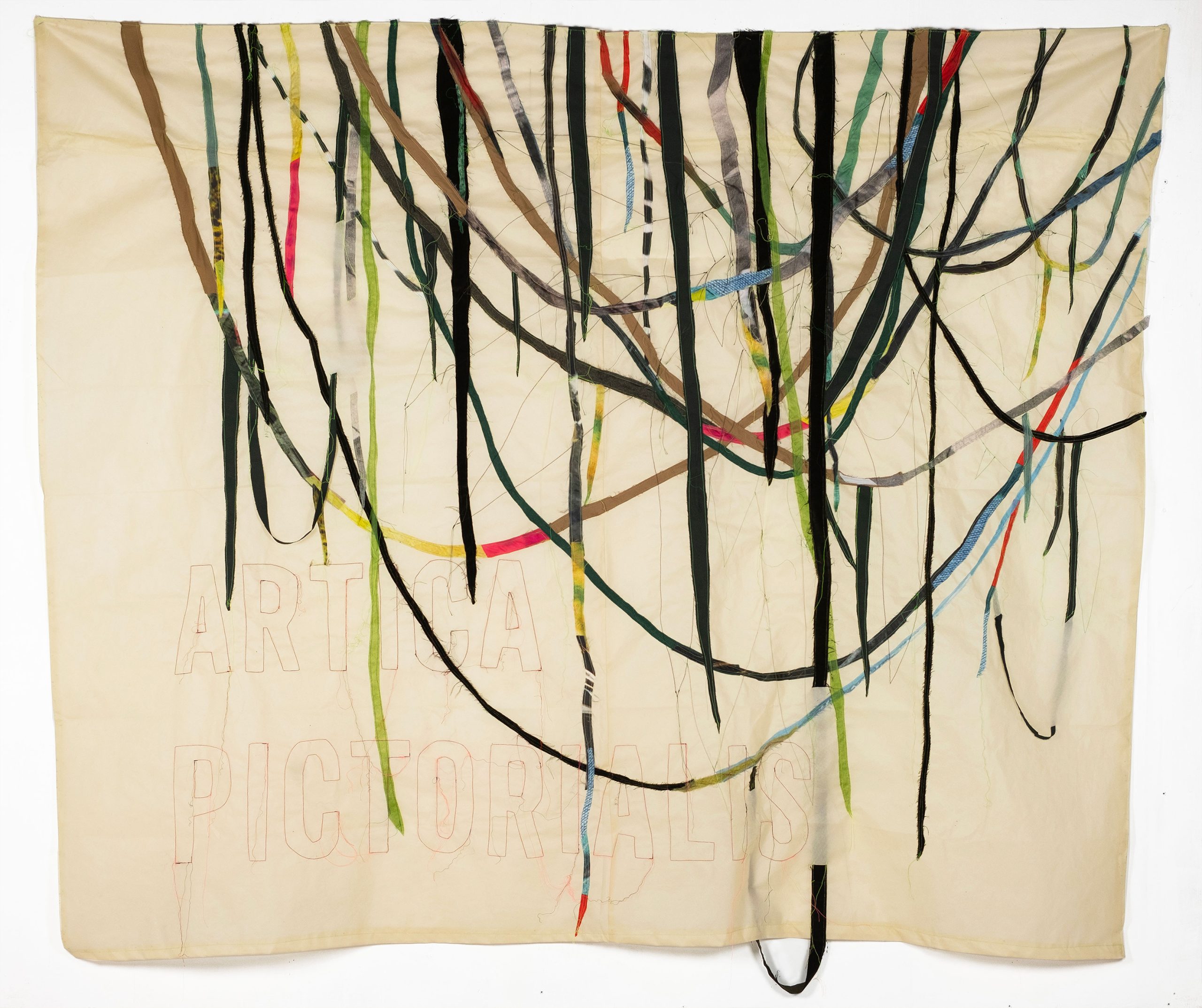
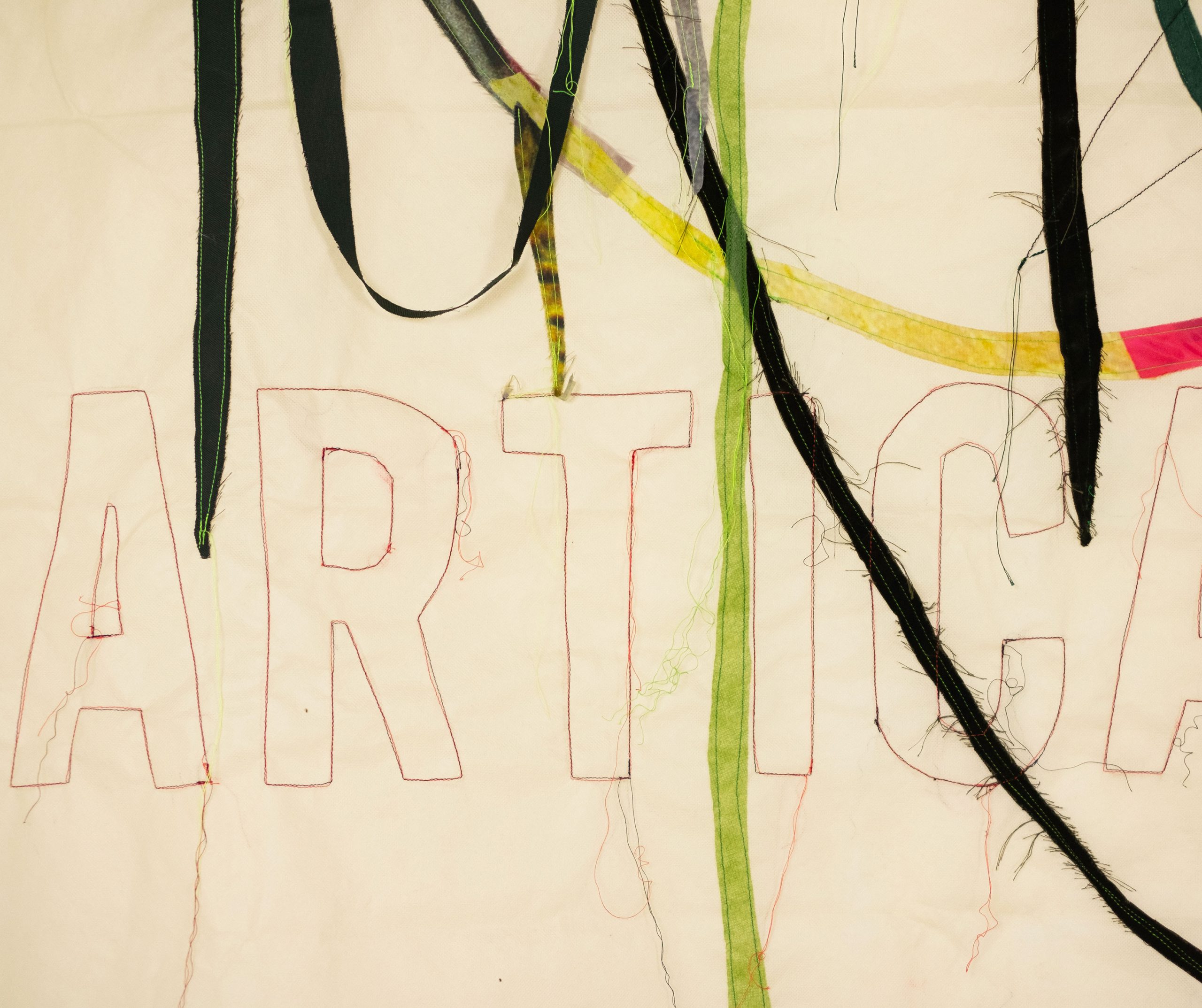
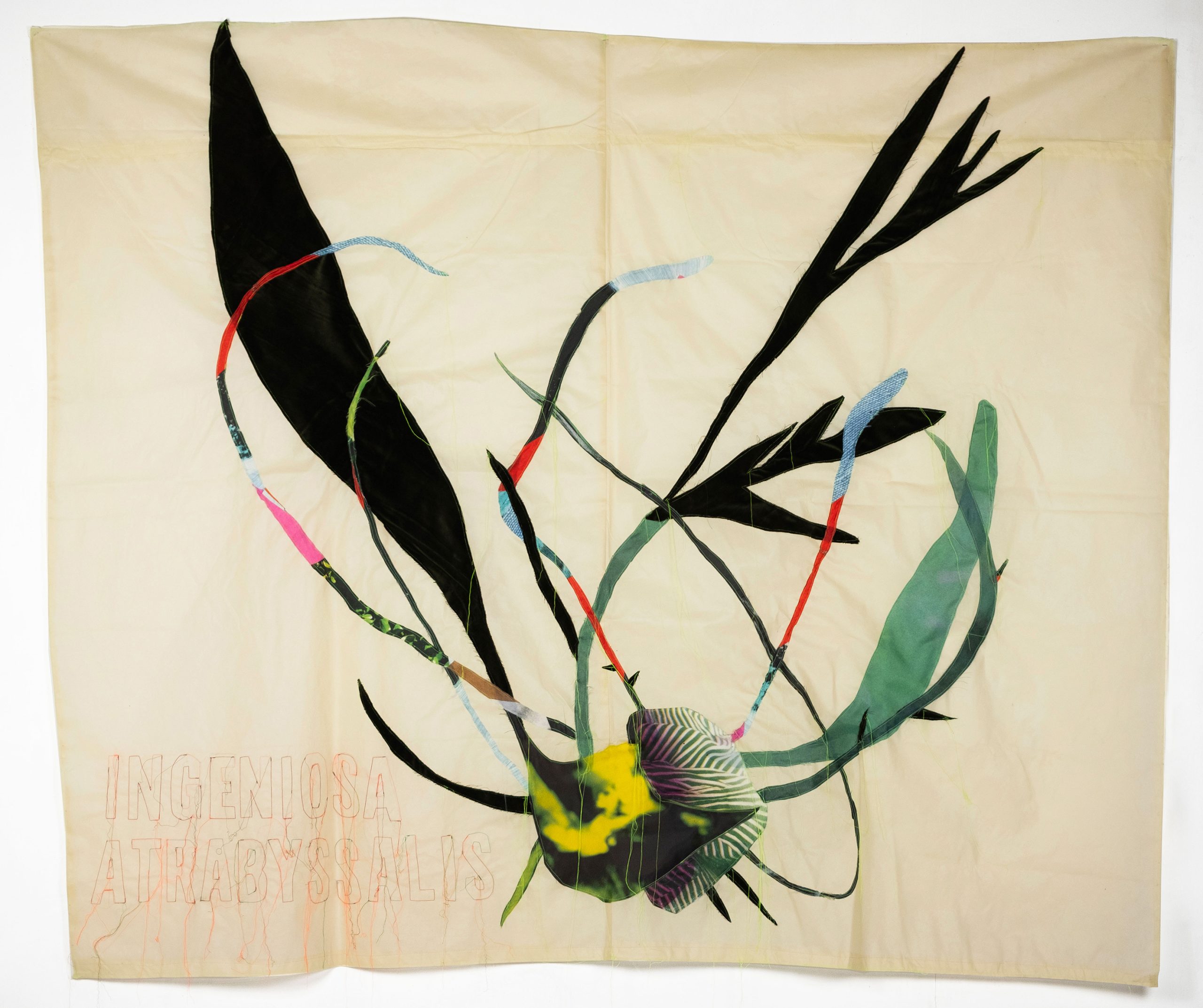
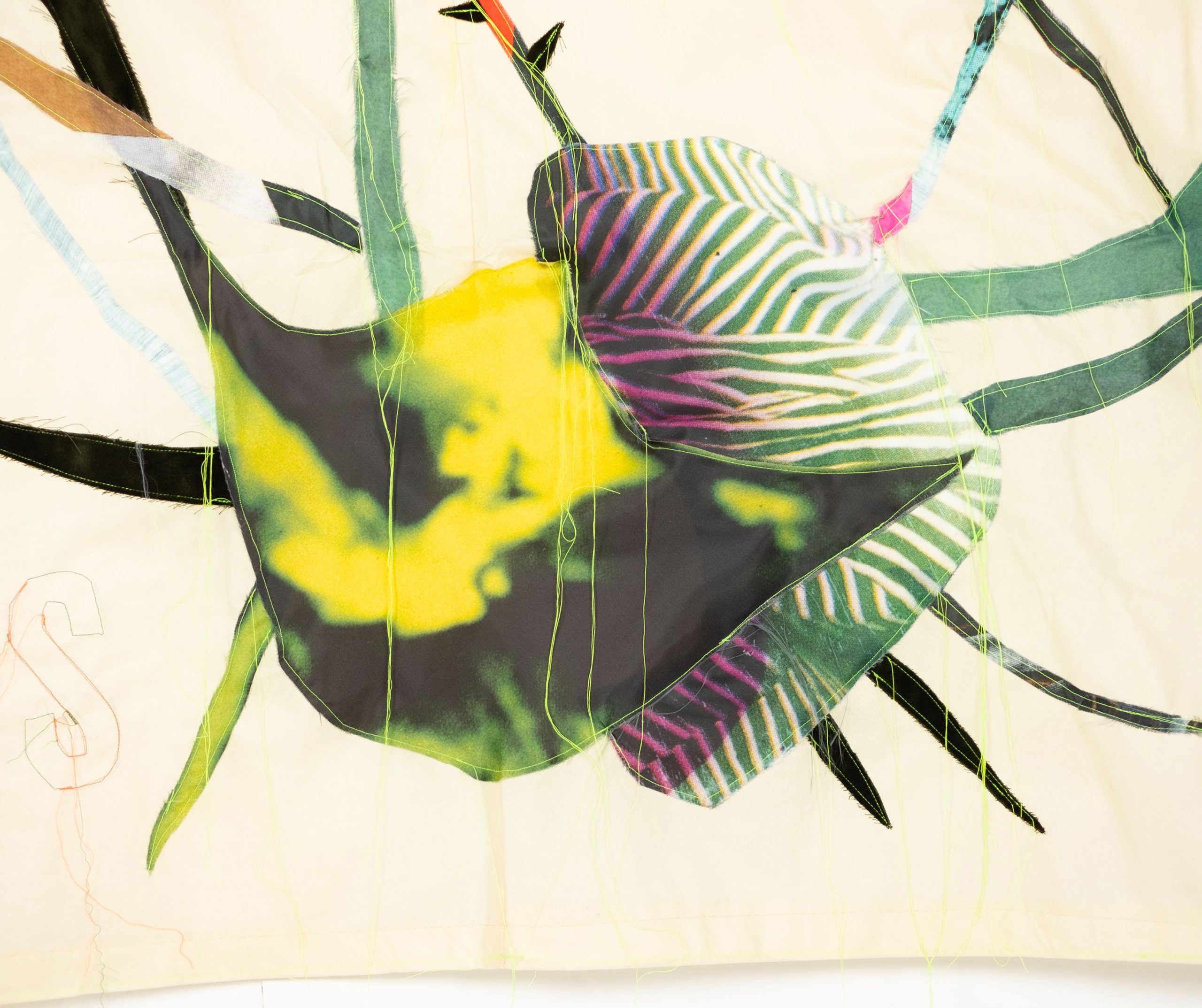
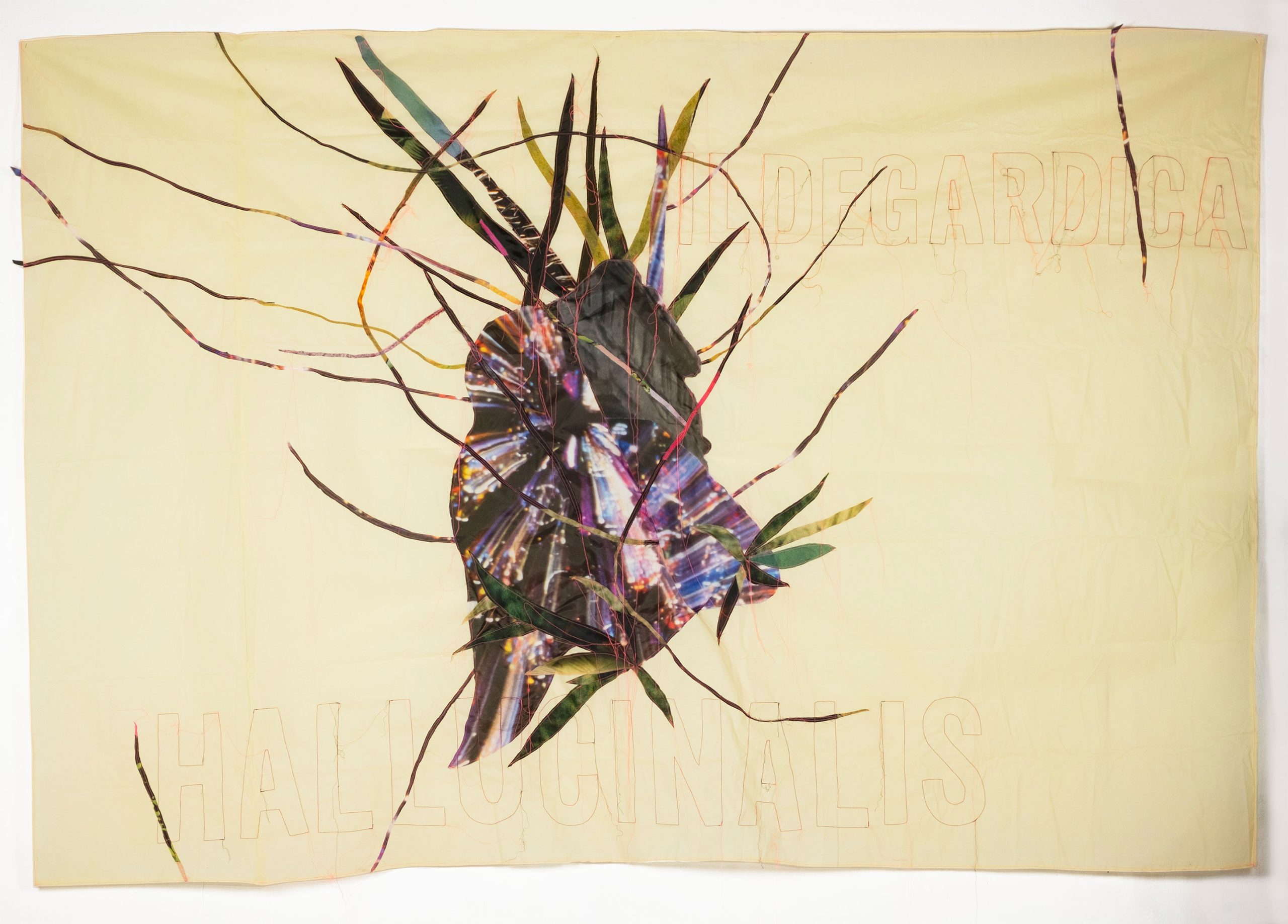
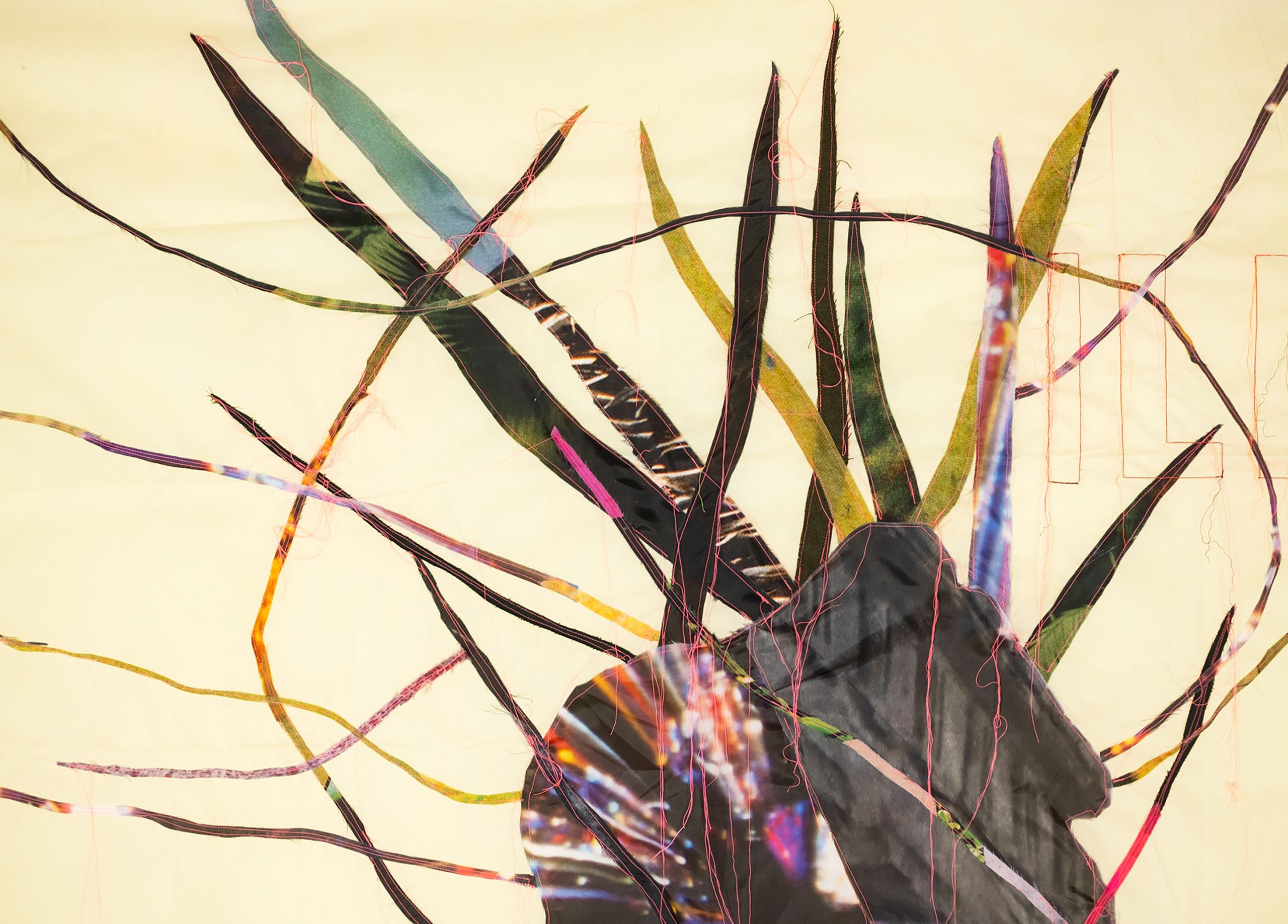
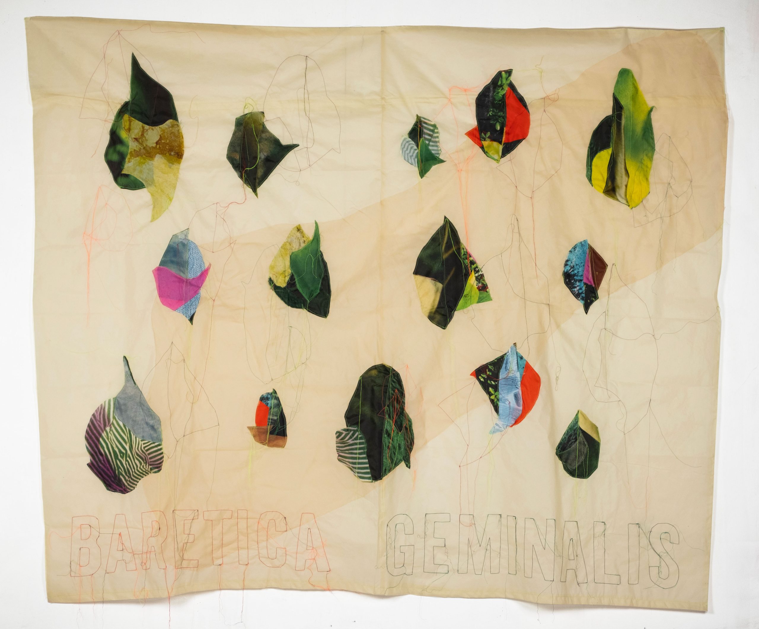
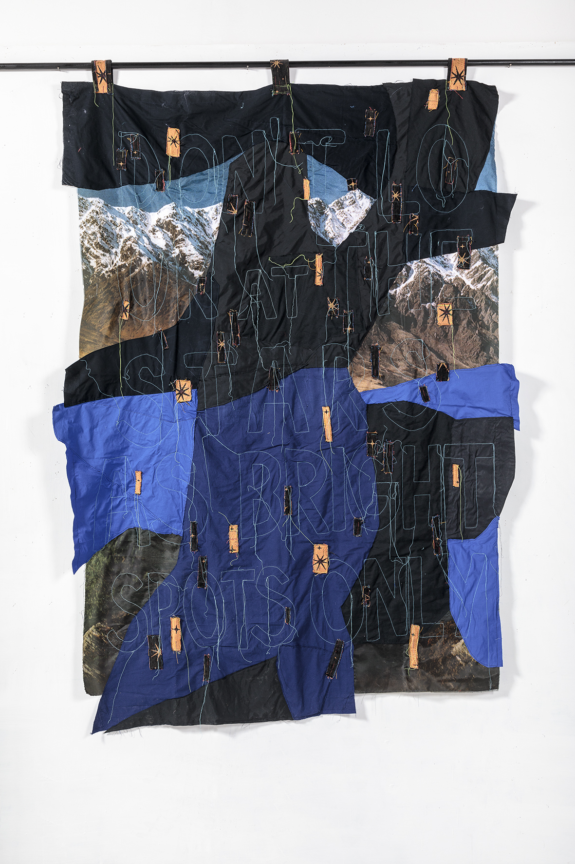
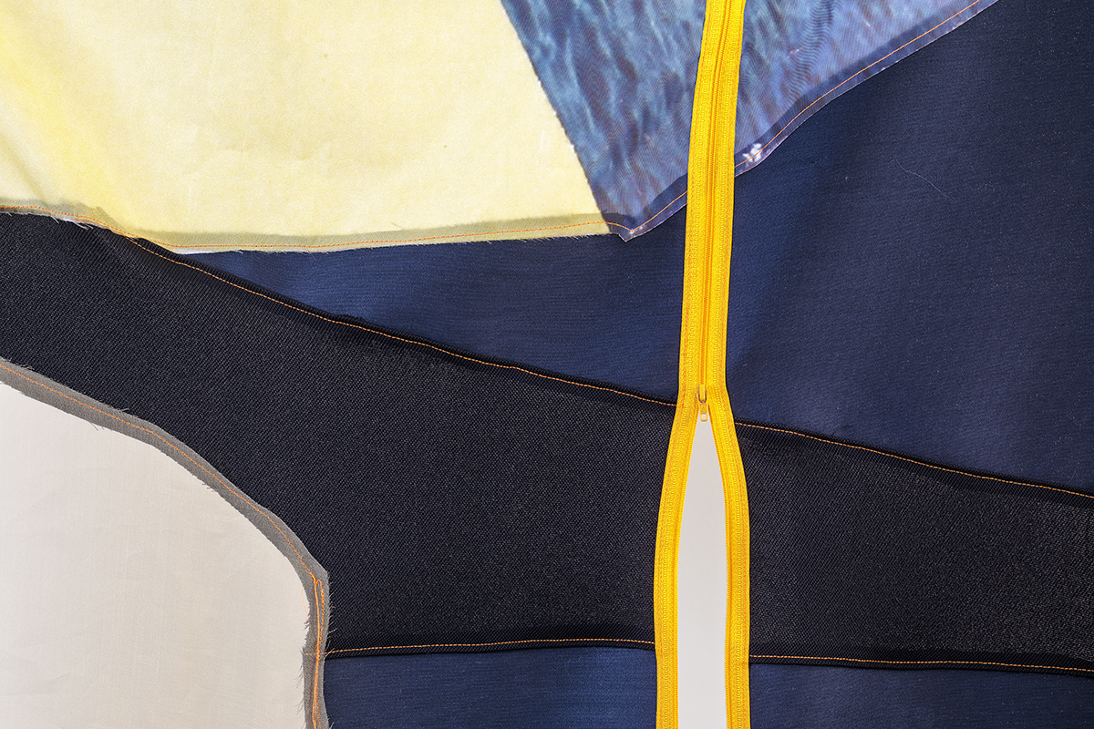
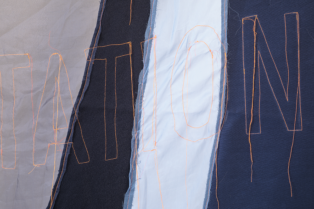
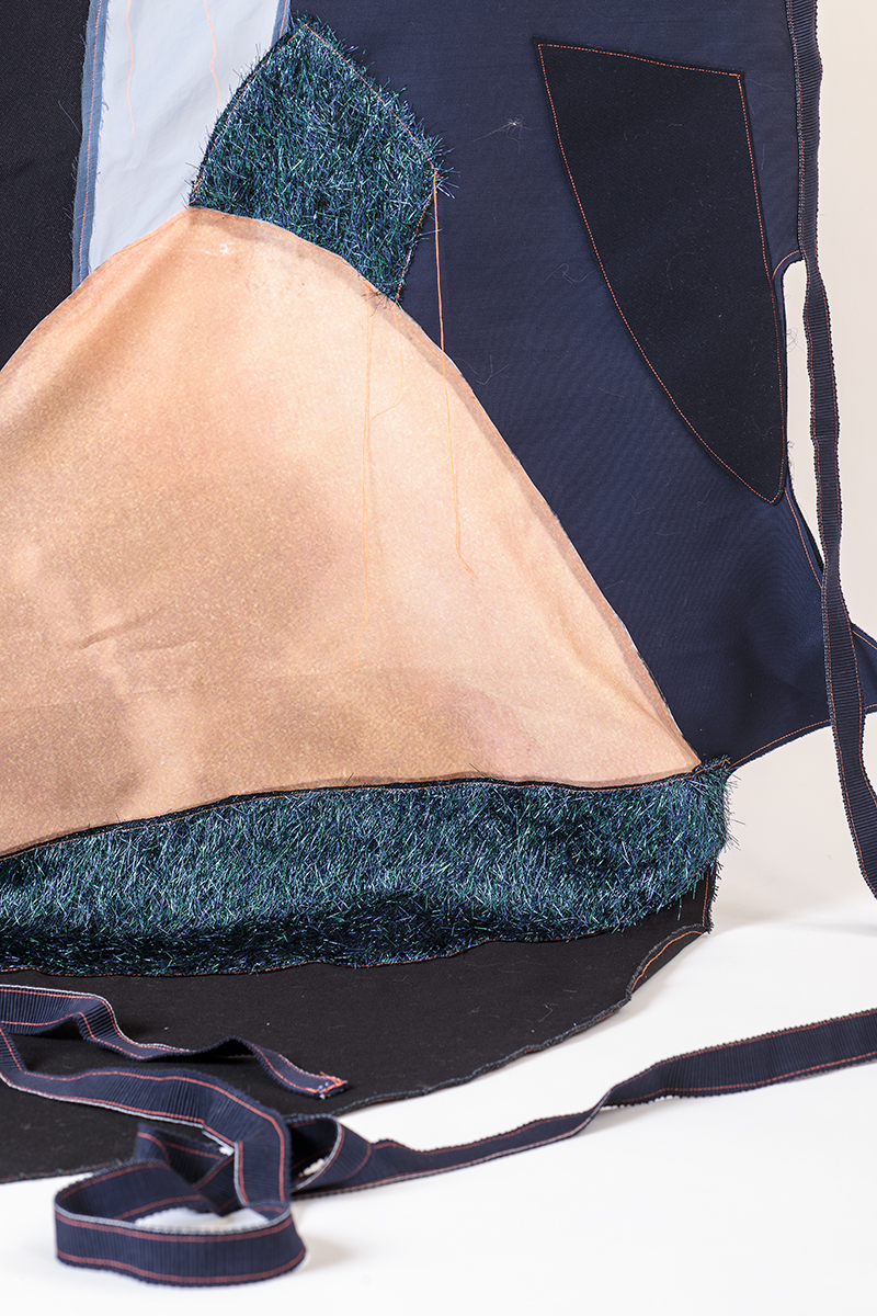
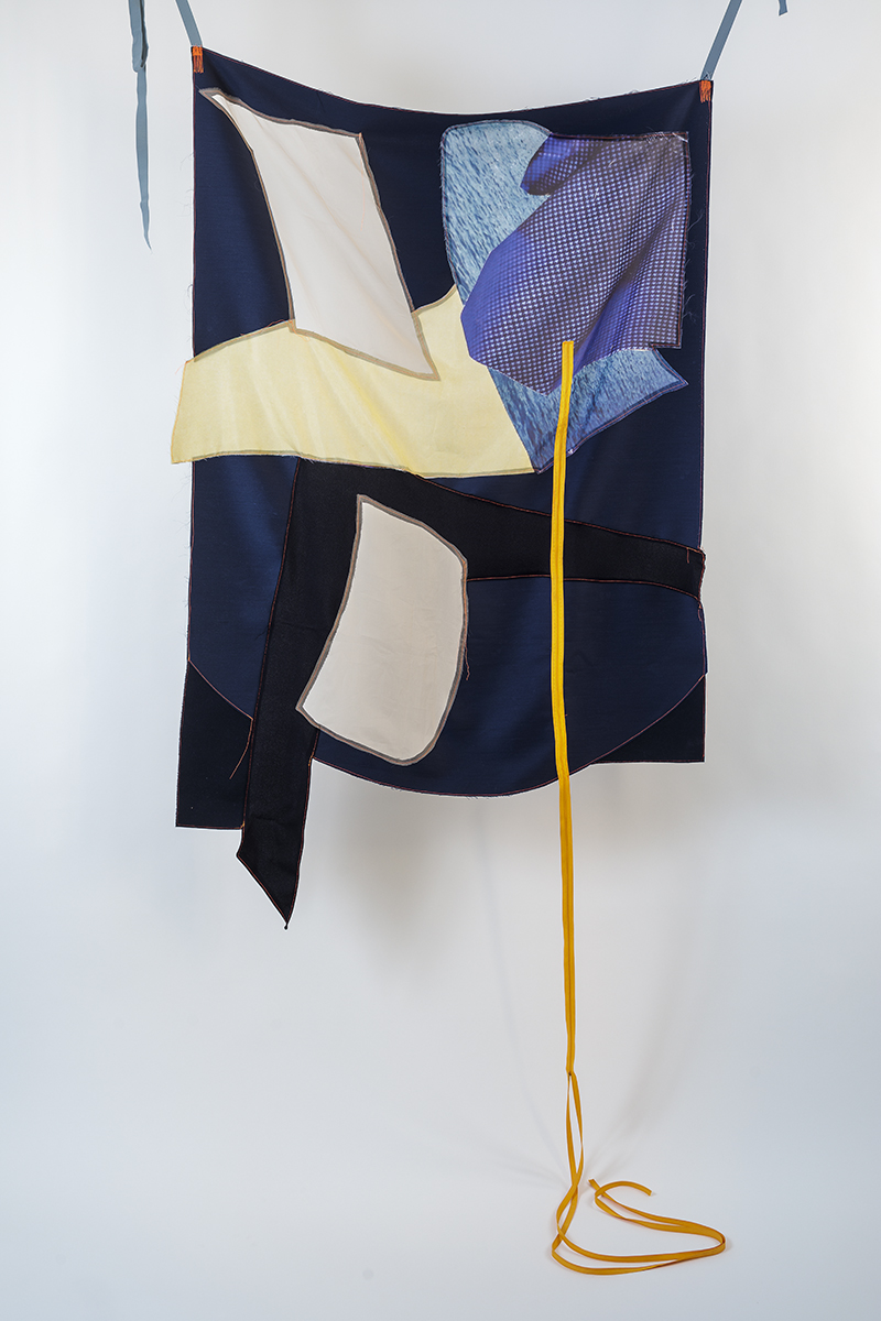
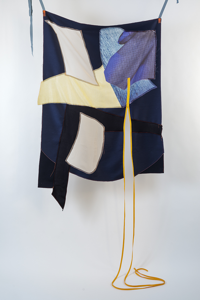
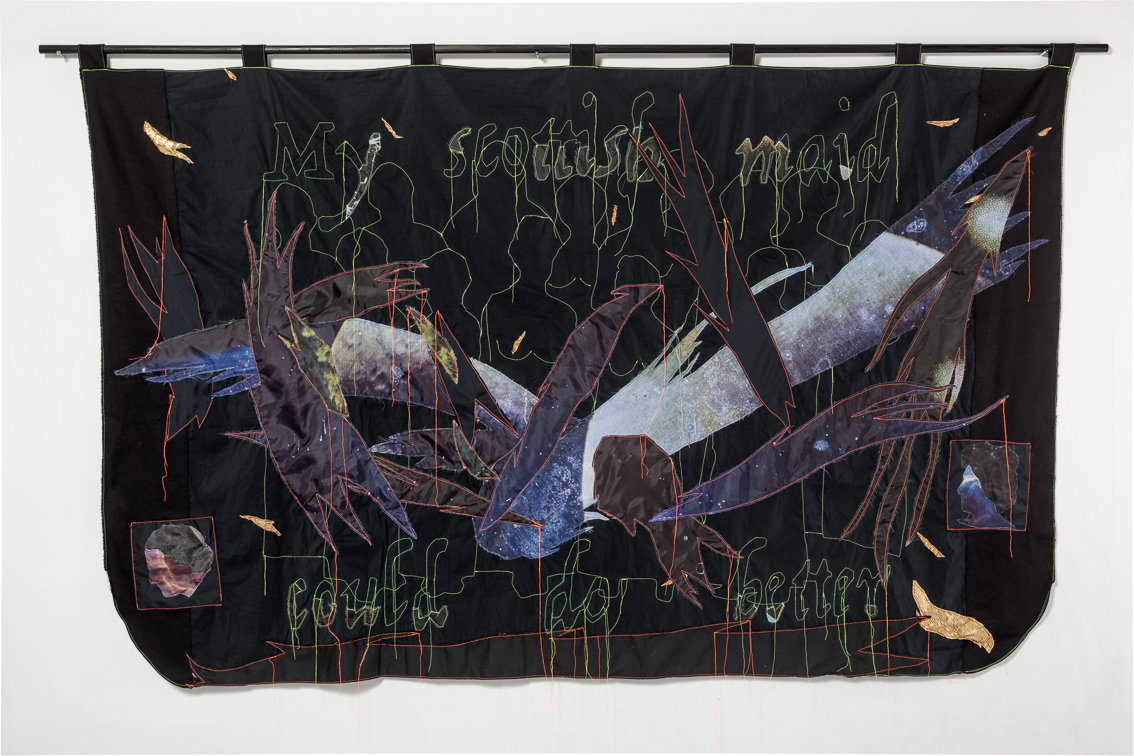
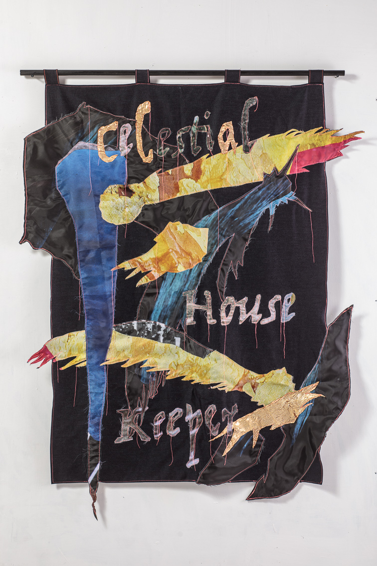
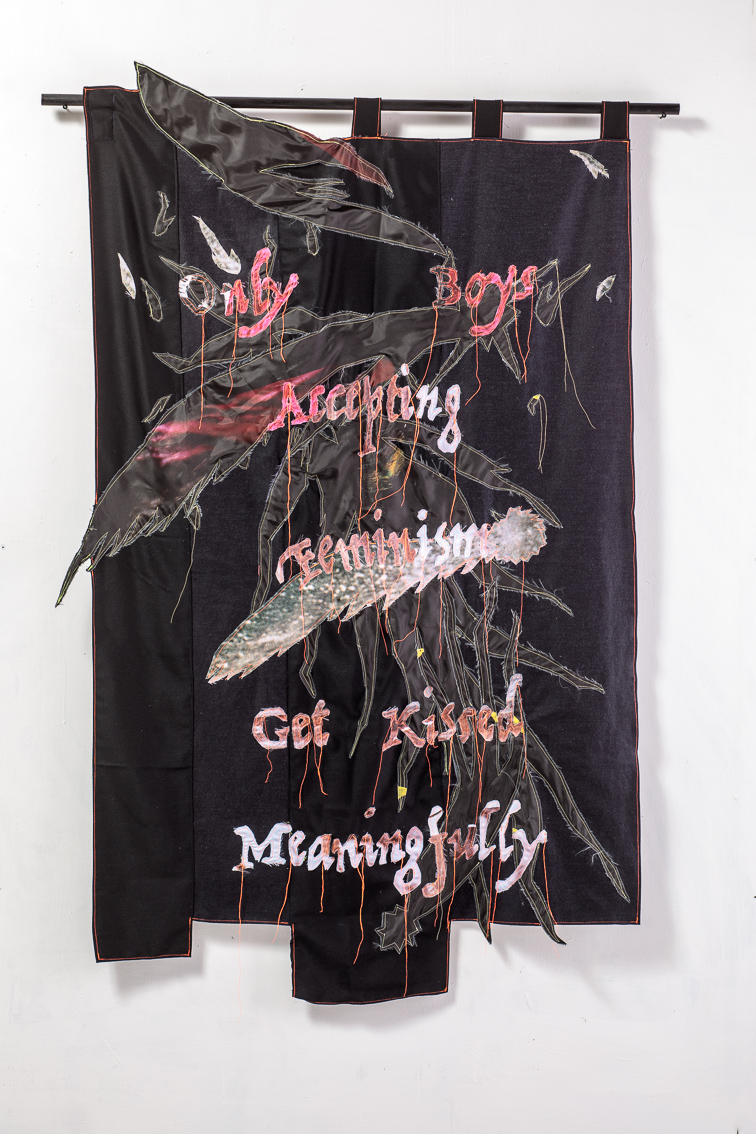
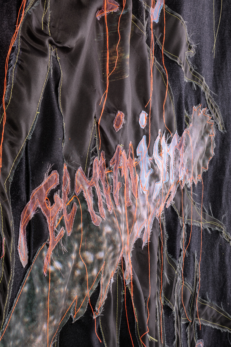
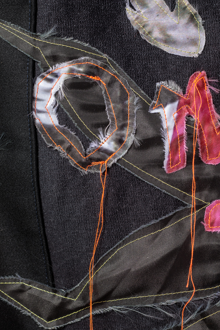
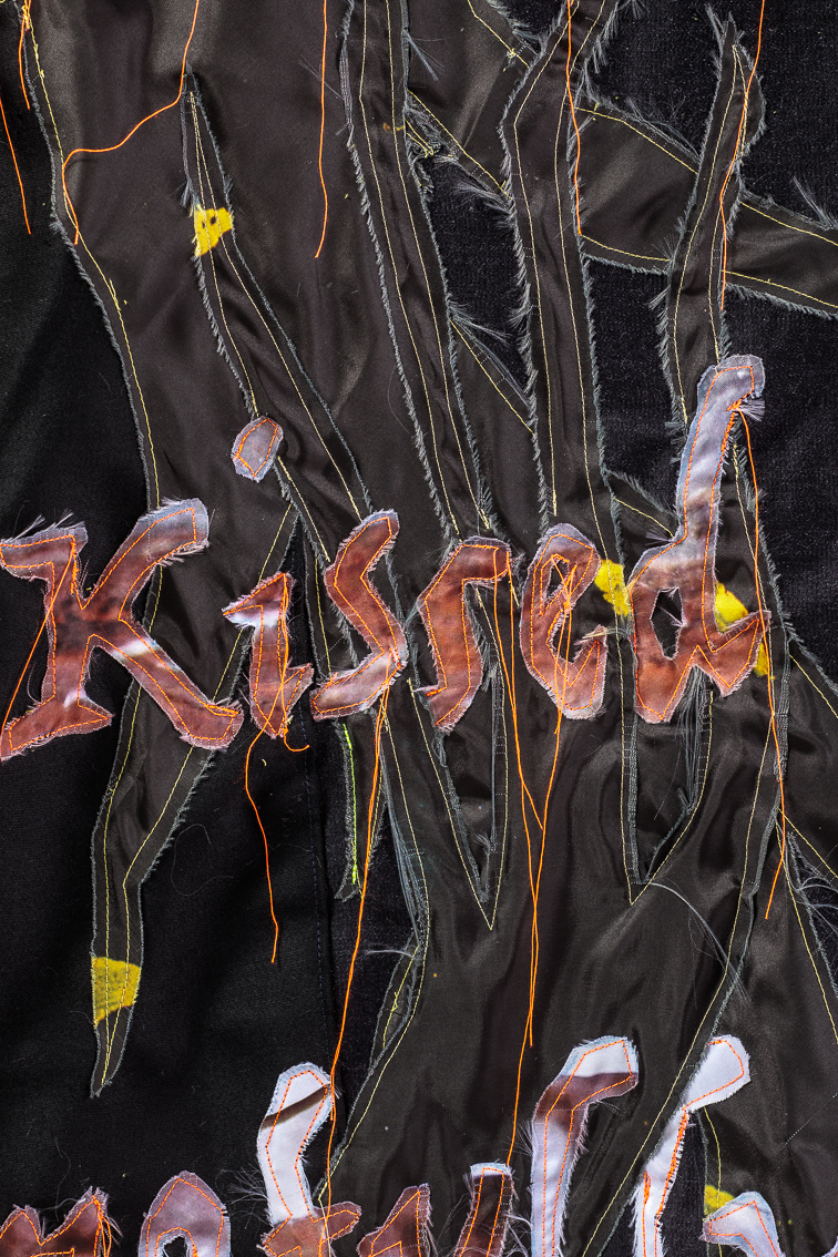
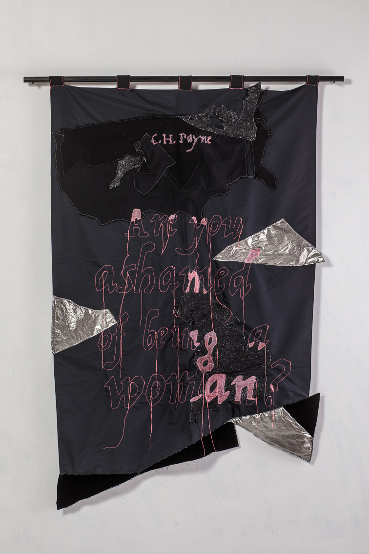
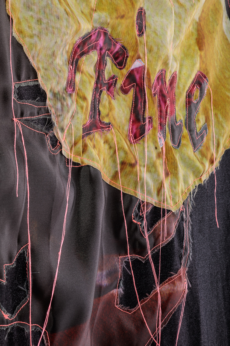
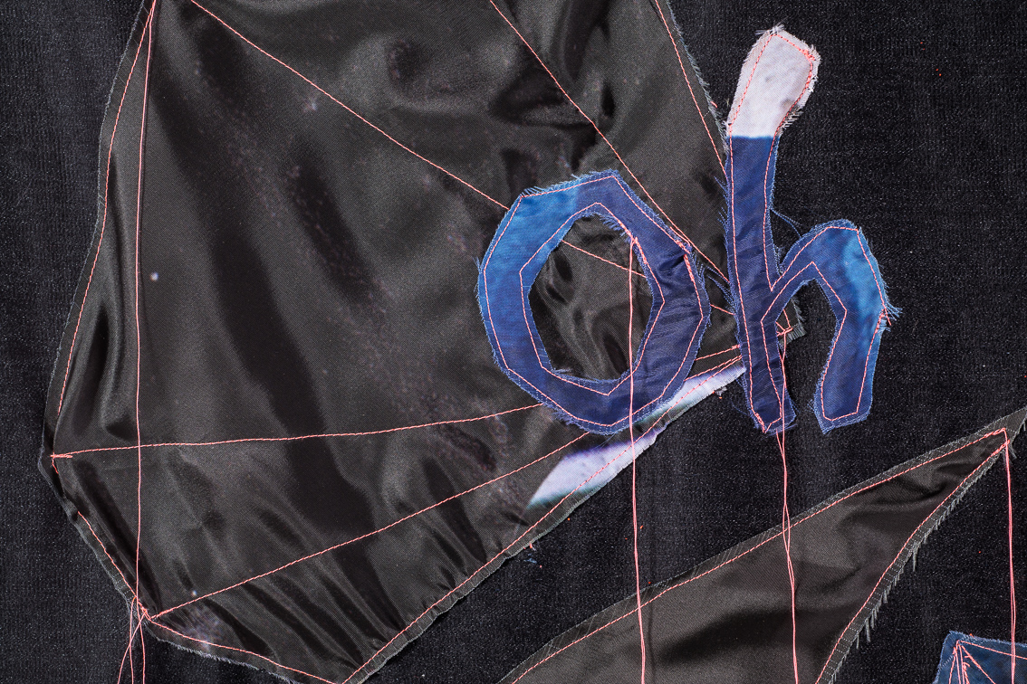
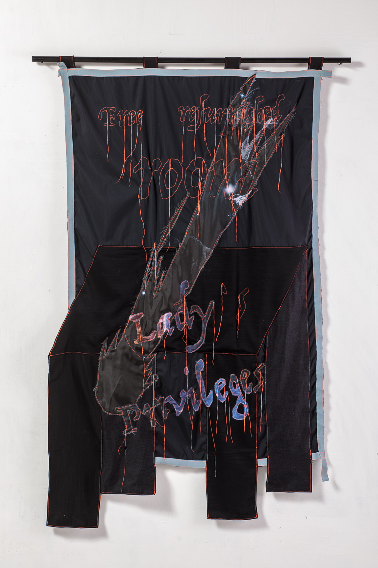
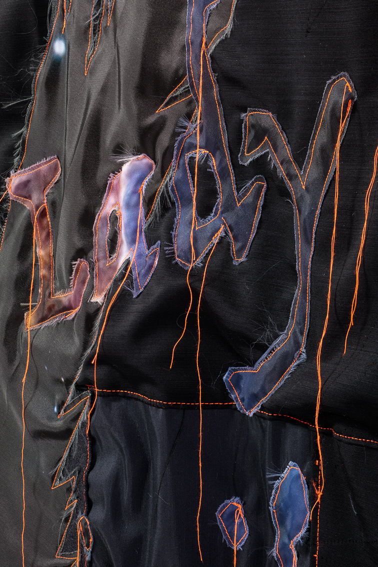
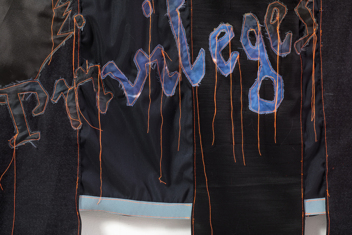
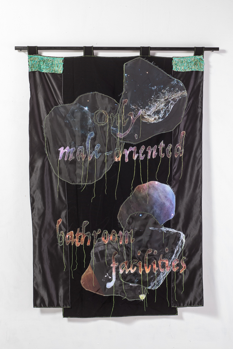
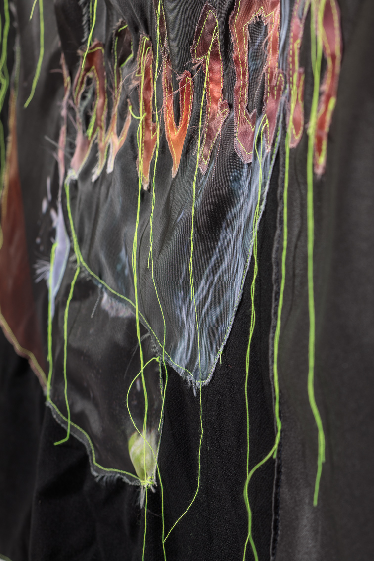
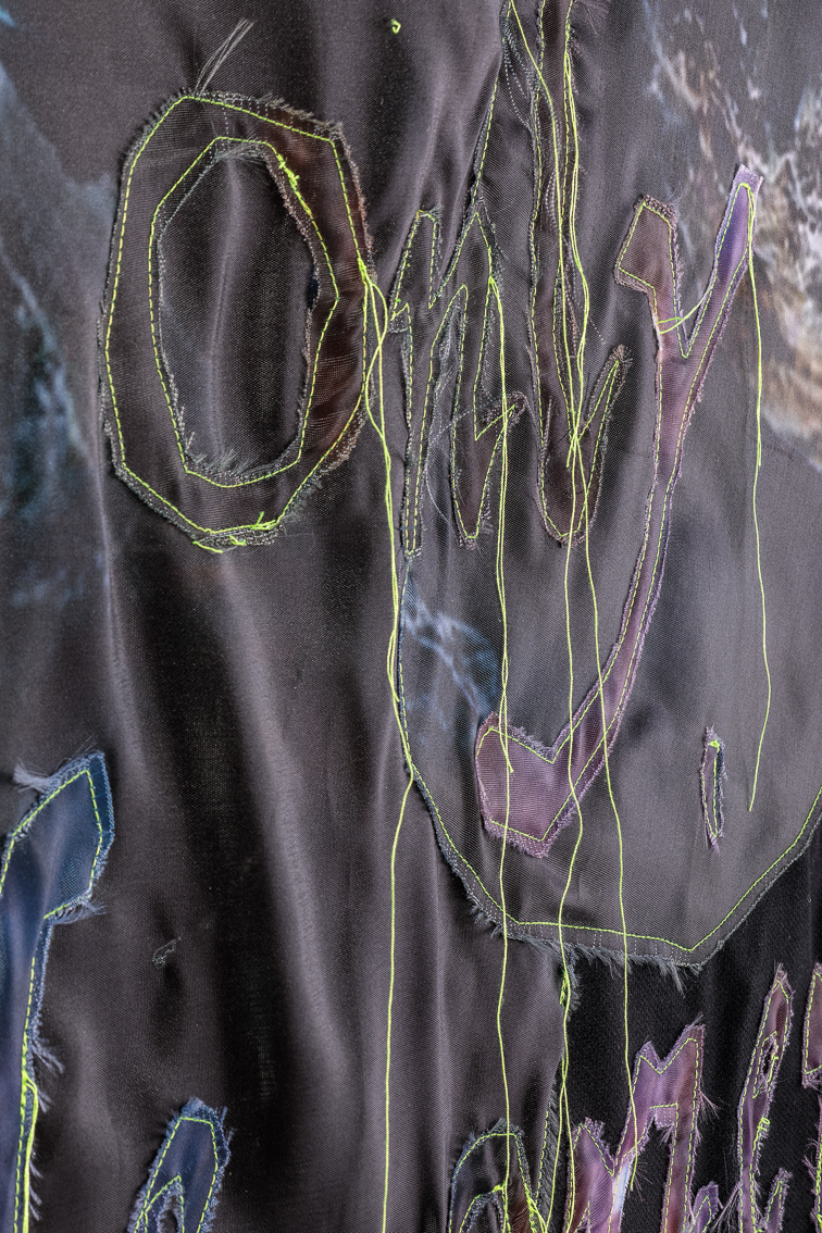
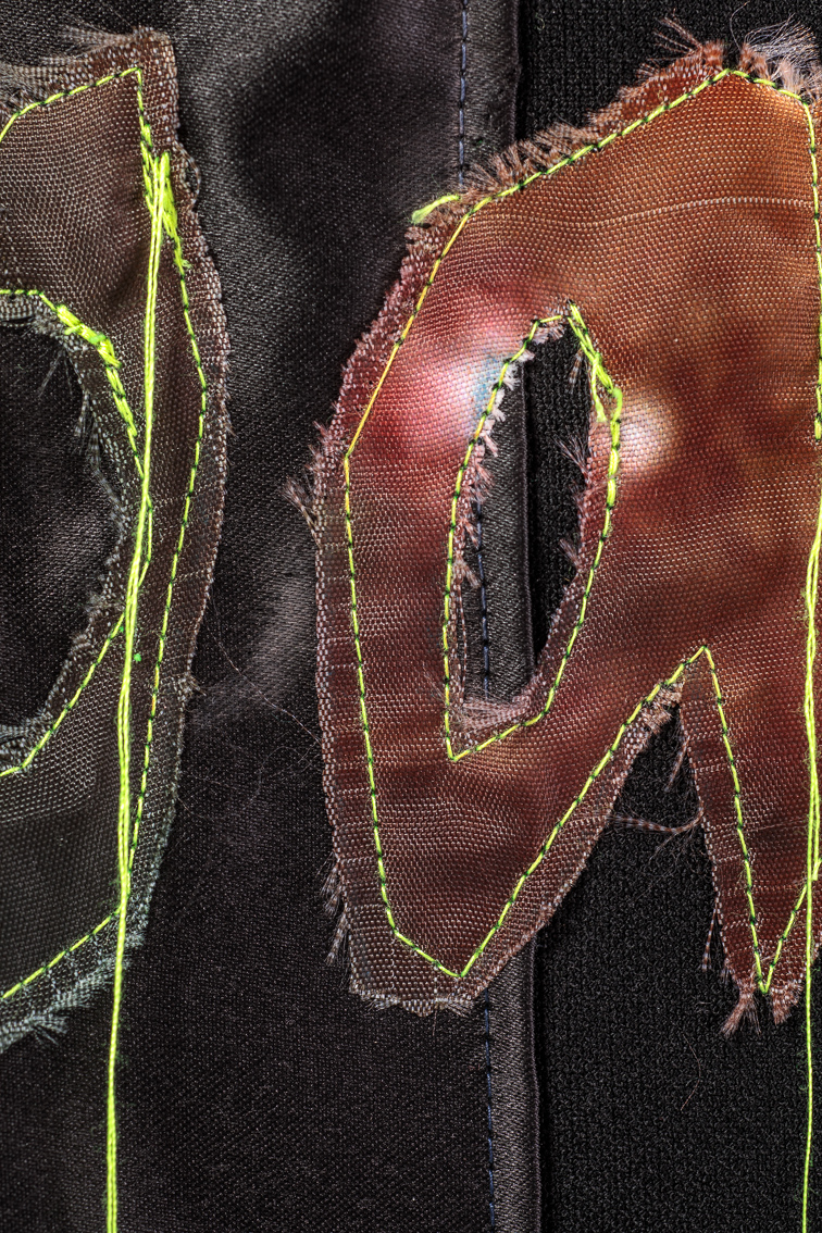
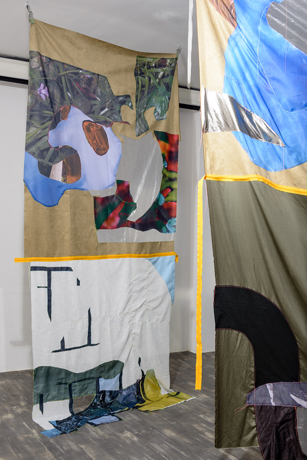
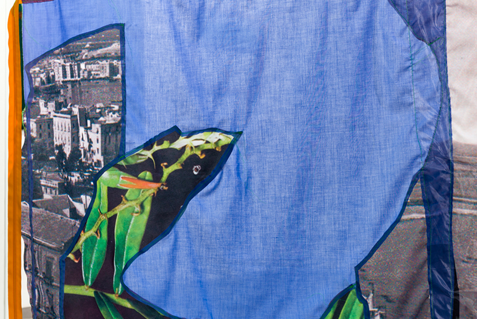
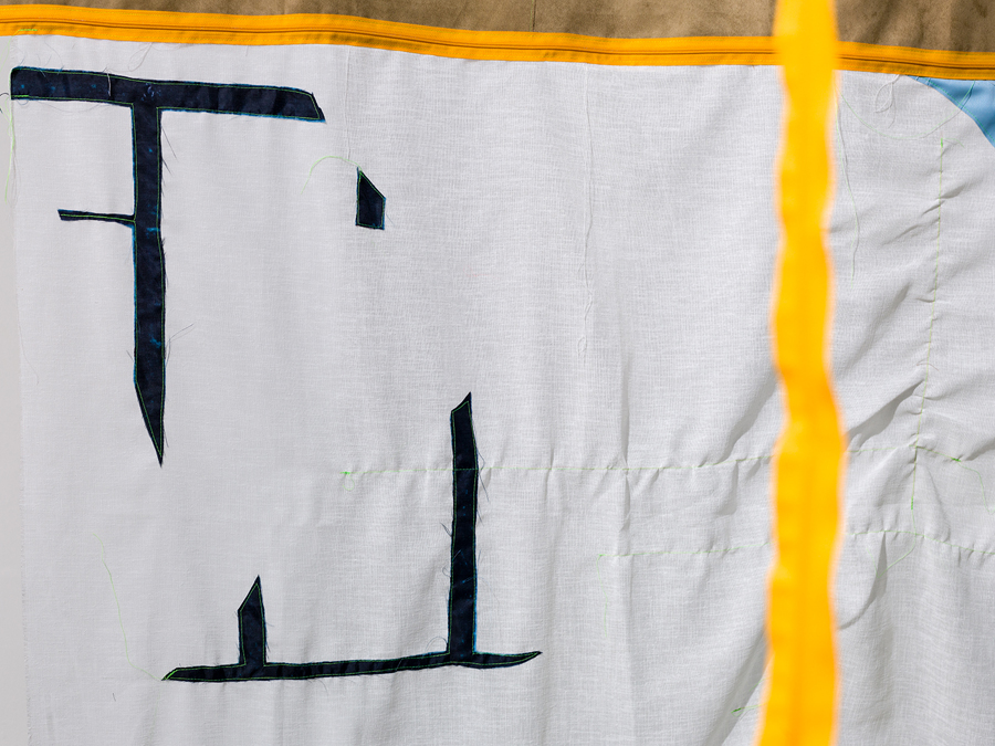
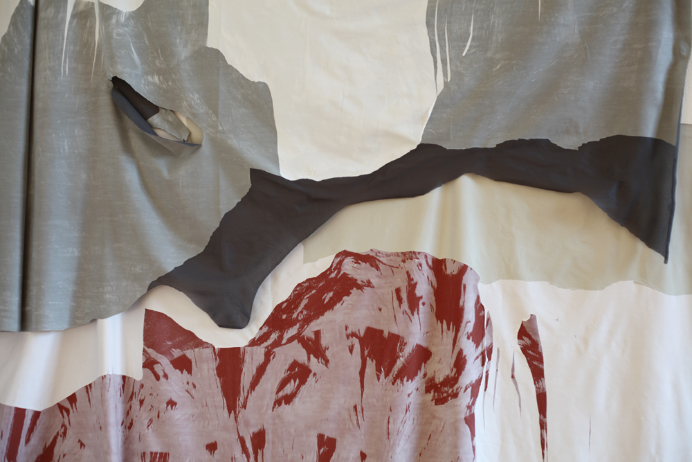
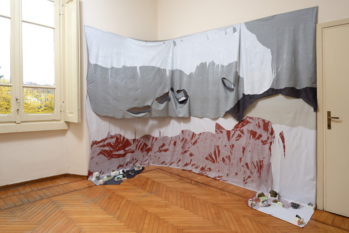
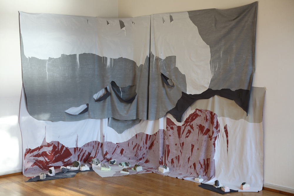
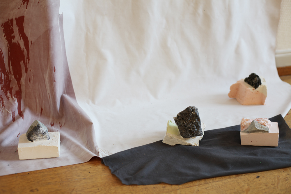
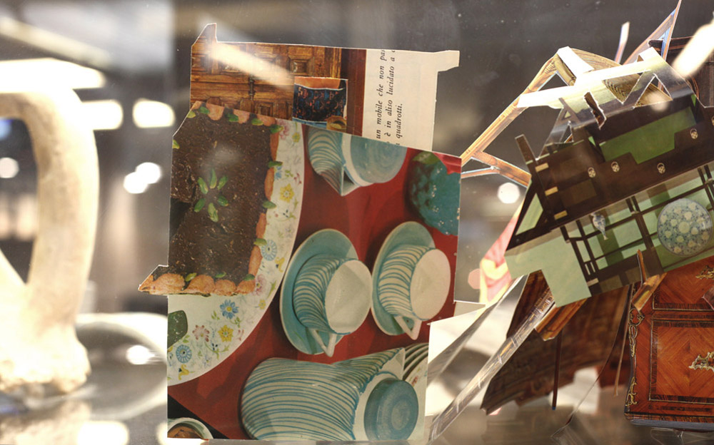
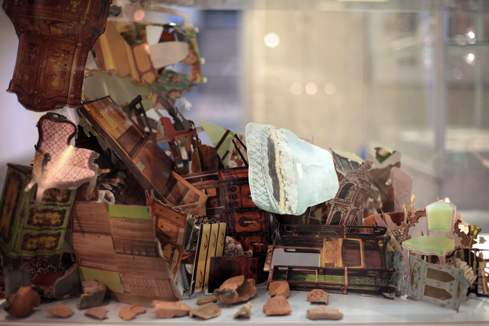
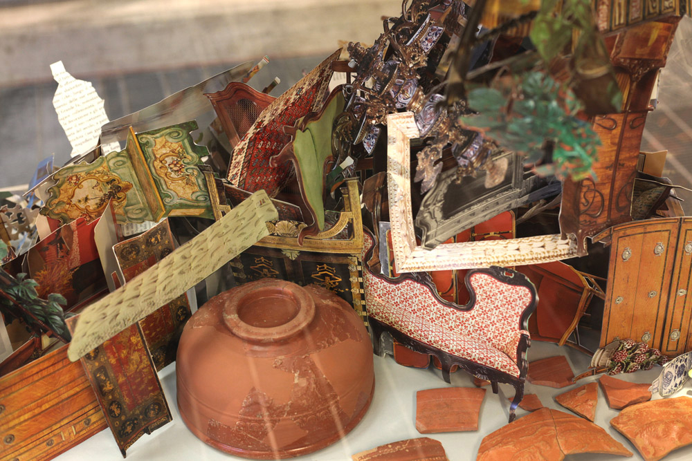
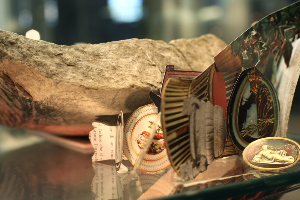
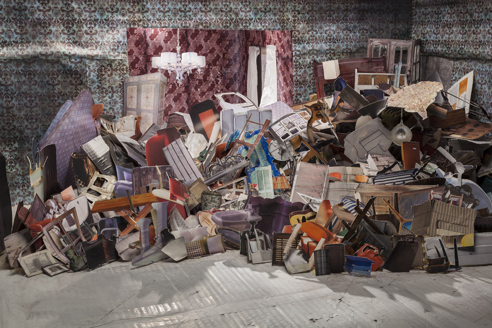
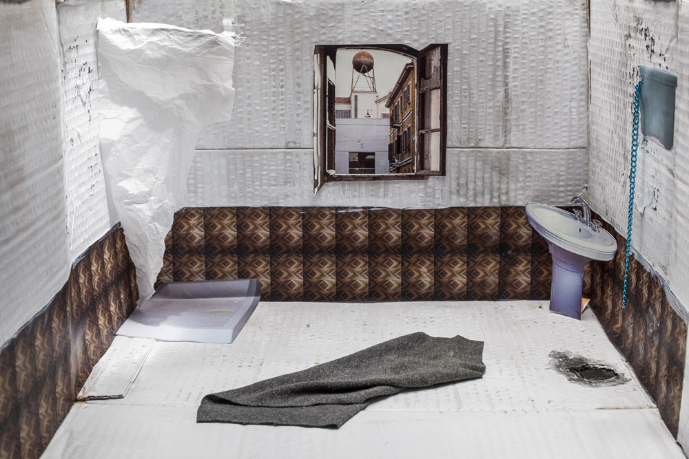
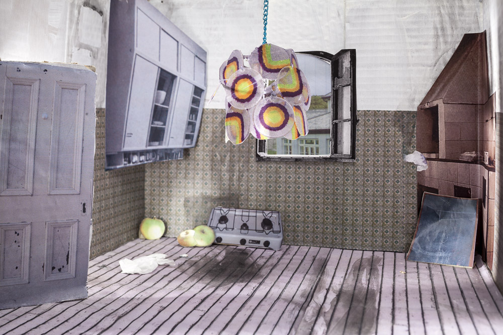
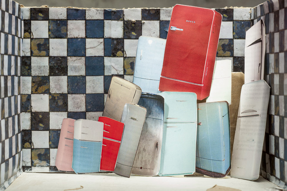
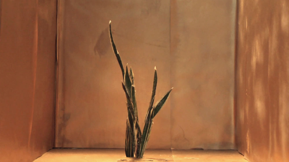
WINNER ITALIAN COUNCIL 12. Edition – LA DESINENZA ESTINTA
Supported by Directorate – General for Contemporary Creativity of the Italian Ministry of Culture under the Italian Council program (12th Edition, 2023), which aims to promote Italian contemporary art worldwide promoted and curated by Ramdom (Lecce, Italy) in collaboration with the Nordenfjeldske Kunstindustrimuseum MiST (Trondheim, Norway) and with the support of the University of Zurich (Zurich, Switzerland); Goldsmiths University (London, UK); Ca’ Pesaro, Galleria Internazionale d’Arte Moderna (Venice, Italy)
2022
PREMIO E-CONTEST, 1st Edition. Winner artist
2018
PREMIO MICHETTI 69. Edition. Winner artist
2017
PREMIO COSUA Videocompetition Pasinetti. Special Mention for “Out there, a big night of stars”
2015
PREMIO ARTE RUGABELLA finalist artist
2013
PREMIO TERNA 05 finalist artist
2012
PREMIO SAN FEDELE Selected artist
2002
ALIDA EPREMIAN Grants for young women artists. Winner artist
MOVIN’UP FELLOWSHIP, GAI, Milan
RESIDENCIES
2026
CASA MASSELLA. BORGO DELLE TESSITRICI, Fondazione Le Costantine, curated by Eccom
GIBELLINA CAPITALE DELL’ARTE CONTEMPORANEA, project selected and curated by Cristina Costanzo, Andrea Cusumano and Enzo Fiammetta.
2025
LANGUAGES, PLEASE Unidee Residency Program, Fondazione Pistoletto, Biella
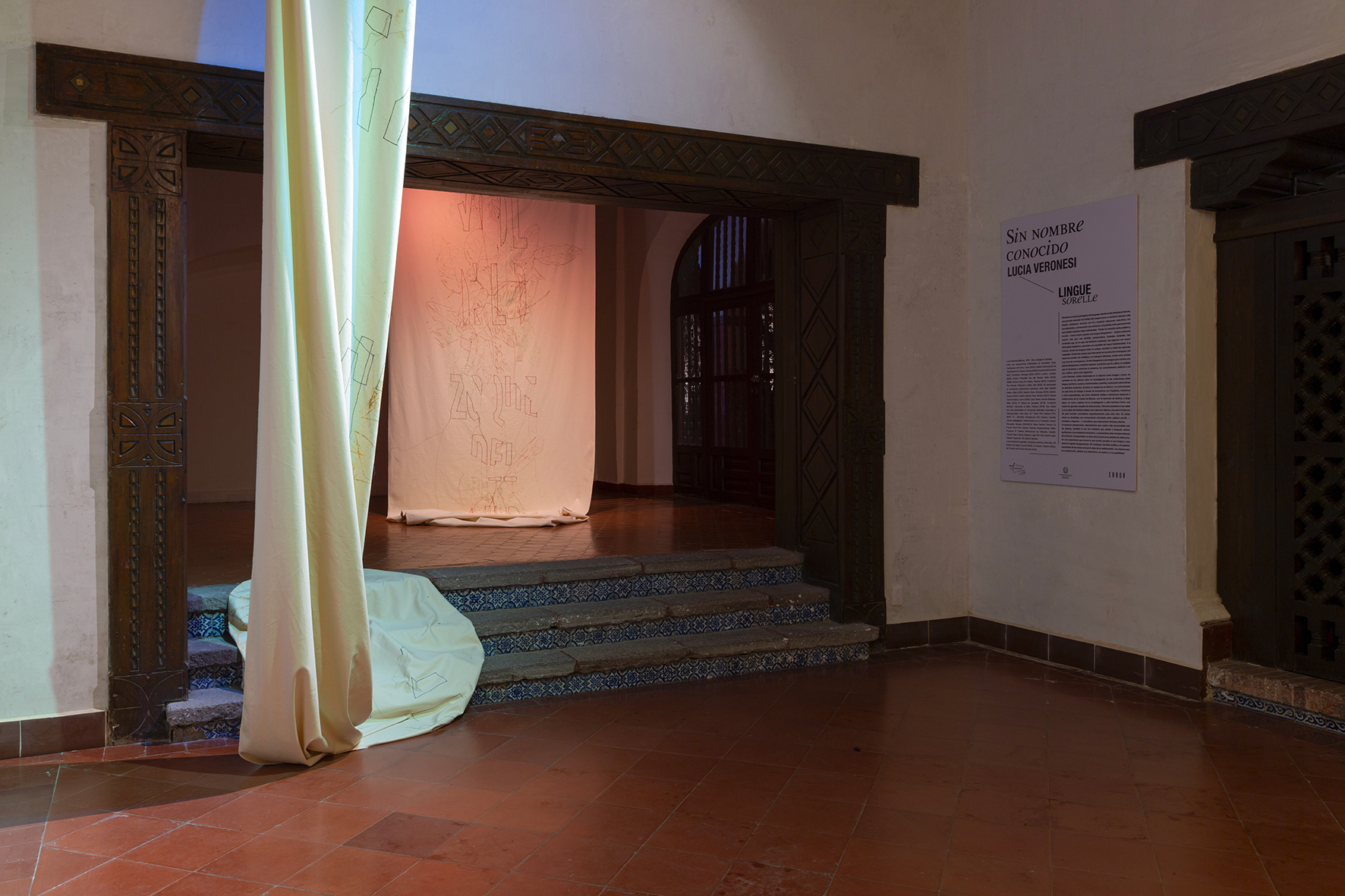
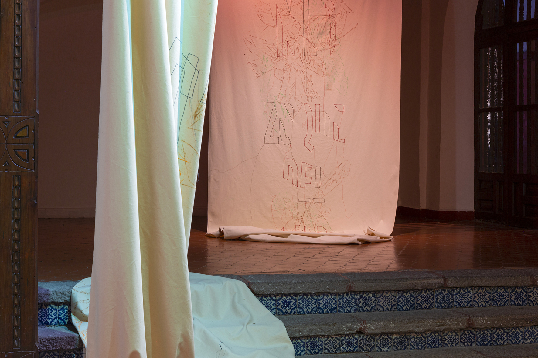
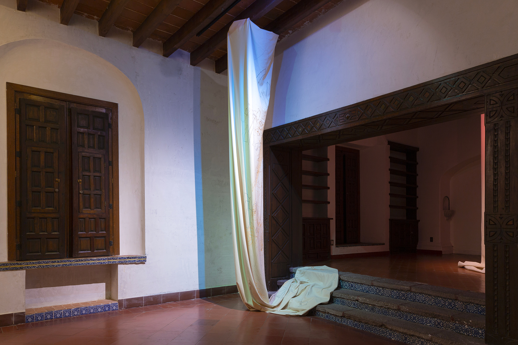
LINGUE SORELLA, Italian Cultural Institute coordinated by Error Projecto, Mexico City
2023
OFFICINA MALANOTTE, Tezze di Piave, TV
AIR GREEN RESIDENCY, Noresund, Buskerud County, Norway
2022
KUNSTNARHUSET MESSEN, Ålvik, Norway
2019
KUNSTNARHUSET MESSEN, Ålvik, Norway
SIMPOSIO DI PITTURA, Fondazione Lac o Le Mon, curated by Luigi Presicce, San Cesario di Lecce
2017
DEFAULT17 International Workshop and Residency, Gagliano del Capo, Italy
2012
MUSTARINDA, Hyrynsalmi, Finland
PAINTING DETOURS, Artist in residence curated by Andrea Bruciati, Guado dell’Arciduca, Udine
2002
SANSKRITI KENDRA, New Dehli, India
2000
FAR Advanced course in Visual Arts, Fondazione Antonio Ratti, Como. Visiting Professor Ilya Kabakov
SOLO SHOWS
2025
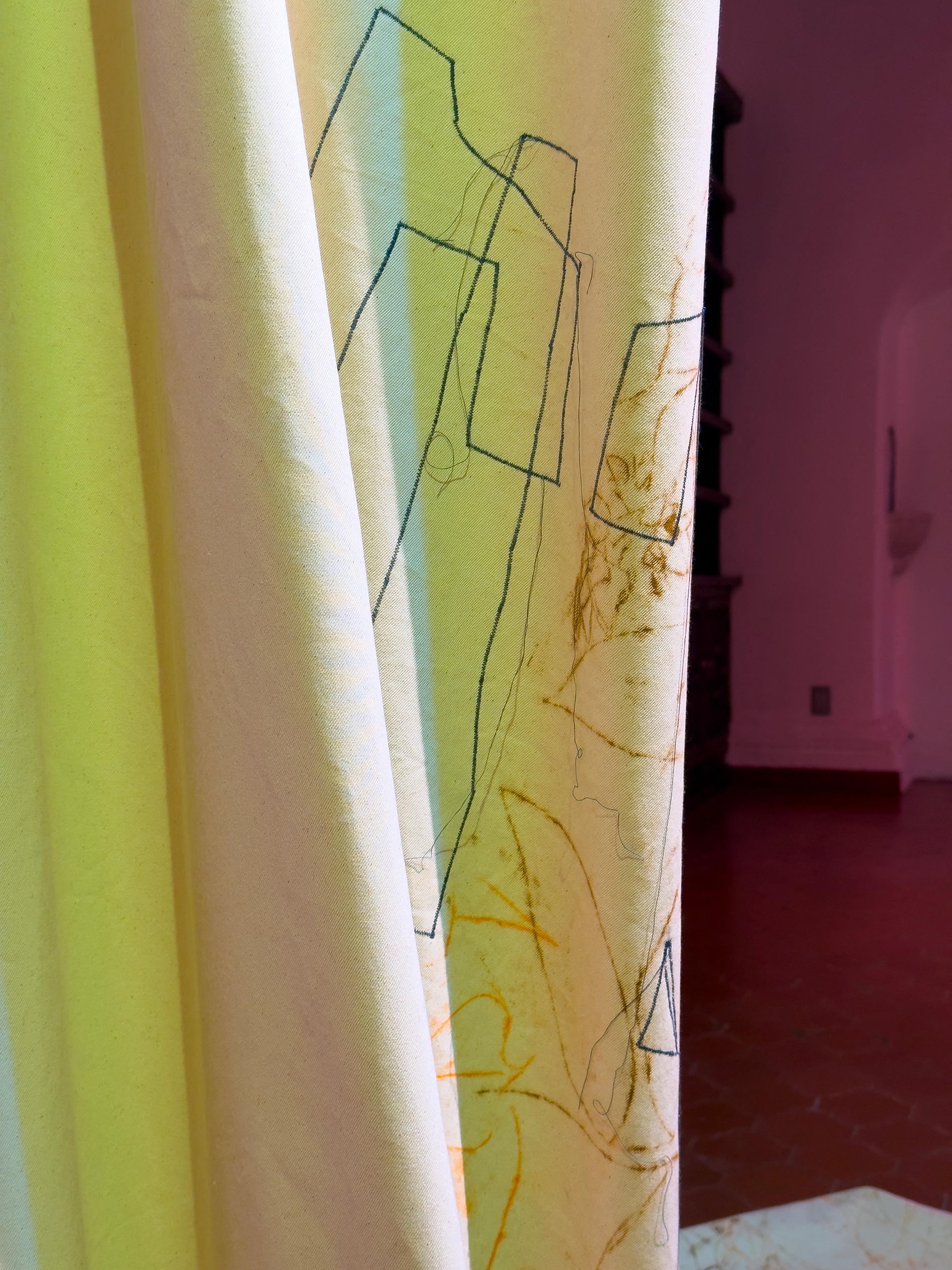
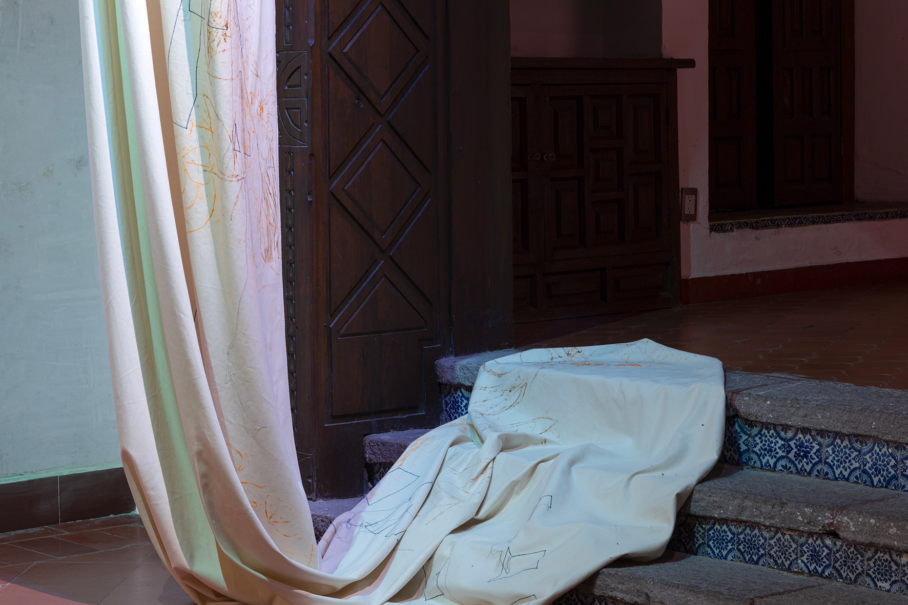
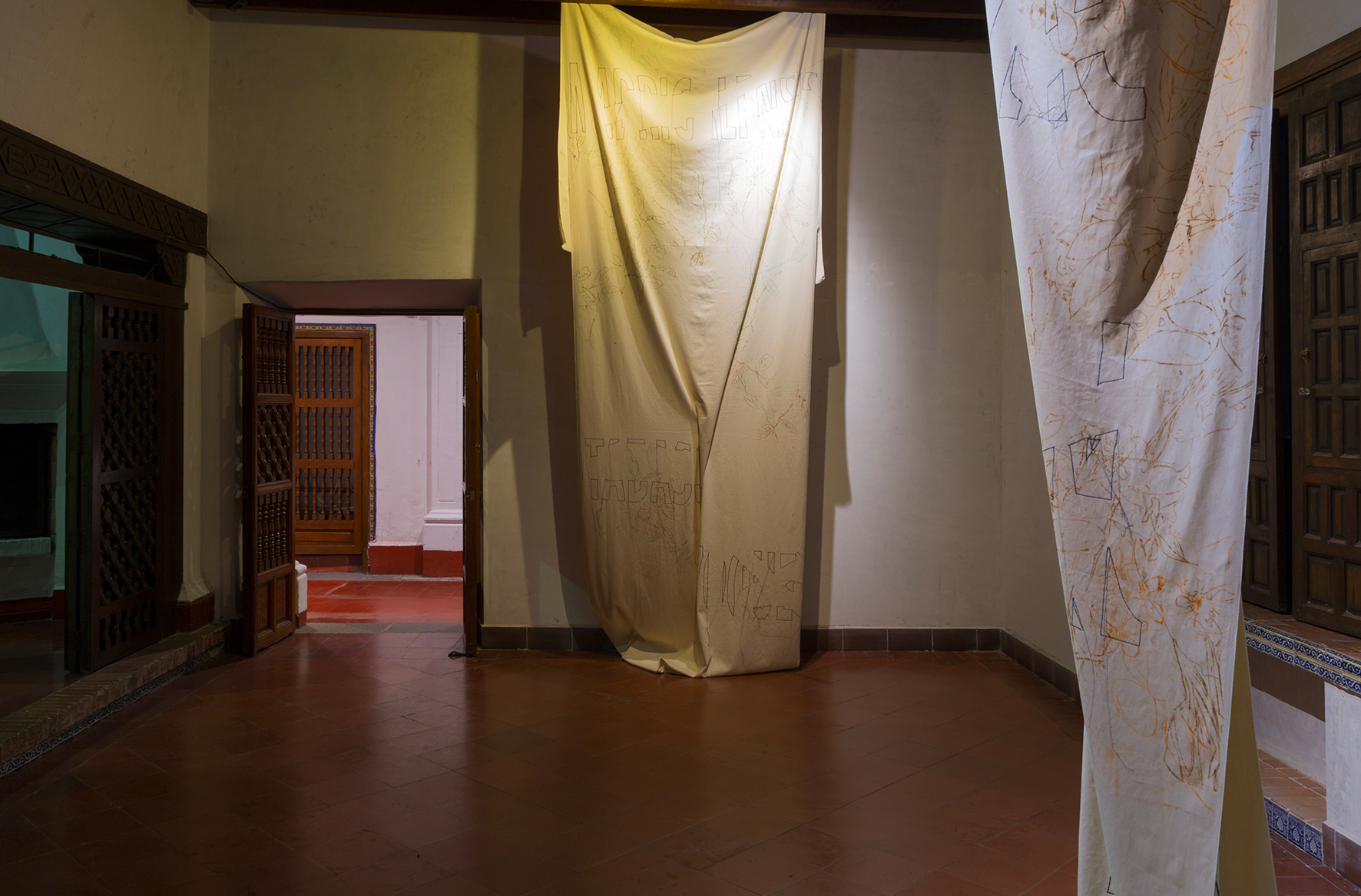
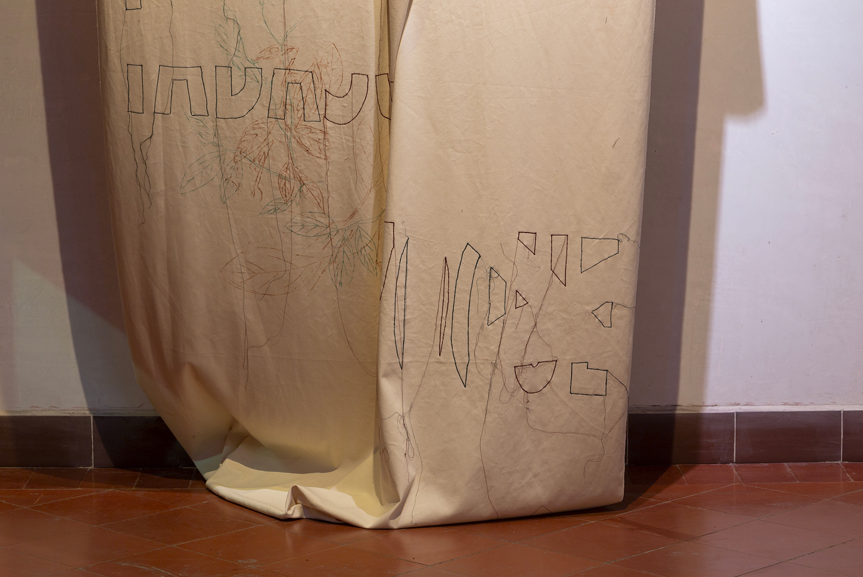
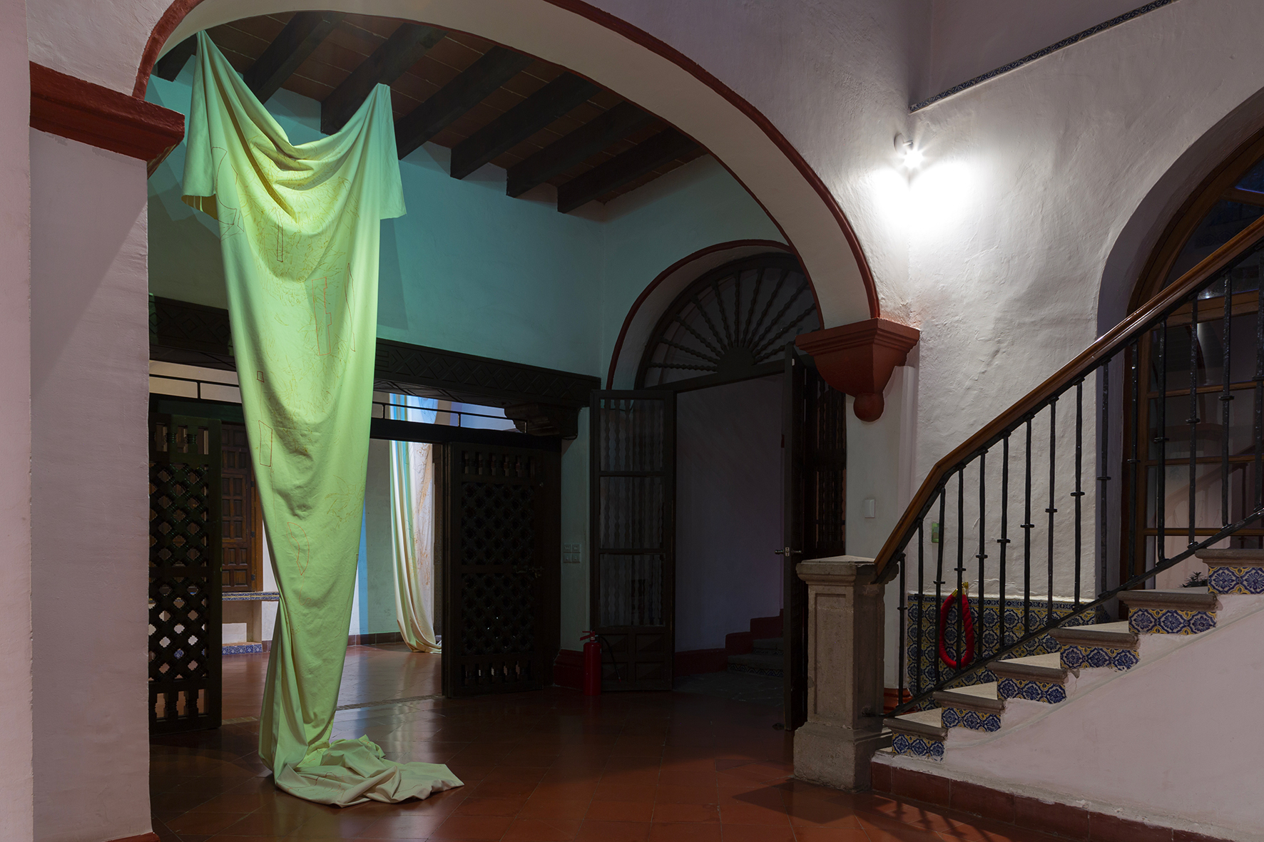
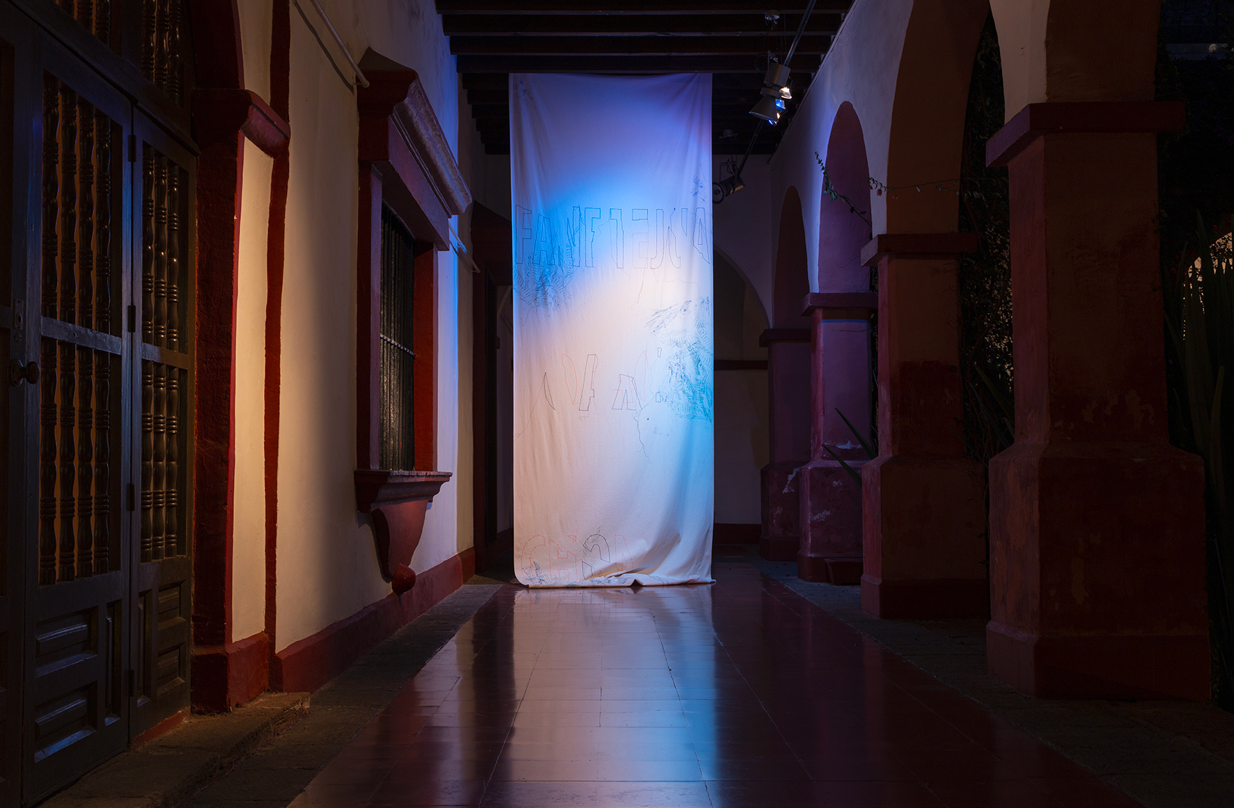
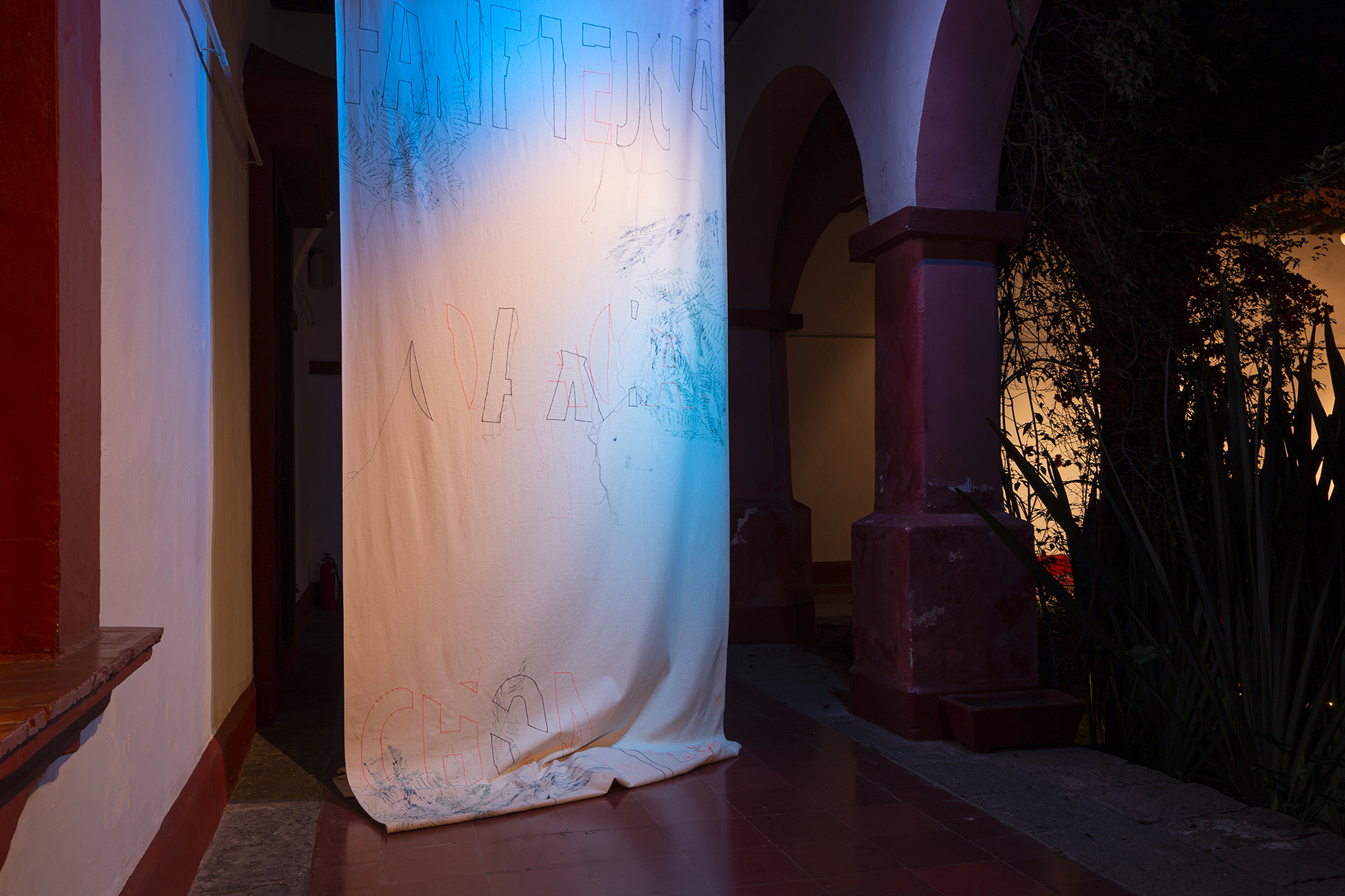
SIN NOMBRE CONOCIDO, Italian Cultural Institute, Mexico City
FORSE DOMANI, Galleria Simóndi, Torino (double solo show)
2024
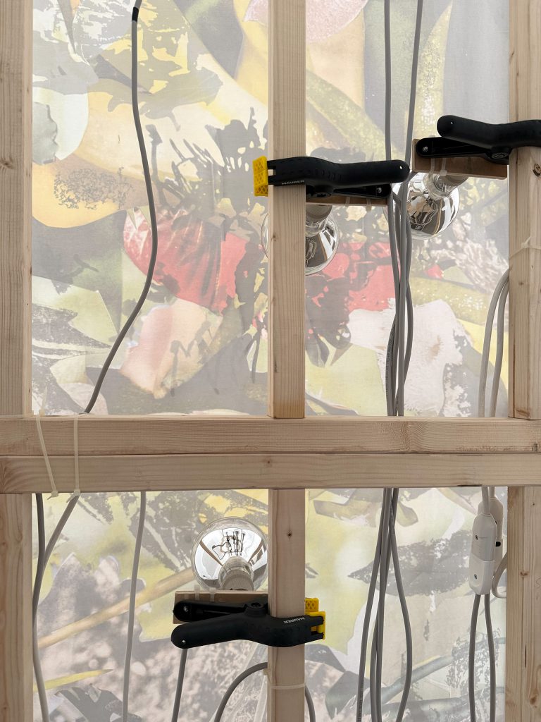
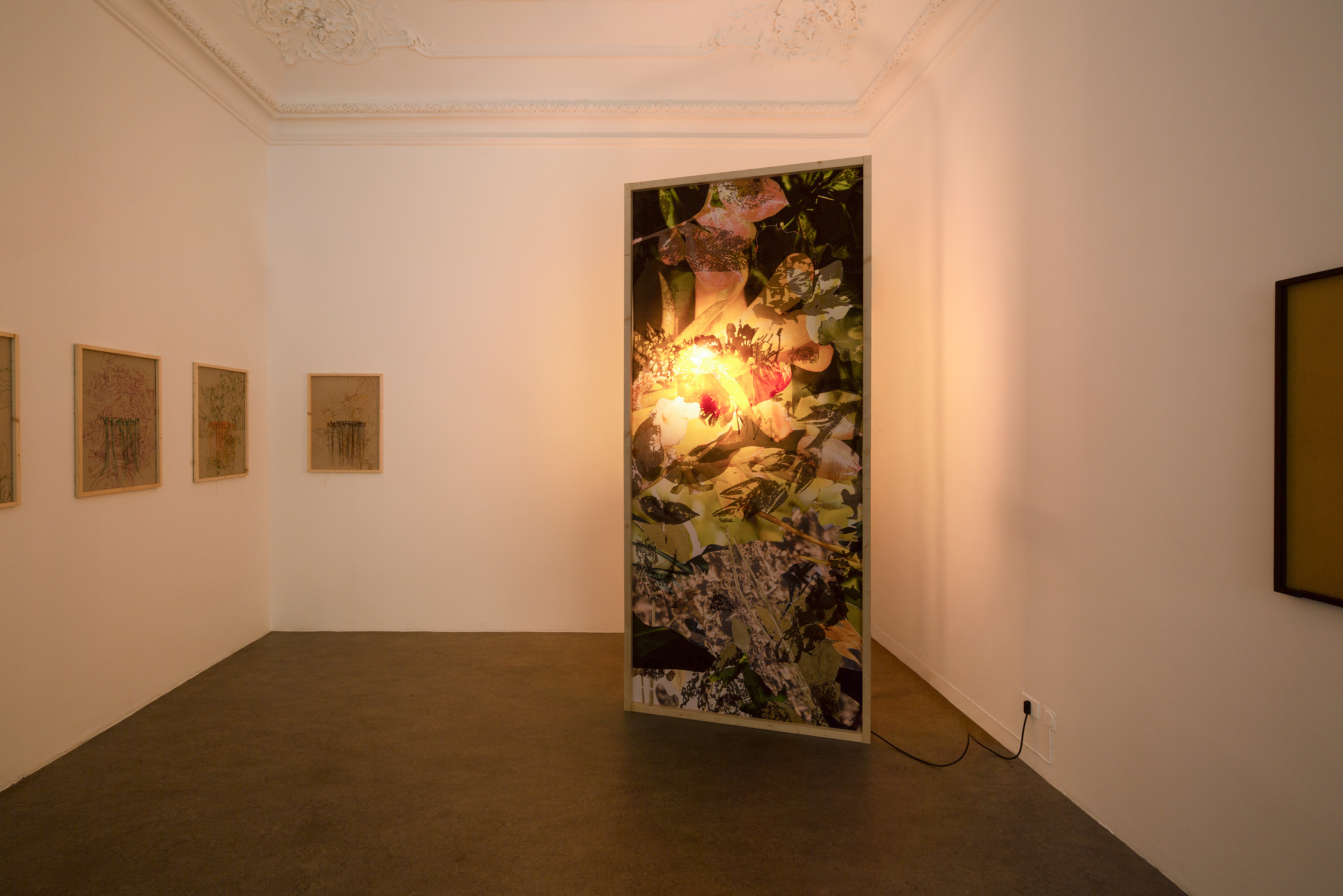
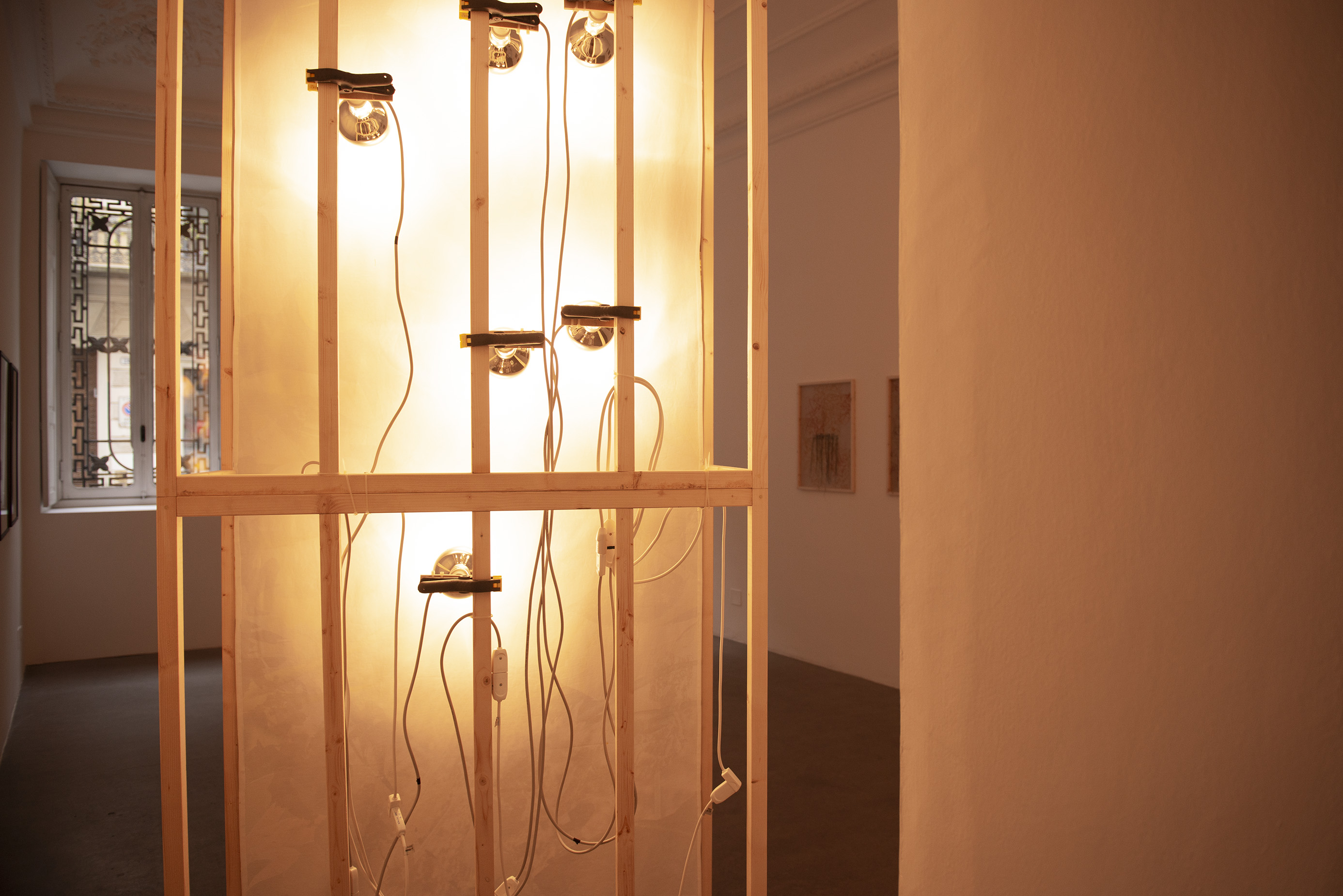
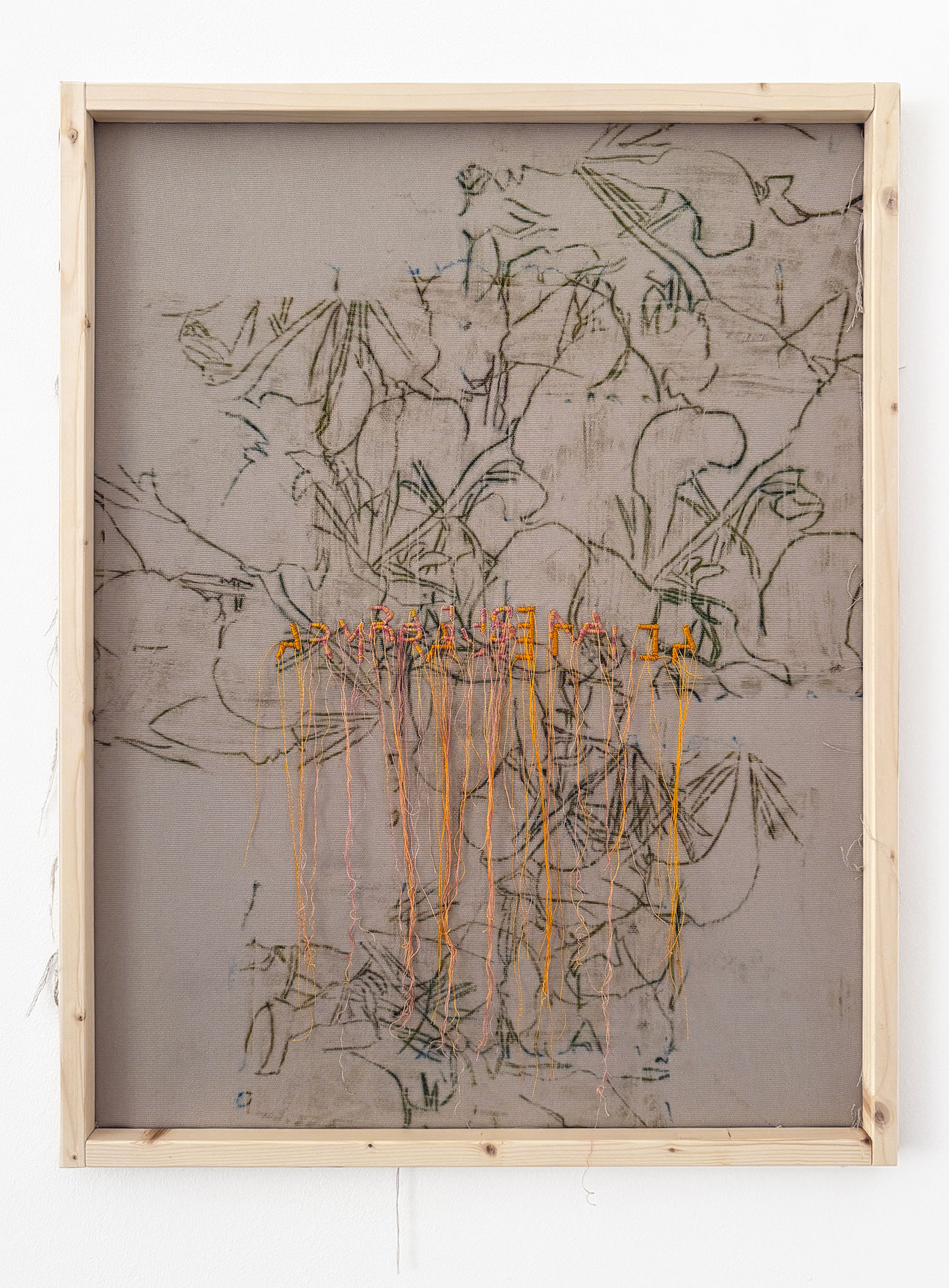
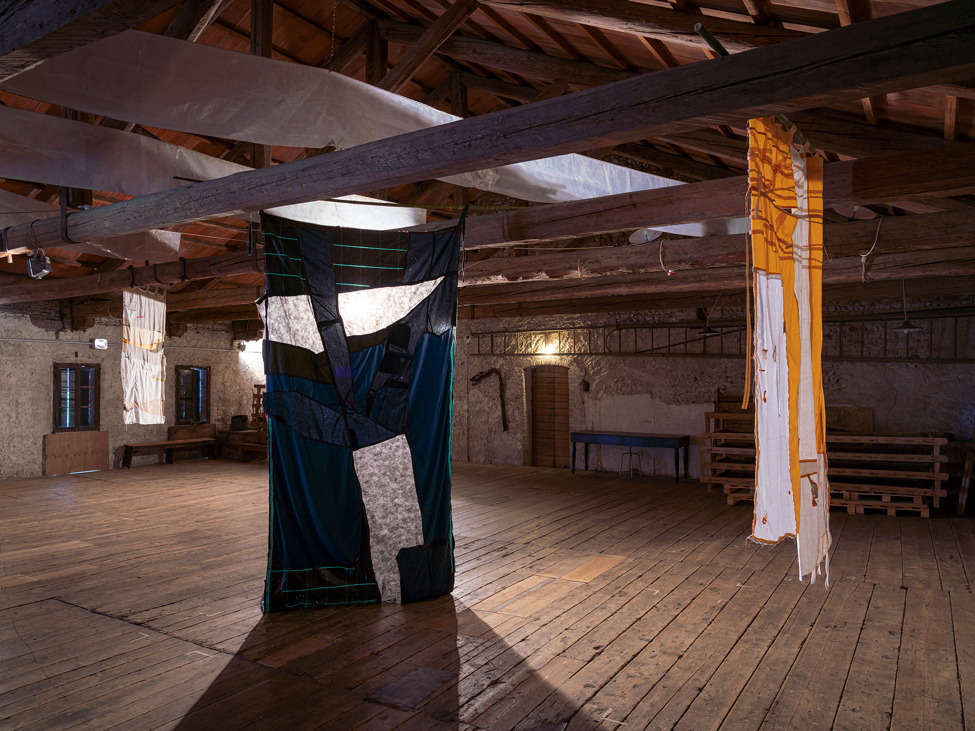
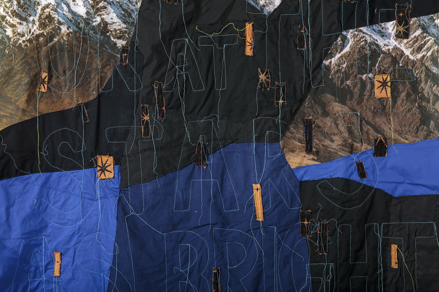
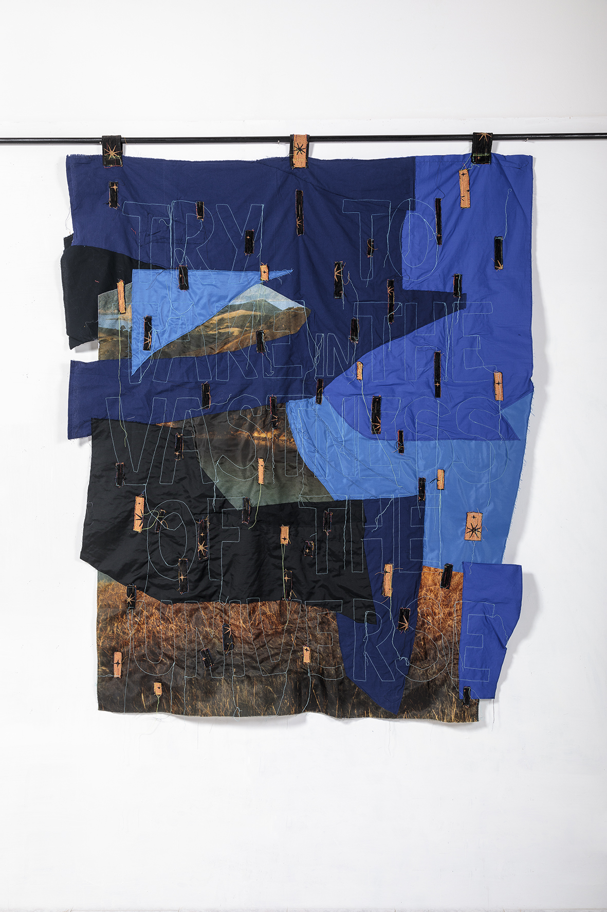
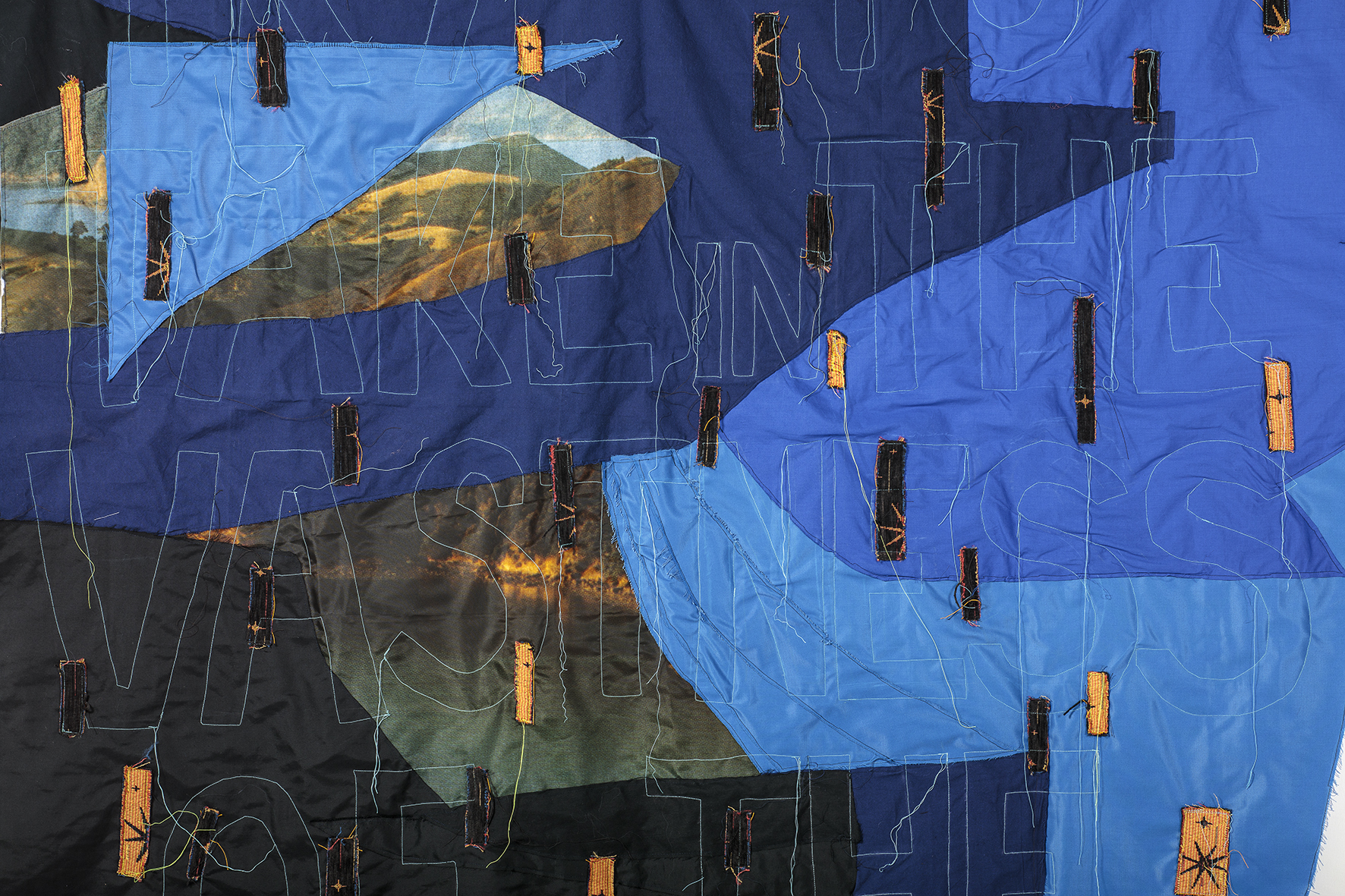
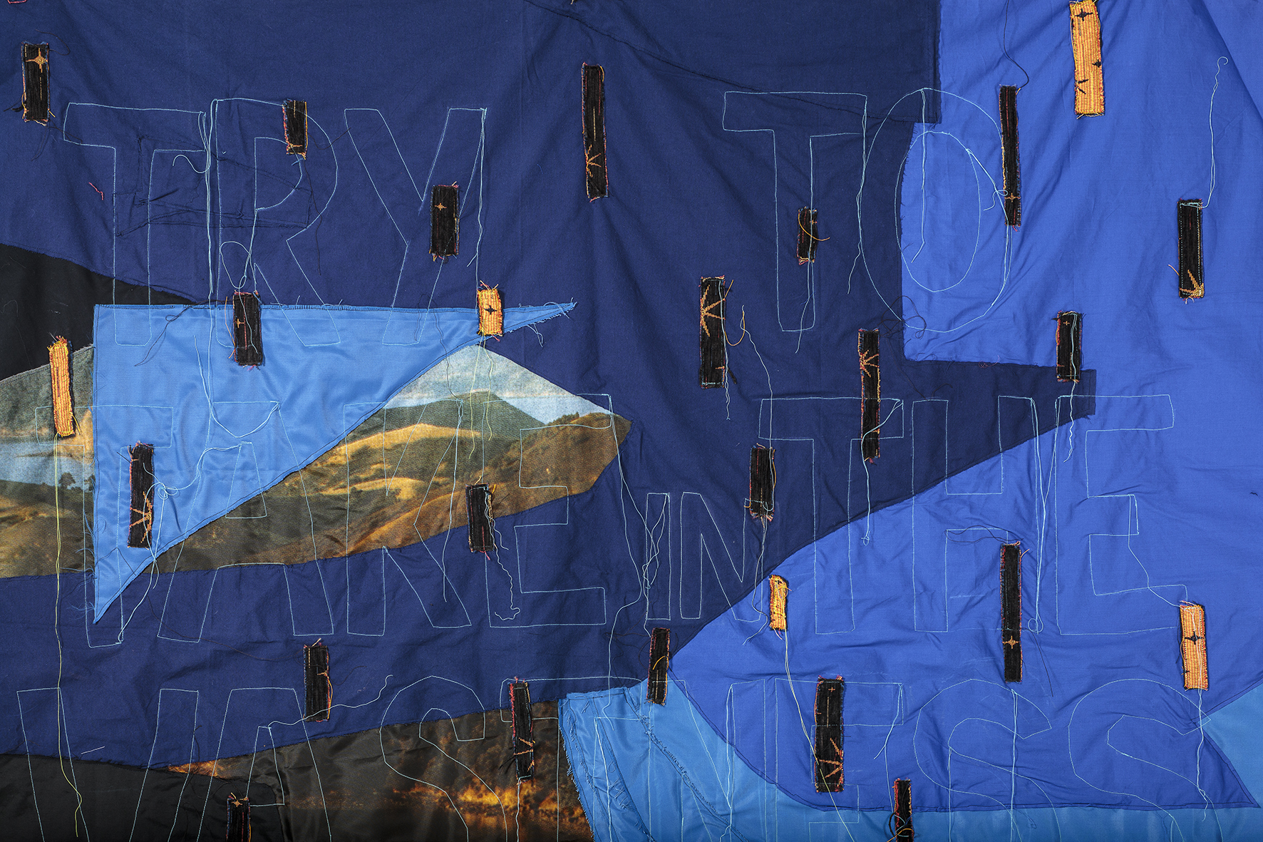
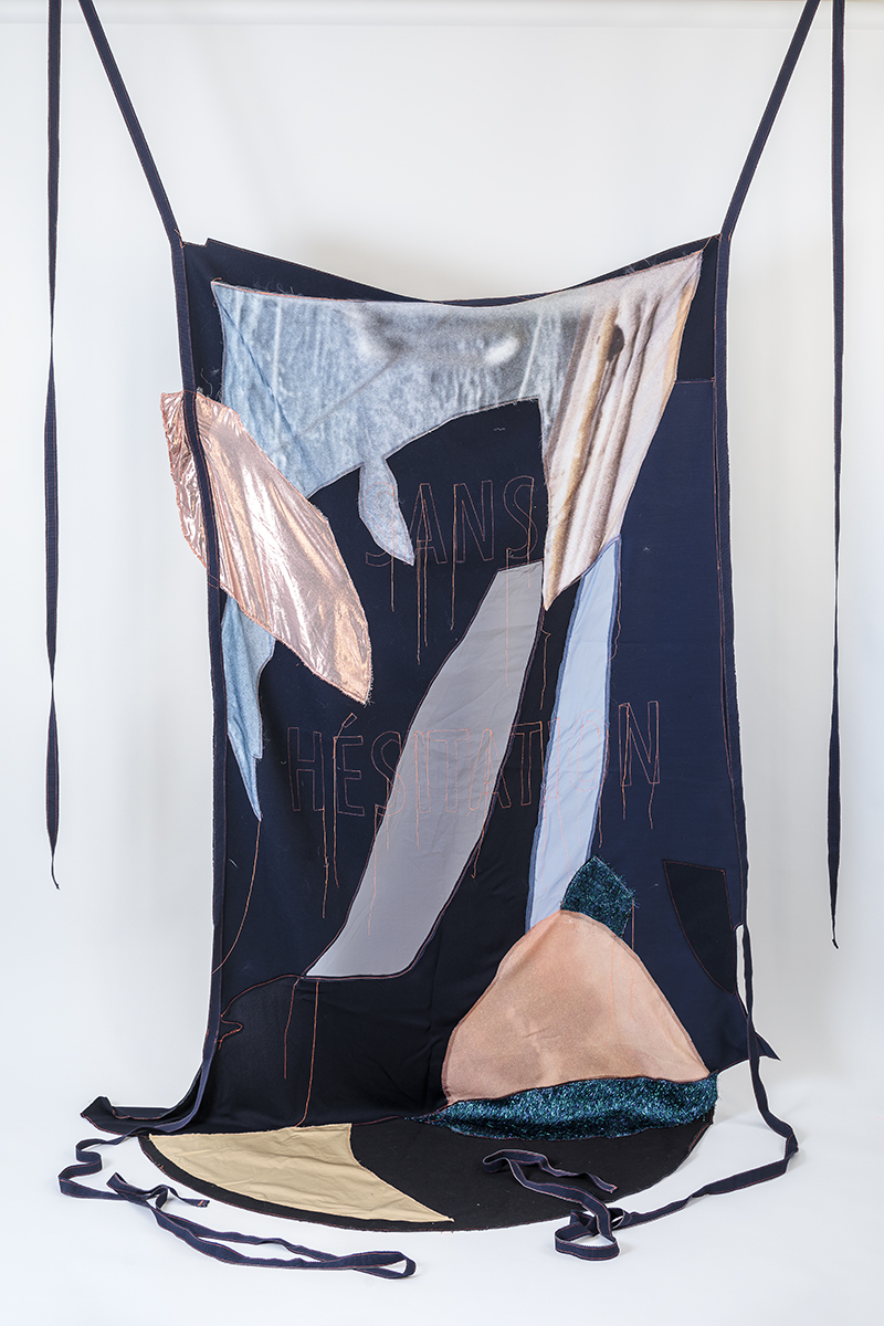
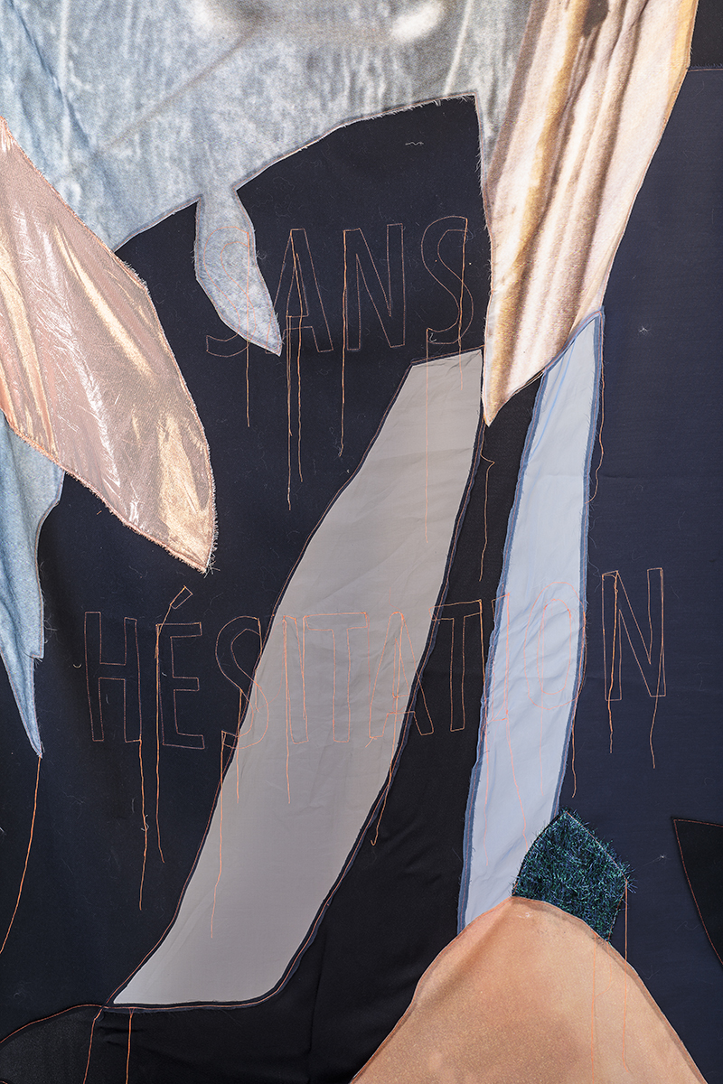
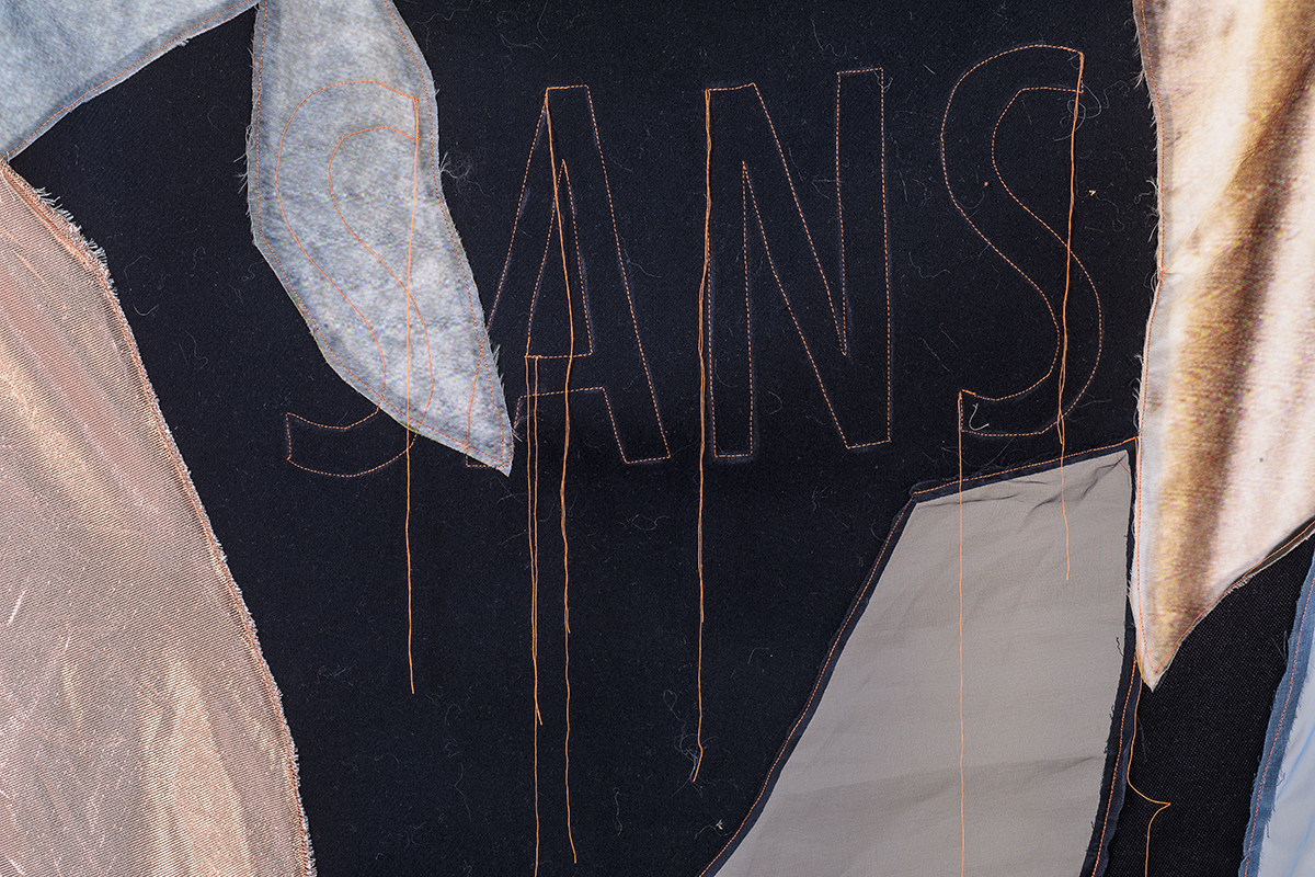
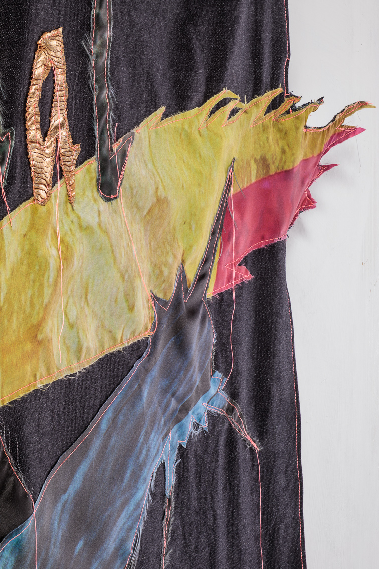
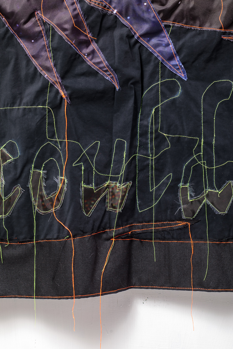
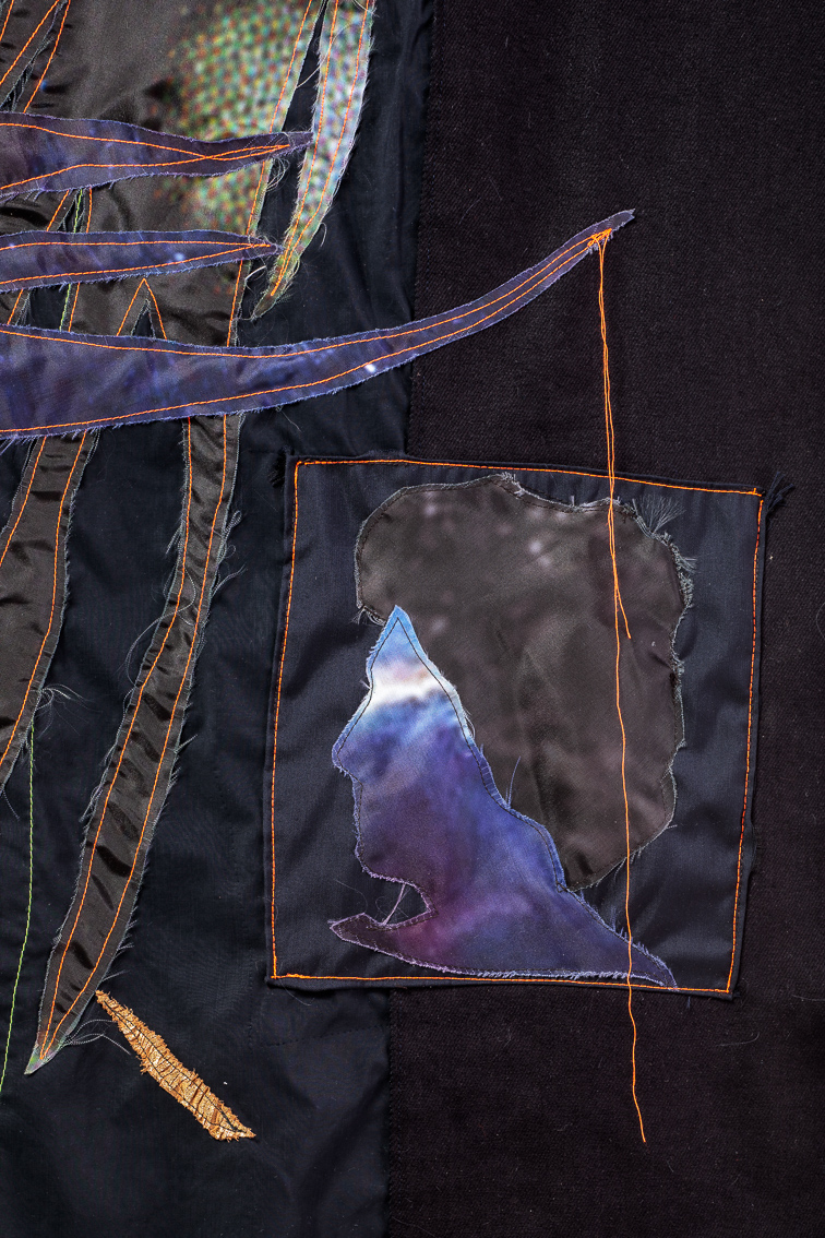
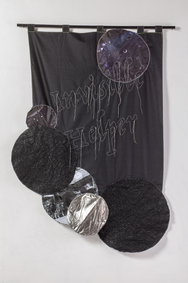
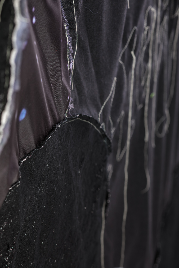
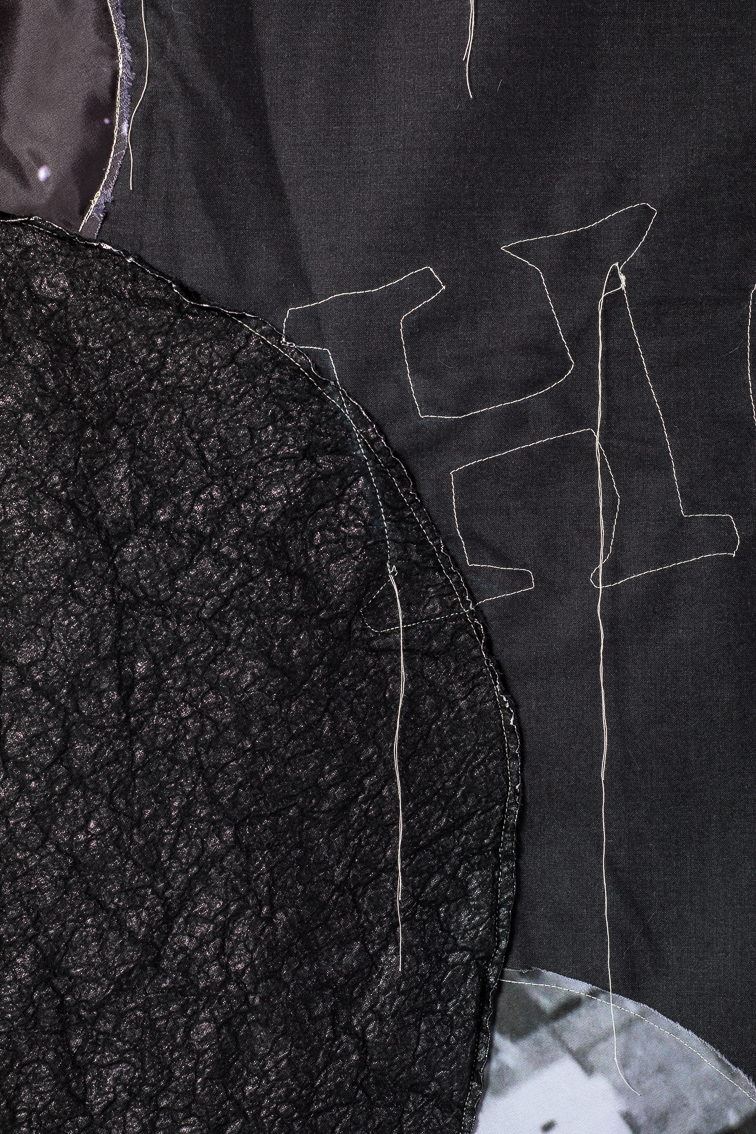
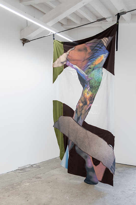
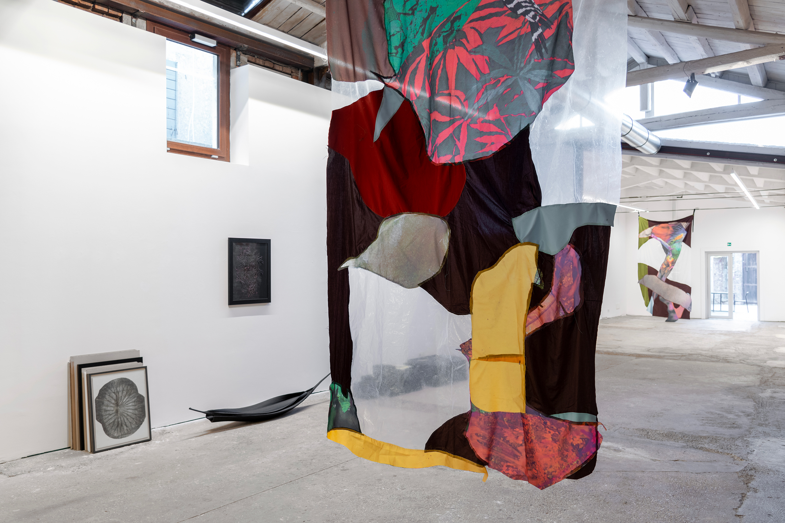
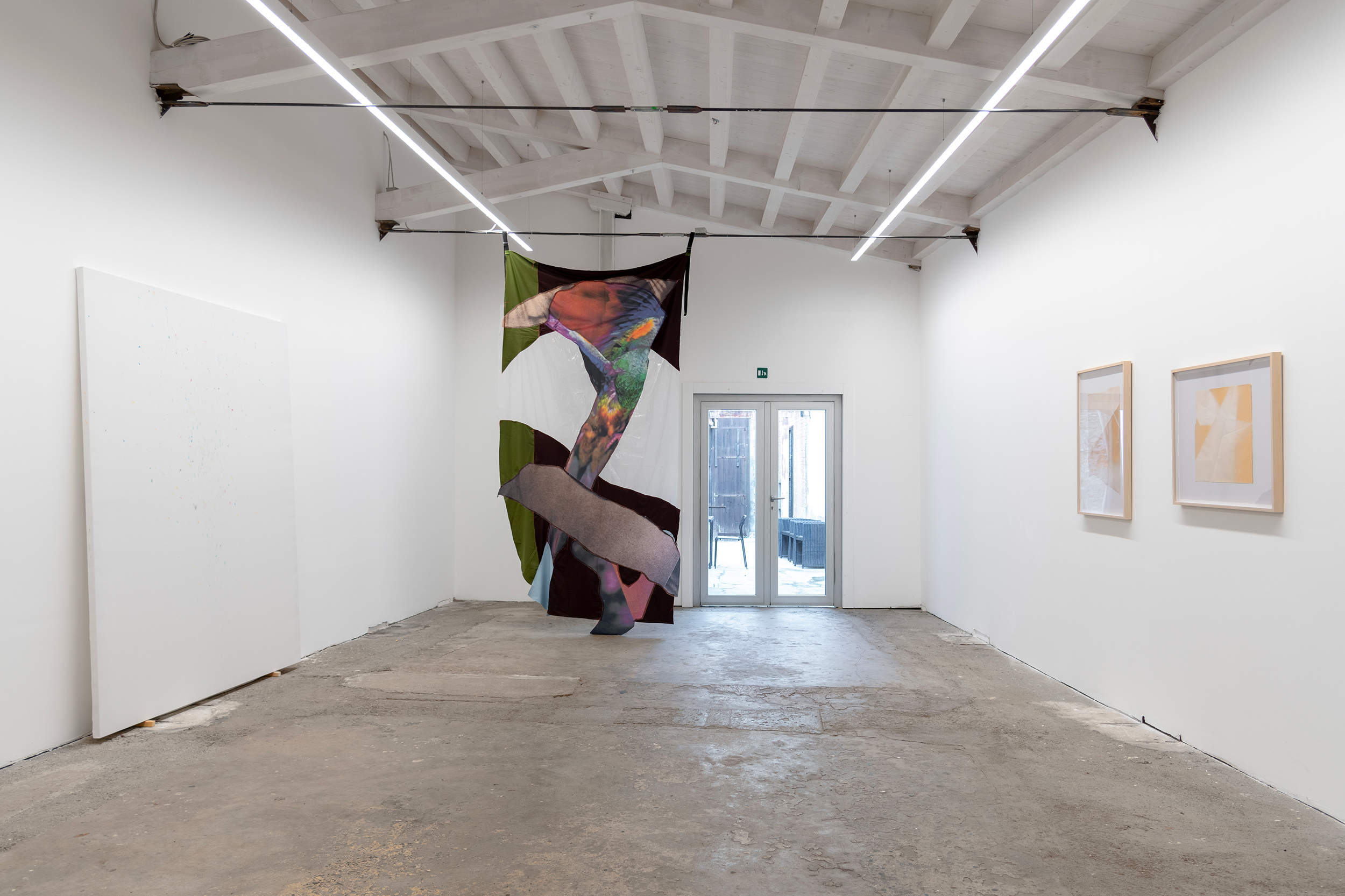
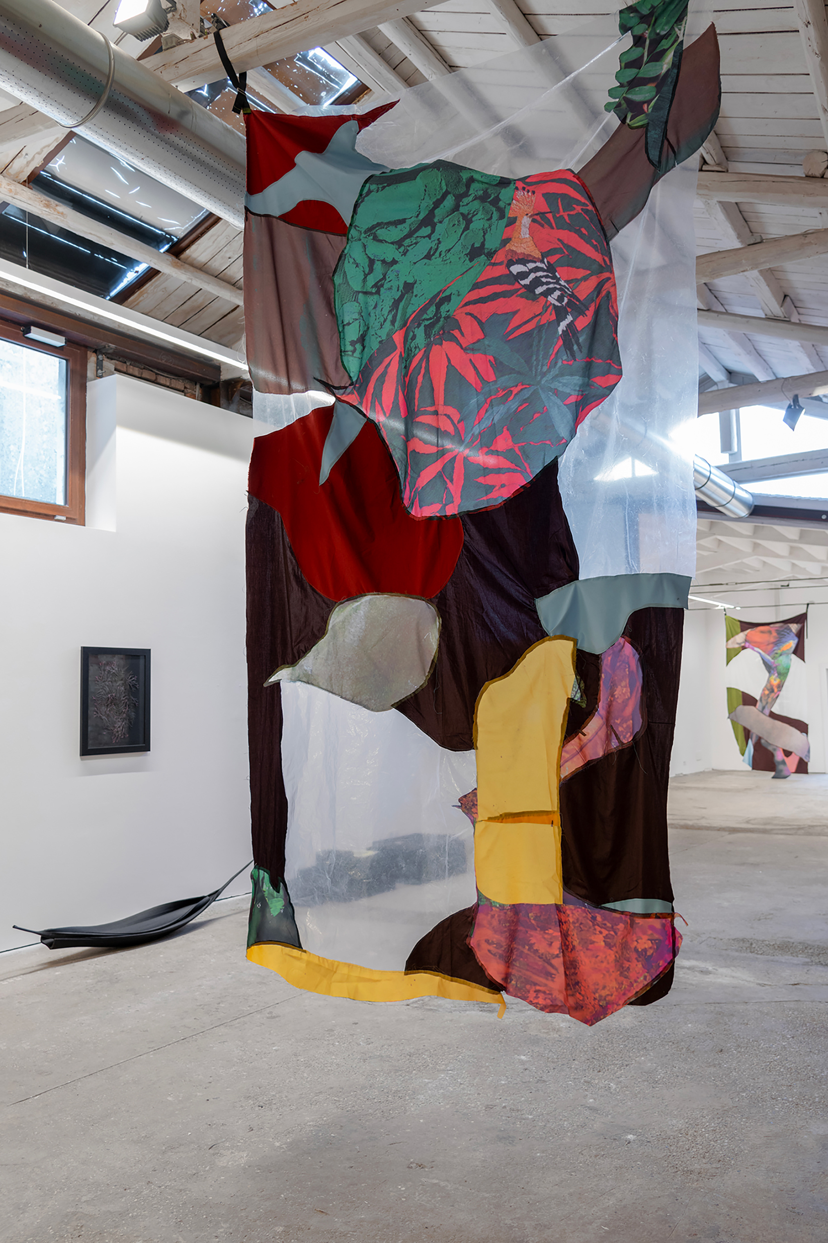
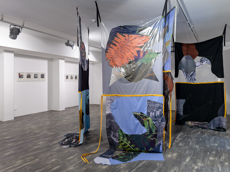
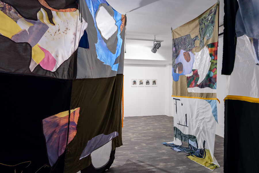
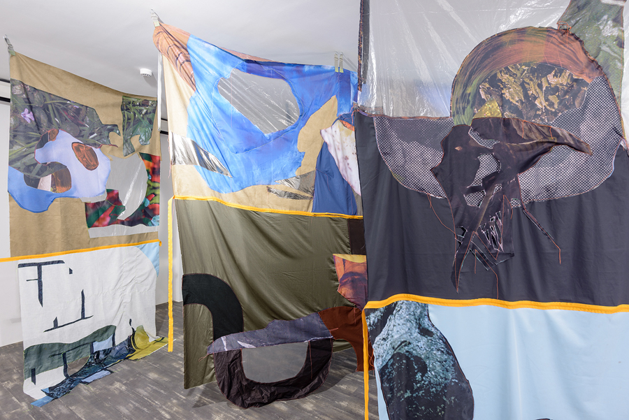
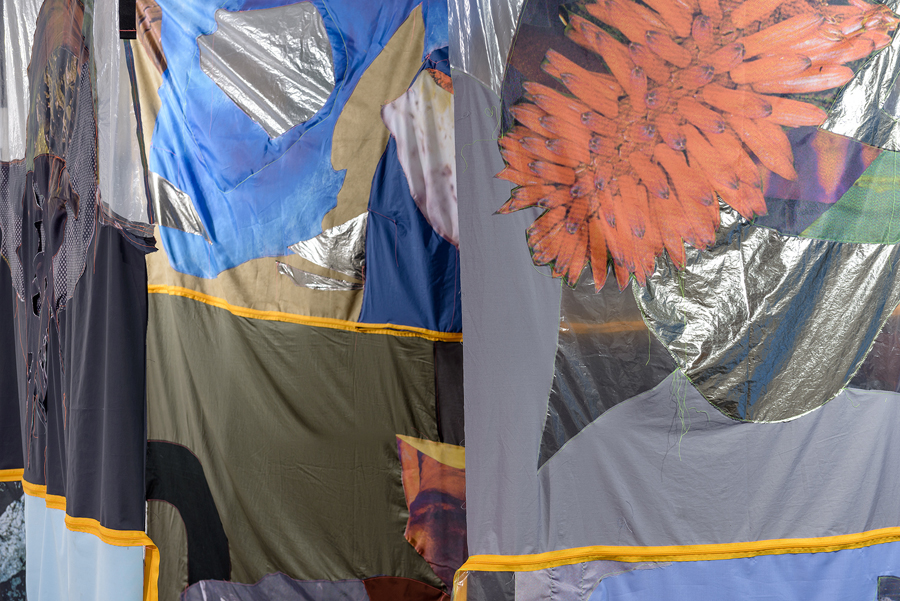
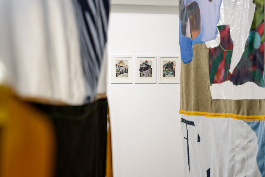
LA DESINENZA ESTINTA, curated by Paolo Mele and Claudio Zecchi, Kora, Castrignano dei Greci, Lecce
LA DESINENZA ESTINTA, curated by Paolo Mele and Claudio Zecchi, Ca’ Pesaro Galleria Internazionale d’Arte Moderna, Venice
THE WORDLESS FOREST (LA DESINENZA ESTINTA), curated by Paolo Mele and Claudio Zecchi, Hannah Ryggen Centre, Ørlandet Kultursenter, Trondheim, Norway
LA DESINENZA ESTINTA, curated by Paolo Mele and Claudio Zecchi, MOCA London, UK
2023
PROJECT ROOM #8, Archivio Pharaildis Van den Broeck, Milan (double solo show)
DA SOLA NEL BOSCO, curated by Eva Comuzzi. D3082 Domus Civica Art Gallery, Venice
2020
É SUCCESSO IL MARE, within the exhibition STA COME TORRE, curated by Paolo Mele and promoted by Teatro Pubblico Pugliese.
Fondazione Pino Pascali, Polignano a Mare (Ba)
2018
LA ZONA SICURA, curated by Christian Caliandro, Opera Viva, Barriera di Milano, Turin
2016
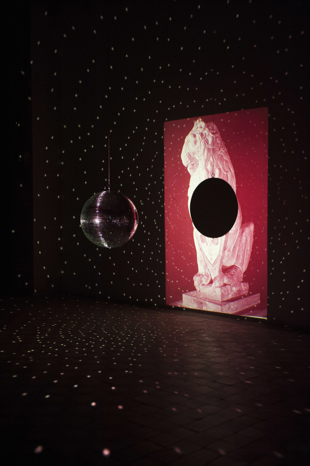
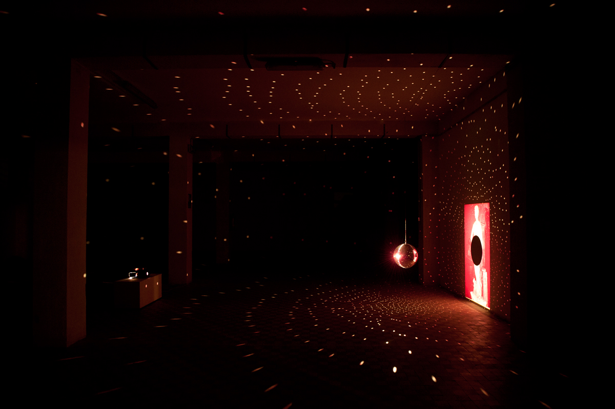
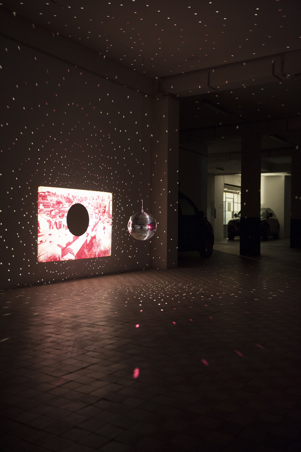
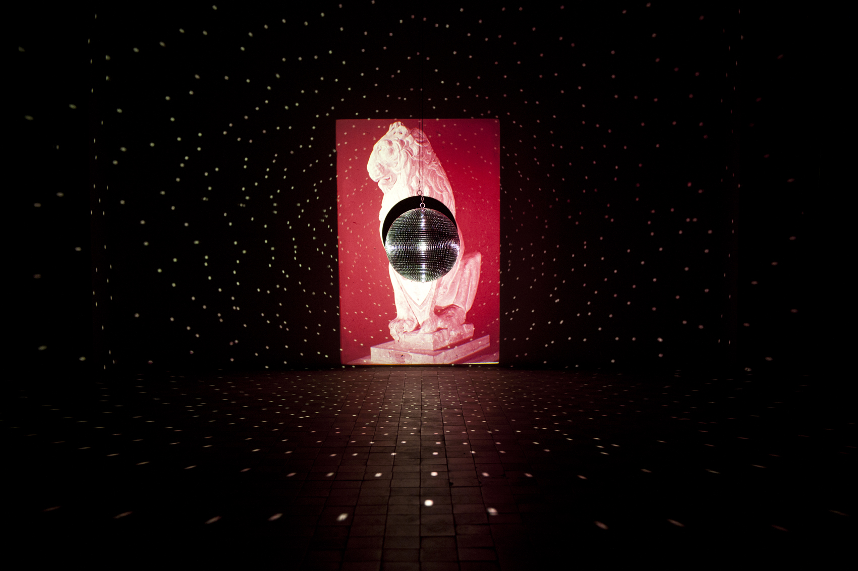
FUORI, UNA GRAN NOTTE DI STELLE, Muratcentoventidue Gallery, Bari
2015
IN PIENA PRESENZA, Yellow, Varese
PICCOLE SELEZIONI curated by Gianluca Vassallo The white box gallery, San Teodoro, Sardinia (double solo show)
2012
PARTNERS LUCIA LEUCI/LUCIA VERONESI, M.A.R.S, Milan. (double solo show)
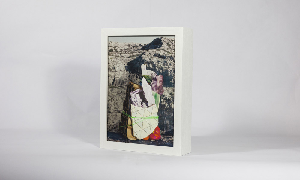
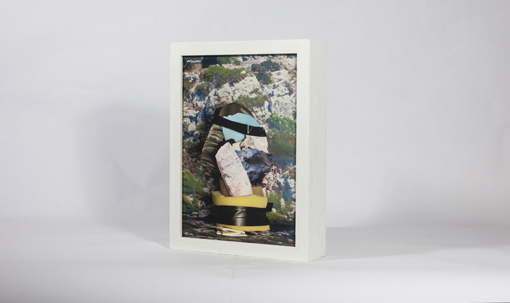
L’INABITABILE, curated by Bruno Lorini e Silvia Codato, Studio Bongiana, Padua
2010
PLEASE DON’T STEP HERE WITH YOUR SHOES Browning Gallery, Asolo (Tv)
2009
REPLAY LOVES ARTS Open air Exhibition promoted by Fondazione Buziol, Cà Rezzonico, Venice
GROUP SHOWS
2024
FEDE E BELLEZZA, curated by Lorenza Boisi, Sacro Monte di Ghiffa, VB
2023
OFFICINA MALANOTTE, curated by Daniele Capra, Tezze del Piave, TV
MINIFESTIVAL, curated by AirGreen and promoted by NTK and Kristin Lindberg, Sondre Green, Noresund, Norway
2022
ÀLMA VENÙS, curated by Mara Sartore and Iganzio Mortellaro, Cantine Planeta, Val di Noto
I SEE AN OBJECT LIKE A STAR WITH A BURR ALL AROUND, Piramide delle Cascine, Firenze
DE RERUM NATURA, curated by Mara Sartore, Navy Officers’ Club, Venice
A NON PLAYABLE CHARACTER curated by School for Curatorial Studies Venice and THE FAIREST, Secondary School “Calvi”, Venice
2021
A BARTLEBY, Galleria Alberta Pane, Venice
ABOUT THE FUTURE FESTIVAL, curated by Luca Basilico in collaboration with Fondazione Molise, Palazzo Gil, Campobasso
2020
WHATEVER IT TAKES, curated by School of Curatorial Studies, AplusA Gallery, Venice
STA COME TORRE, curated by Paolo Mele, Museo Castromediano, Lecce,
KITCHEN TAKEOVER, Openspacecontemporary, London (Instagram show)
VISUALDOGGLER, FINESTRE an idea by Replica and ATP, curated by Vera Portatadino (online show)
ARTISTSINQUARANTINE an Instagram Exhibition, curated by Giada Pellicari
2019
LIBERE TUTTE, curated by Daniele Capra and Giuseppe Frangi, Casa Testori, Novate Milanese, Milan
FOR HEAVEN’S SAKE. 4th JERUSALEM BIENNALE Living Under Water curated by Andi Arnovitz, Jerusalem, Israel
OPEN STUDIO August and September at KH Messen Artist in Residence, Norway
X BIENNALE DI SONCINO. OVER THE REAL selection curated by Alessandra Arnò, Soncino
WOPART FAIR with the project Drawings from Lighting, curated by Laura Santamaria, Lugano, Switzerland
IL DISEGNO POLITICO ITALIANO, AplusA Gallery, Venice
2018
SUPERSIMMETRY, curated by Yellow, Strizzi space, Cologne, Germany
ATRII / SSSSSSS curated by Alice Pedroletti and Lucia Veronesi, Yellow, Varese
TERRAE. SGUARDI SULLE TERME ESTREME, curated by Maria Savarese, Other Size Gallery, Milan
CHE ARTE FA OGGI IN ITALIA, curated by Renato Barilli, 69. Premio Michetti, Fondazione Michetti, Francavilla al Mare, Pescara
THE HANGING GARDEN, Curated by Christian Caliando, Spazio Centrotre, Palermo
2017
IL VOLTO CHE CAMBIA, curated by Fabio Carnaghi, MIDEC, Cerro di Laveno Mombello, Italy
ATRII / VENEZIA Workshop curated by Lucia Veronesi and Alice Pedroletti, Fondazione Bevilacqua La Masa, Venice, Italy
INDAGINE SULL’INVISIBILE, Vera Portatadino e Lucia Veronesi, Sacro Monte, Varese, Italy
PREMIO COSUA 2017. Fabbrica del Vedere, Venice, Italy
LAENDS FESTIVAL, curated by Ramdom, Gagliano del Capo, Italy
ANIMALS, curated by Yellow, Zoologic Collection, Comerio, Varese, Italy
HYBRIDS AND MONSTERS IN CONTEMPORARY ART, Cà Foscari Cultural Flow Zone, Venice. Italy
DRAWINGS FROM LIGHTING, curated by Laura Santamaria. Book Presentation / Talk / Biblioteca Civica D’Arte Luigi Poletti, Modena, Italy
PETIT SALON, curated by Fabio Carnaghi, MARS, Milan, Italy
STUDIO FREUD, curated by Fabio Carnaghi, Studio B&G, Milan (Studi Festival), Italy
DRAWINGS FROM LIGHTING, curated by Laura Santamaria. Book Presentation / Talk / Artists Book Signing, Madeinbritaly, London, UK
SHINE ON YOU CRAZY DIAMOND, curated by Eva Comuzzi and Orietta Masin, Casa della musica, Cervignano del Friuli, Italy
2016
SHINE ON YOUR CRAZY DIAMONDS curated by Eva Comuzzi and Orietta Masin. Cervignano del Friuli, Udine.
Drawings From Lightning /// Artists Book, Fonderia Artistica Battaglia, Milan
ATRII/SEZIONE PIANI I7, Independent Spaces ArtVerona
NO PLACE 3, 49° Premio Suzzara
EPICENTRI, curated by Fabio Carnaghi. Terme di Como Romana, Como
EMPATEMA curated by Corrado Levi, Yari Miele, Alberto Mugnaini, Studi Aperti Festival #2, Milan, Italy
CARRUS NAVALIS, curated by Andrea Lacarpia, Dimora Artica. Milan, Italy
THE END OF CERTAINTY, Muratcentoventidue, Bari, Italy
2015
BESTIE; ARBUSTI E ARTIFICI, curated by Veronica Mazzucco for Schermi Piatti Festival, Vicenza, Italy
ACCUMULATION, a project curated by MARS for THE OTHERS ART FAIR, Turin
TUTTI FRUTTI HABITAT, curated by Fabio Carnaghi. Premio d’Arte Rugabell, Villa Rusconi, Castano Primo (Mi), Italy
SOME VELVET DRAWINGS curated by Eva Comuzzi, ARTVERONA 2015
NOTRE AVENIR EST DANS L’AIR curated by Fabio Carnaghi, Antiquarium Alda Levi, Milan
BIRD-MEN IL VOLO DELLE IMMAGINI curated by Marco Senaldi,
Centro Laber (PAV). Berchidda, Sardinia
SIMBOLISMO COSTRUTTIVO a project by Fiorella Fontana in collaboration with Dimora Artica,
Sala delle colonne, Fabbrica del Vapore, Milan
ALTRI MOTIVI DI FAMIGLIA, curated by Paolo Toffolutti. Gallery P74, Ljubljana
STUDI FESTIVAL #1 – VETRINA , Soap, Milan – PROSOPOPEA – Fiorella Fontana’s studio, Milan
BG3 BIENNALE GIOVANI, curated by Renato Barilli, Guido Molinari and Guido Bartorelli, Museum of the City, Rimini
2014
LET THERE BE LIGHT, Yellow, Varese.
BG3 BIENNALE GIOVANI, curated by Renato Barilli, Guido Molinari and Guido Bartorelli. Accademia
of Fine Arts of Bologna
PROGETTO ITALIANO N.2 La religione del mio tempo. Curated by Pietro di Lecce
Kunsthalle Eurocenter, Lana, Bolzano
ZOOart2014, Giardini Fresia, Cuneo
MOTIVI DI FAMIGLIA curated by Paolo Toffolutti, SPAC, Villa di Toppo Florio, Buttrio, Udine
2013
PREMIO TERNA 05, curated by Cristiana Collu and Gianluca Marziani, Tempio di Adriano, Rome
POI PIOVVE DENTRO L’ALTA FANSTASIA, curated by Marcella Ferro, Astronomical Observatory, Naples
C’È UNA PICCOLA RADICE CHE SE LA MASTICATE, VI SPUNTANO LE ALI IMMEDIATAMENTE, curated by Cecilia Guida, MAC Museum of Contemporary Art, Lissone
ROCCEDIMENTI, curated by Gianluca d’incà levis, in collaboration with Guido Bartorelli, New Space of Casso (Pn)
2012
HOME IS WHERE I WANT TO BE, curated by Saul Marcadent, Serravalle di Vittorio Veneto (Tv)
IL LATO OSCURO DELLA LUNA, curated by Andrea Bruciati, Jarach Gallery, Venice
E QUINDI USCIMMO A RIVEDER LE STELLE, Galleria San Fedele, Milan
PAINTING DETOURS, curated by Andrea Bruciati and Eva Comuzzi, Guado dell’Arciduca, Nogaredo al Torre, Udine
PER TE SOLO IL CUORE DIMENTICA OGNI SUO AFFANNO, curated by Andrea Bruciati and Eva Comuzzi, GAMUD Udine
2011
ANTI CORPI curated by Ivan Bianchi and Giovanna Dal Bon, Torre Massimiliana of Sant’Erasmo, Venice
2010
HOUSE GUEST, Browning Gallery, Asolo (Tv)
2009
QUOTIDIANA 09, curated by Stefania Schiavone e Teresa Iannotta, Palazzo Trevisan, Padua
PARTENZE & ARRIVI, Cz Space, Venice
SGUARDI ALTROVE XVI Edition, Casa del Pane, Milan
X BIENNAL OF YOUNG ARTISTS FROM EUROPE AND MEDITERRANEAN AREA, Sarajevo, Bosnia and Herzegovina
2008
IL PITTORE E IL PESCE, curated by Bruno Lorini and Giulio Mozzi, Pordenonelegge, Pordenone, Galleria d’Arte Moderna Ricci Oddi,
Fondazione Bevilacqua La Masa, Venice
2006
RIZOMA. LO ÍNTIMO EN LO PÚBLICO, curated by Olga M. Dávila and Elena Aparicio,
Instituto de Baja California (ICBC) Tijuana, México
2005
RIZOMA. LO QUE ESTÁ ARRIBA ESTÁ ABAJO, curated by Olga M. Dávila and Elena Aparicio,
Museum University Leopoldo Flores, Toluca, Mexico
2004
MIRADA(S), curated by Alejandro Romero and Elena Aparicio, A+A Gallery, Venice
2002
SGUARDI ALTROVE – IX Edition, Cinema Festival at Spazio Oberdan, Milan
VISUAL-E curated by Emmanuel Mathez, Milan
III EDITION BIENNIAL ART PRICE DONATO FRISA , Palazzo Comunale, Merate (Lc)
2001
TRACCE DI UN SEMINARIO, curated by Angela Vettese and Giacinto Di Pietrantonio,
Galleria Via Farini, Milan
X BIENNAL OF YOUNG ARTISTS FROM EUROPE AND MEDITERRANEAN AREA, Sarajevo, Bosnia and Herzegovina
TRANSARAJ, Open Space, Milan
2000
EXPRESS YOUR WORLD, Palazzo Municipale, Lion, France
THE SPIRIT OF THE PLACE, a cura di Angela Vettese and Giacinto Di Pietrantonio, ex church of S.Francesco, Como
1999
SALON I, curated by Laura Cherubini e Giacinto Di Pietrantonio, Museo della Permanente, Milan
LANDKARTE HIMMELKARTE, curated by Valerio Ambiveri, ARS Gallery, Bergamo
VIDEO FESTIVAL
2021
CINEMA GALLEGGIANTE, screening of La fortuna interiore presented by Chiara Bertola, Fondazione Querini Stampalia
EXSCENARIO screening of La fortuna interiore, curated by Studio Concreto, Lecce
ODAAQ #10, Video Festival, Pont De Nantes, France
2019
FRESH – MiArt Week, curated by Visualcontainer, Milan
OVER THE REAL, Fondazione della Banca del Monte di Lucca, selection by Visualcontainer, Lucca
VIDEOFORMES 2019, curated by Visualcontainer, Clermont-Ferrand, France
2018
INTERFACE, selection curated by Visualcontainer, Video Art Event, IX Edition, Museum Tarii Crisurilor, Oradea, Romania
DAYDREAM, curated by Visualcontainer TV, Milan
BUVETTE ART VIDEO, curated by OODAAQ, Les Ateliers du Vent, Rennes, France
OODAAQ Festival, Rennes and Saint Malo, France
VIDEO – BARS curated by L’Oodaaq, Nantes, France
NIGHTLIGHT SCREENING BASEL 2018, selection by Visualcontainer, Basel, Switzerland
10# FLASHFORWARD selection curated by Visualcontainer, ART WEEK Milan
2017
SHORTZ 8th International Video and Film Festival, selection by Oodaaq, Novi Sad
OVER THE REAL, Festival Viareggio, curated by Visualcontainer
BIENNALE VIDEO ART, curated by L’Oddaaq, Angers, France
SENSITIVE AND DIGITAL LANDSCAPES, Visual Container TV
PROYECTOR FESTIVAL MADRID, Selection by Visualcontainer, Sapin
IN|DUST|REAL|Video art event, VIIIth edition, Visualcontainer’s Selection. The Museum of Tarii Crisurilor, Oradea – Romania
VIDEOCOMPETITION PASINETTI, Fontego dei Tedeschi, Venice
OODAAQ Festival, Rennes, France
2016
CONTEMPO Festival for Contemporary Art. SENSITIVE AND DIGITAL LANDSCAPES curated by Visualcontainer, Varna, Bulgaria.
VIDEO ART SUMMER NIGHTS, Tel Aviv, Israel
CONCORTO FILM FESTIVAL, Piacenza
BODY LANDSCAPES: Italian videoart selection curated by Visualcontainer for Obliqua festival, Appleton Square gallery, Lisbon
2015
SUSPENDED TERRITORIES AND OTHER ITALIAN STORIES, selection by Visualcontainer, Muu Galleria, Helsinki
FALSHFORWARD #8 selection by Visualcontainer, [.BOX] video project, Milan
MNEMONIC CITY LISBON, selection by Visualcontainer, Lisbon
VIDEOYEARBOOK 2015, curated by Renato Barilli, Chiostro di Santa Cristina, Bologna
OTHER MOVIE 4°Lugano Film Festival
B_L_I_N_K_K_K_K Festival #1, Brussels
MUFF 10. Montréal Underground Film Festival, Canada
OODAAQ Festival, Rennes, Nantes and St. Malo, France
SHORT FILM FESTIVAL Cà Foscari, Venice
2014
32 TORINO FILM FESTIVAL, Official Selection Italia.corti
OODAAQ FESTIVAL, Rennes, France
STILL FRAME, curated by Cake Away collective. Videoart from Bevilacqua La Masa young artists archive, Palazzetto Tito, Venice
2013
PROYECTOR 6° International Video Art Festival selection curated by Visualcontainer – Madrid, Spain
THE CUTTING ROOM – CAST curated by Jennifer Ross and Clare Harris, Nottingham Playhouse, Nottingham, UK
VISUALCONTAINER@Palazzo Righini, Fossano, Cuneo
VIDEO.it 2013 ARTE ANIMATA, Fondazione Merz, Turin
FACADE Video Festival, Plovdiv, Bulgaria
VIDEOHOLICA International Video Art Festival, Varna, Bulgaria
LAGO FILM FEST, Official selection, Revine Lago, Treviso
OUT OF THE PUZZLIN’ PUZZLE. Selection curated by Visualcontainer in collaboration with OODAAQ Festival of Rennes, France
LAGO FILM FEST, Official selection, Revine Lago, Treviso
VIDEOART YEARBOOK 2013, VIII Edition curated by Renato Barilli, Chiostro di Santa Cristina, Bologna
2012
FLASHFORWARD, curated by Visualcontainer, [.BOX] Videoart Project Space, Milan
VIDEOART YEARBOOK, VII Edition curated by Renato Barilli, Chiostro di Santa Cristina, Bologna
2011
VIDEA 3, Female Directing Festival, curated by Massimo Bignardi and Ada Patrizio Fiorillo, Bitonto, (Ba)
2010
VIDEA 3, Female Directing Festival, curated by Massimo Bignardi
2009
DIALOGHI CONTEMPORANEI, curated by Saul Marcadent in collaboration with Careof DOCVA, LagoFilmFest, Revine Lago (Tv)
ART FAIRS
2025
ARTISSIMA, Simòndi Gallery, Turin
2020
HYBRID ART FAIR for Independent Spaces, Madrid. Curated by Yellow
2019
ART VERONA. I10 Independent Spaces. “Il sol, che le mie notti aggiorna” curated by Yellow
2018
FLASHBACK, l’Arte è tutta contemporanea (Fair), Turin
2017
LA SECONDA NOTTE DI QUIETE Collateral, curated by Christian Caliandro, ART VERONA
2016
ATRII / VERONA. I7 Independent Spaces
2015
ART VERONA. SOME VELVET DRAWINGS curated by Eva Comuzzi
2012
ART VERONA, I3 Independent Spaces, Out of place_an ongoing archive, curated by 22:37
COLLABORATIONS, TALKS, WORKSHOP, TEACHING EXPERIENCES
2025
ARTis, Contemporary Art Festival, Vicenza. Conversation with Santa Nastro and Elena Dal Molin “L’equilibrio precario”
Talk “La desinenza estinta”, Academy of Fine Arts, Florence.
2024
Teacher of LAB 1, IUAV Multimedia Art, Iuav University, Venice (2024 – 2025)
Giungla Festival, talks with Davide Dal Sasso, Lucca
Talk “La desinenza estinta”, Academy of Fine Arts, Bologna
Talk “L’inabitabile” Class of Interior Design curated by Silvia Codato, Università IUAV, Venice
Ordinare le cose: archivi e pratiche artistiche contemporanee, talk with Davide Dal Sasso, Fondazione Querini Stampalia, Venice
“La desinenza estinta” Talk at WEAREAIA, Zurich. The project is promoted and curated by Ramdom (Lecce, Italy) in collaboration with the Nordenfjeldske Kunstindustrimuseum MiST (Trondheim, Norway) and with the support of the University of Zurich (Zurich, Switzerland); Goldsmiths University (London, UK); Ca’ Pesaro, Galleria Internazionale d’Arte Moderna (Venice, Italy)
IMAGES, SOUND AND PERFORMANCE AS WAYS OF KNOWING, International workshop, Ca Foscari University, Venice, 4-8 March 2024
“Artiste e botanica. Esperienze intermediali tra natura e cultura” speech by Cristina Costanzo within the conference “Il valore della classicità nella cultura del giardino e del paesaggio”, Palazzo Riso, Palermo, Italy
Presentation of ” La desinenza estinta” within the class of illustration, Academy of Fine Arts, Bologna
2023
Teacher of Theory of Colours, LABA Academy of Fine Arts, Brescia
Tutor at IUAV for internships, Department of Fashion Design and Multimedia Art
2022
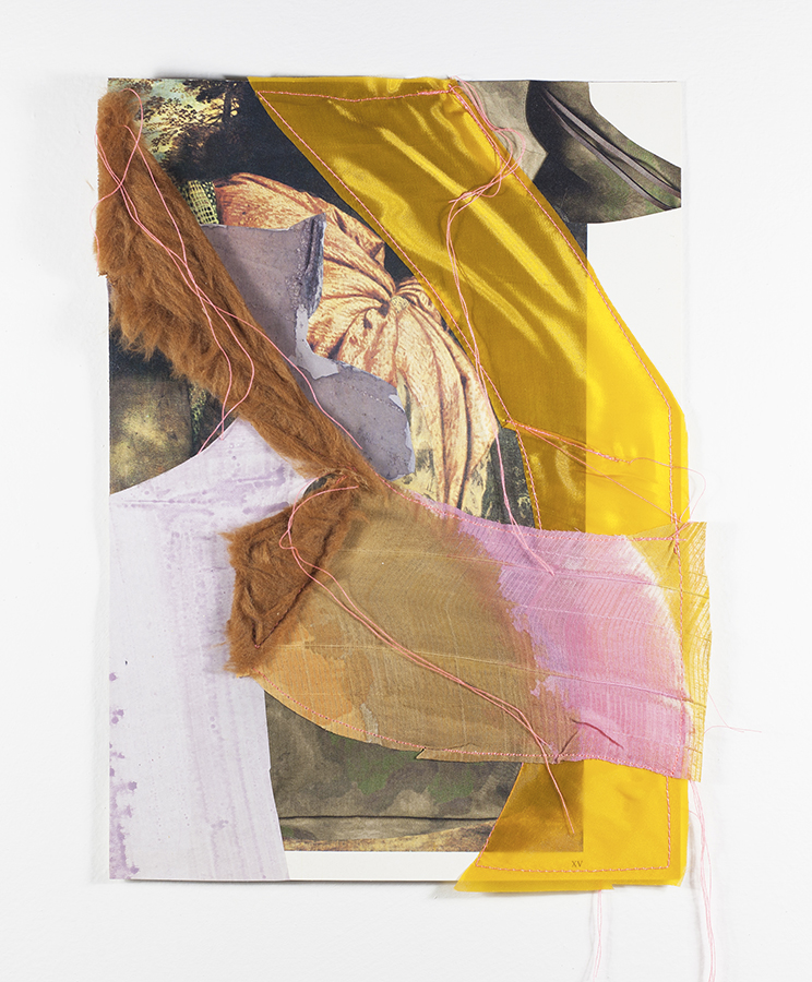
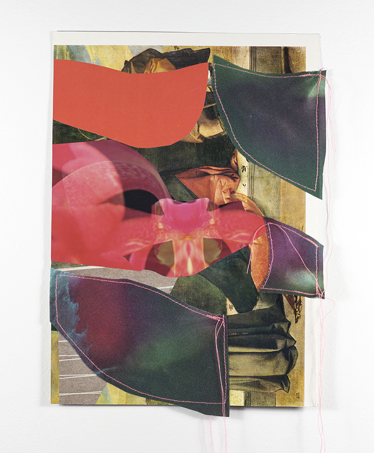
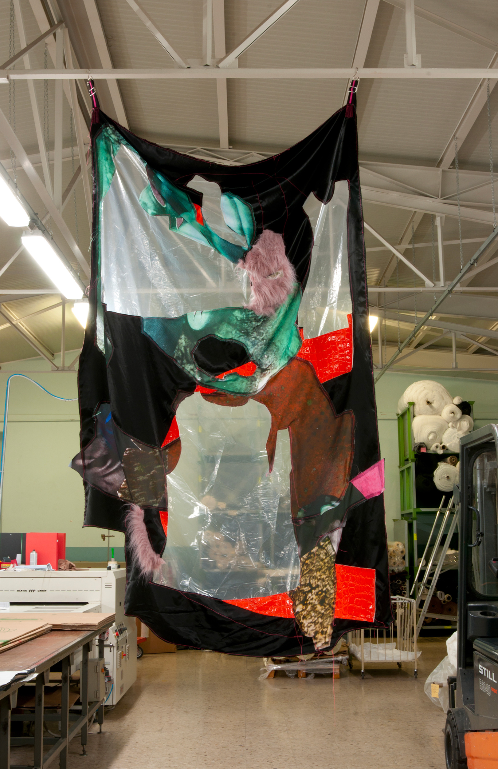
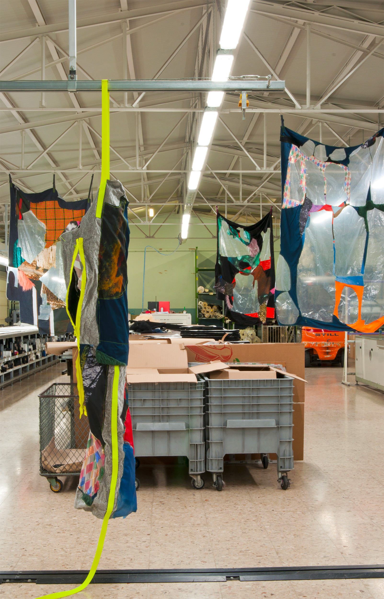
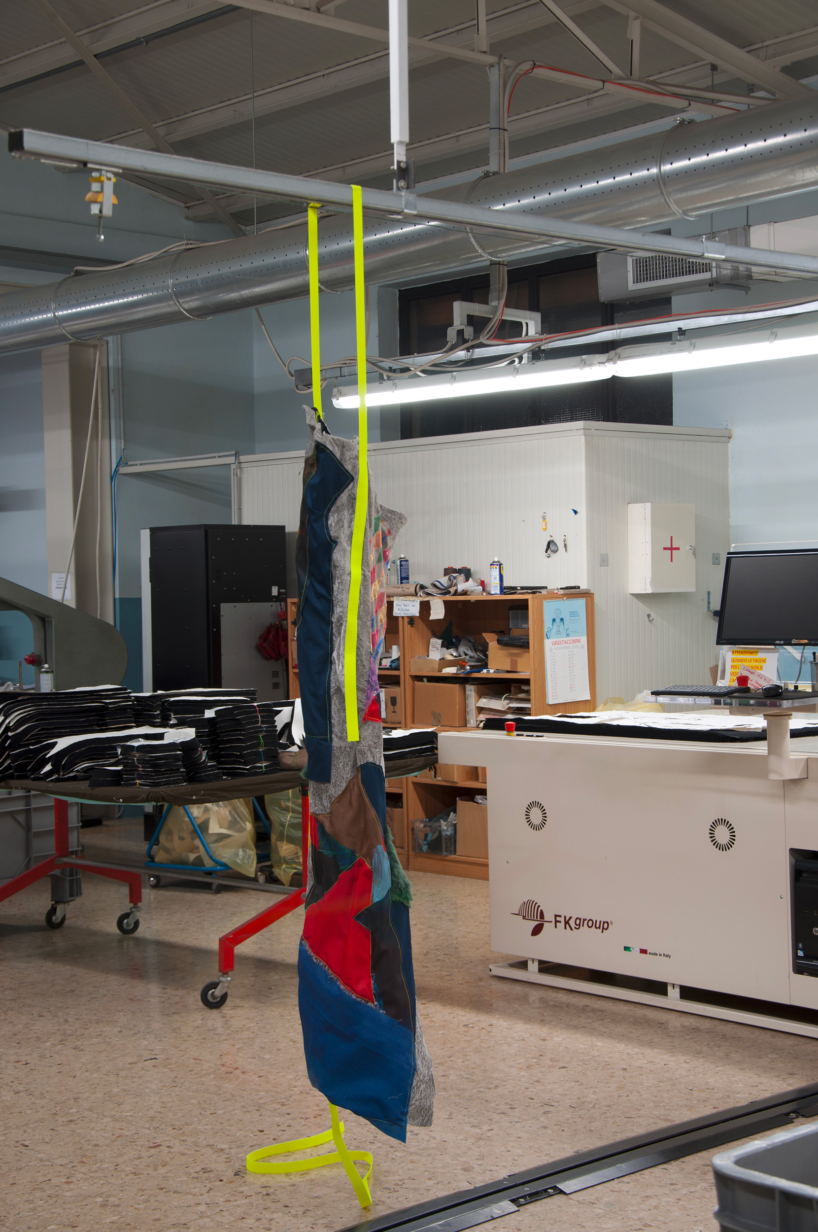
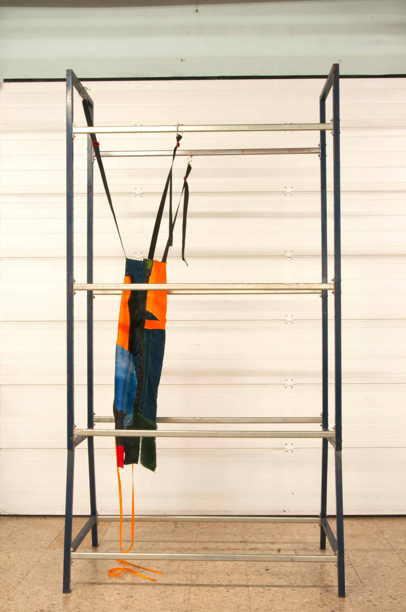
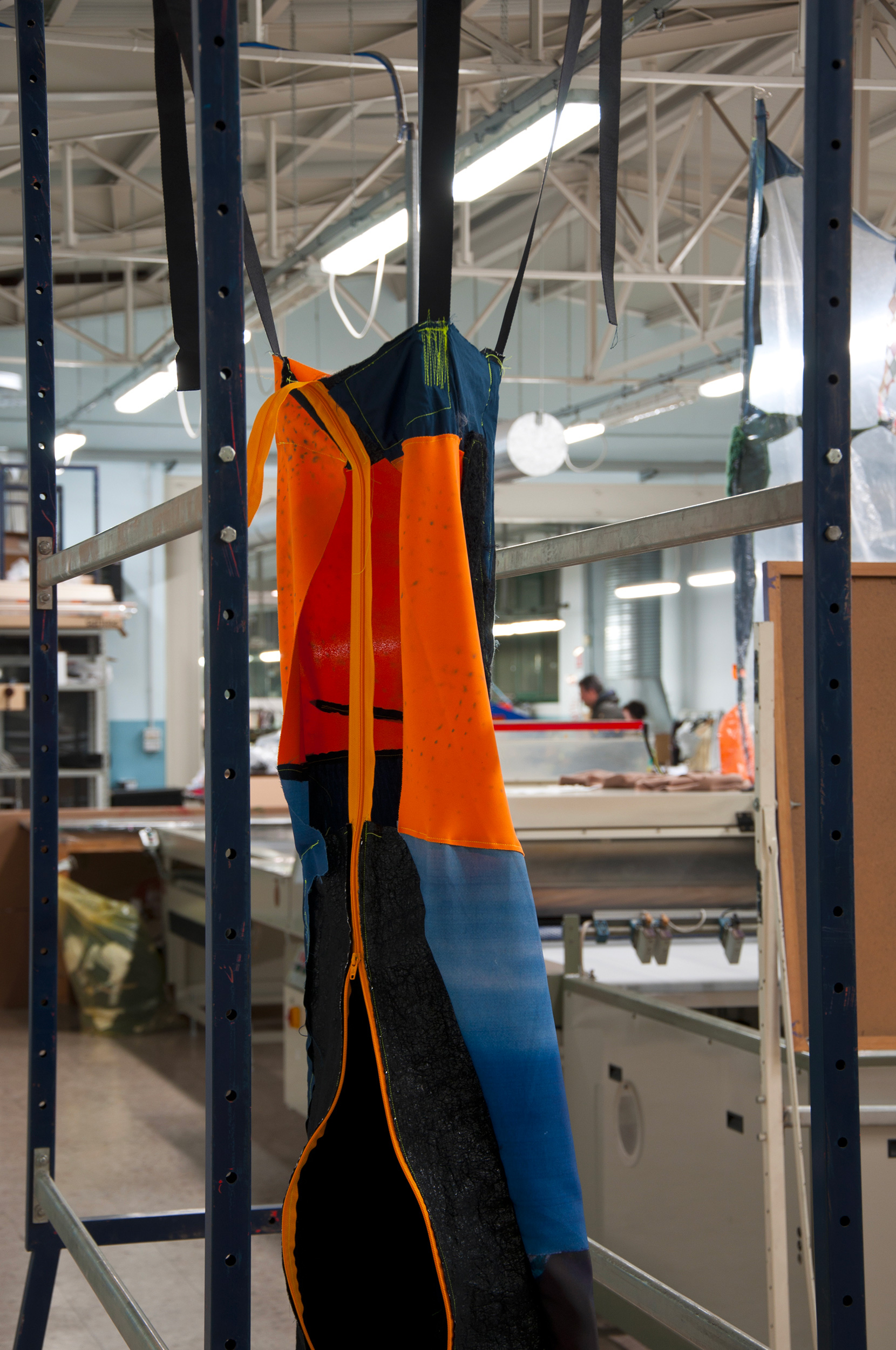
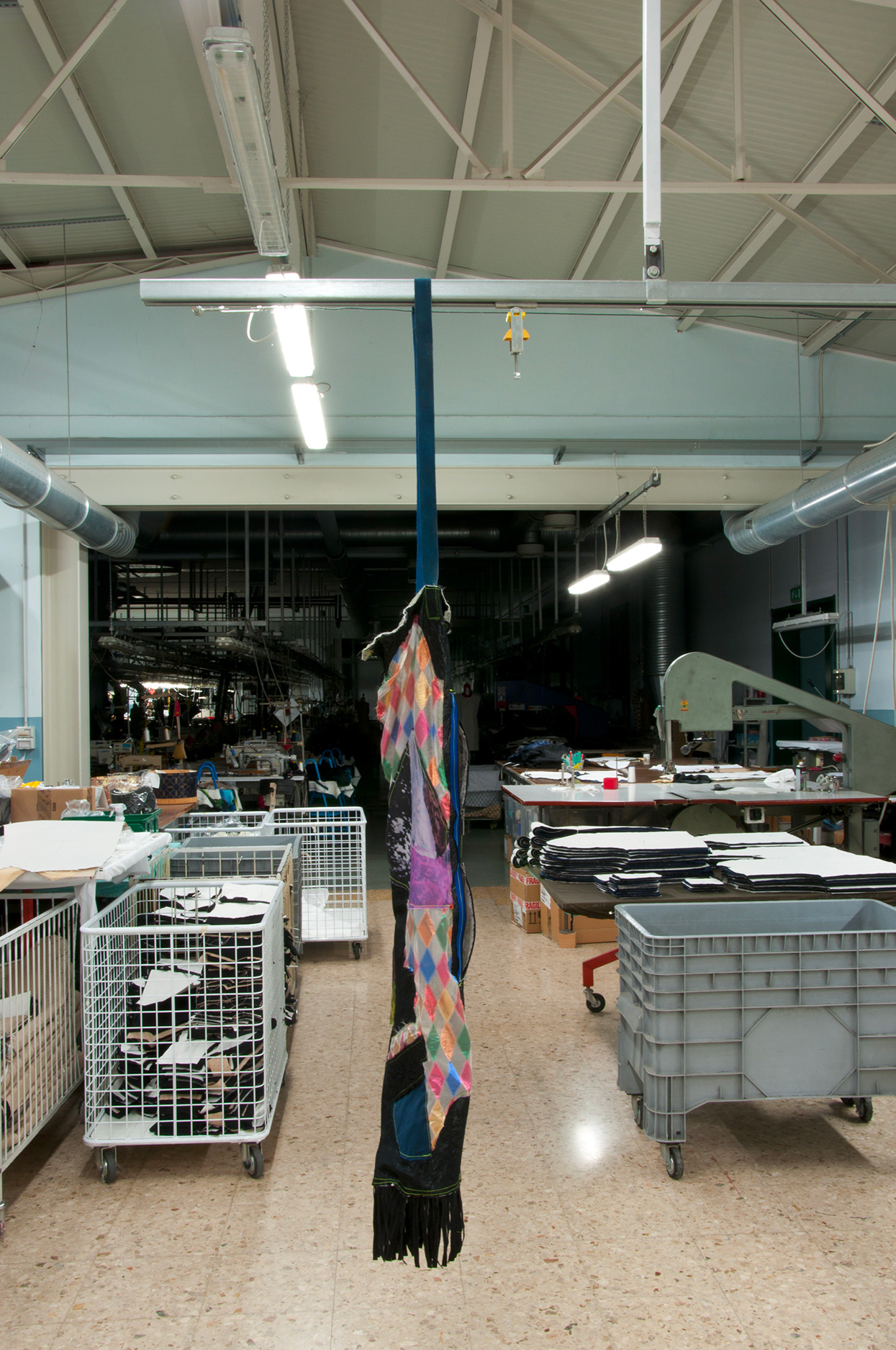
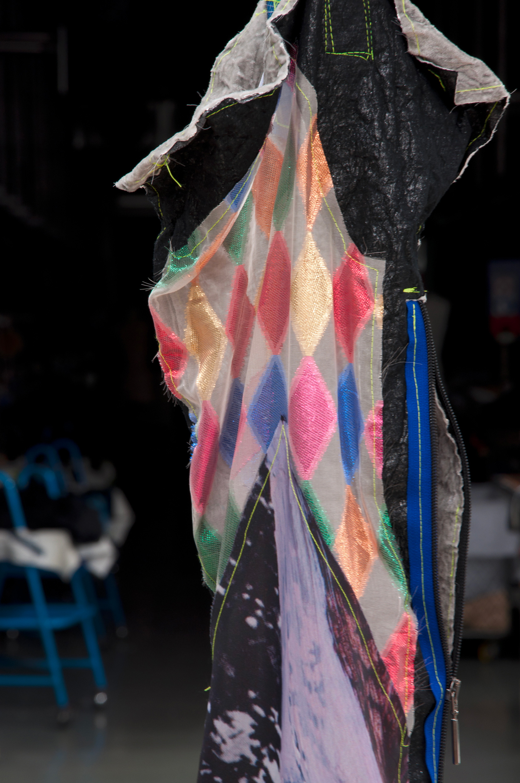
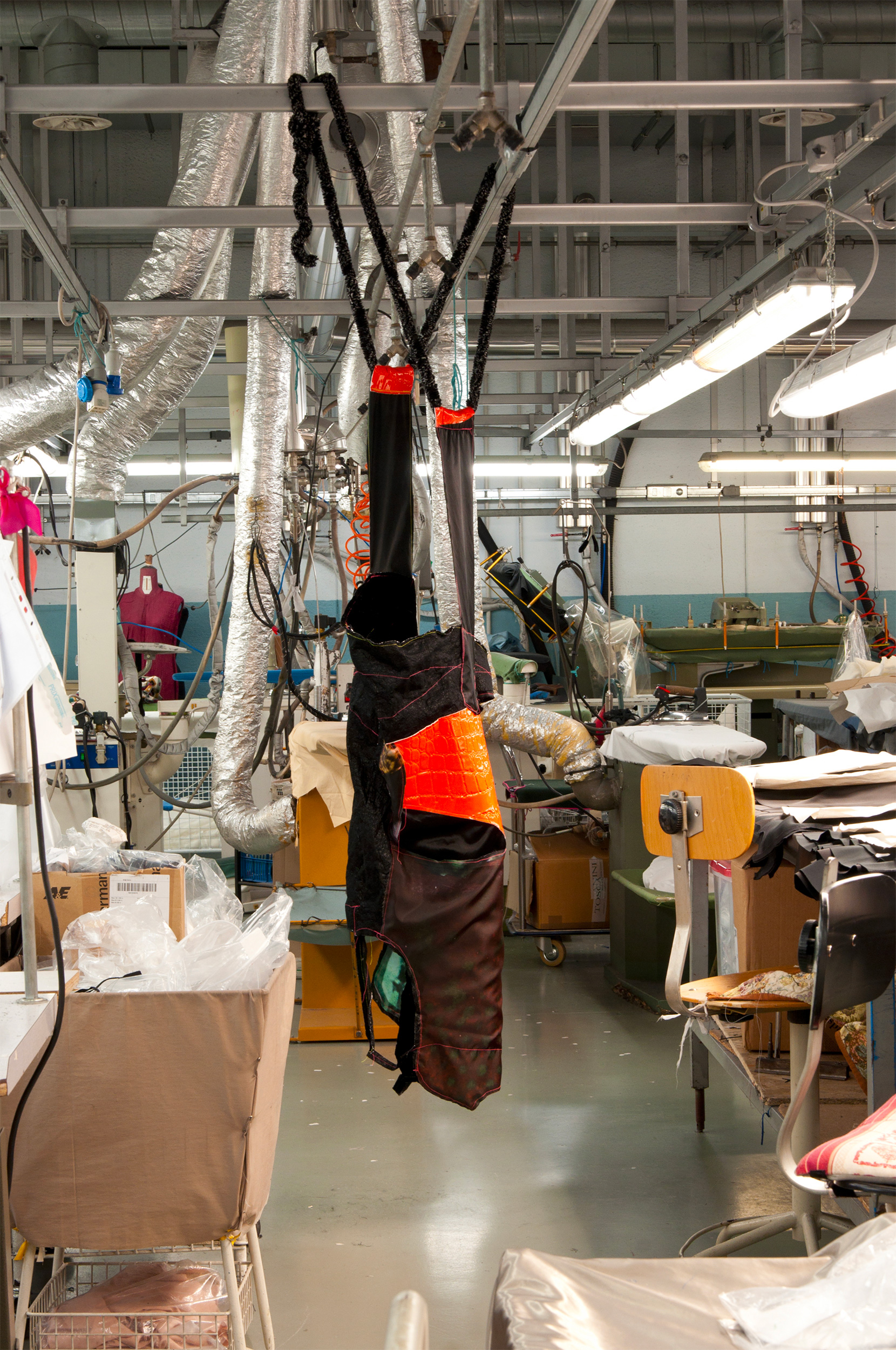
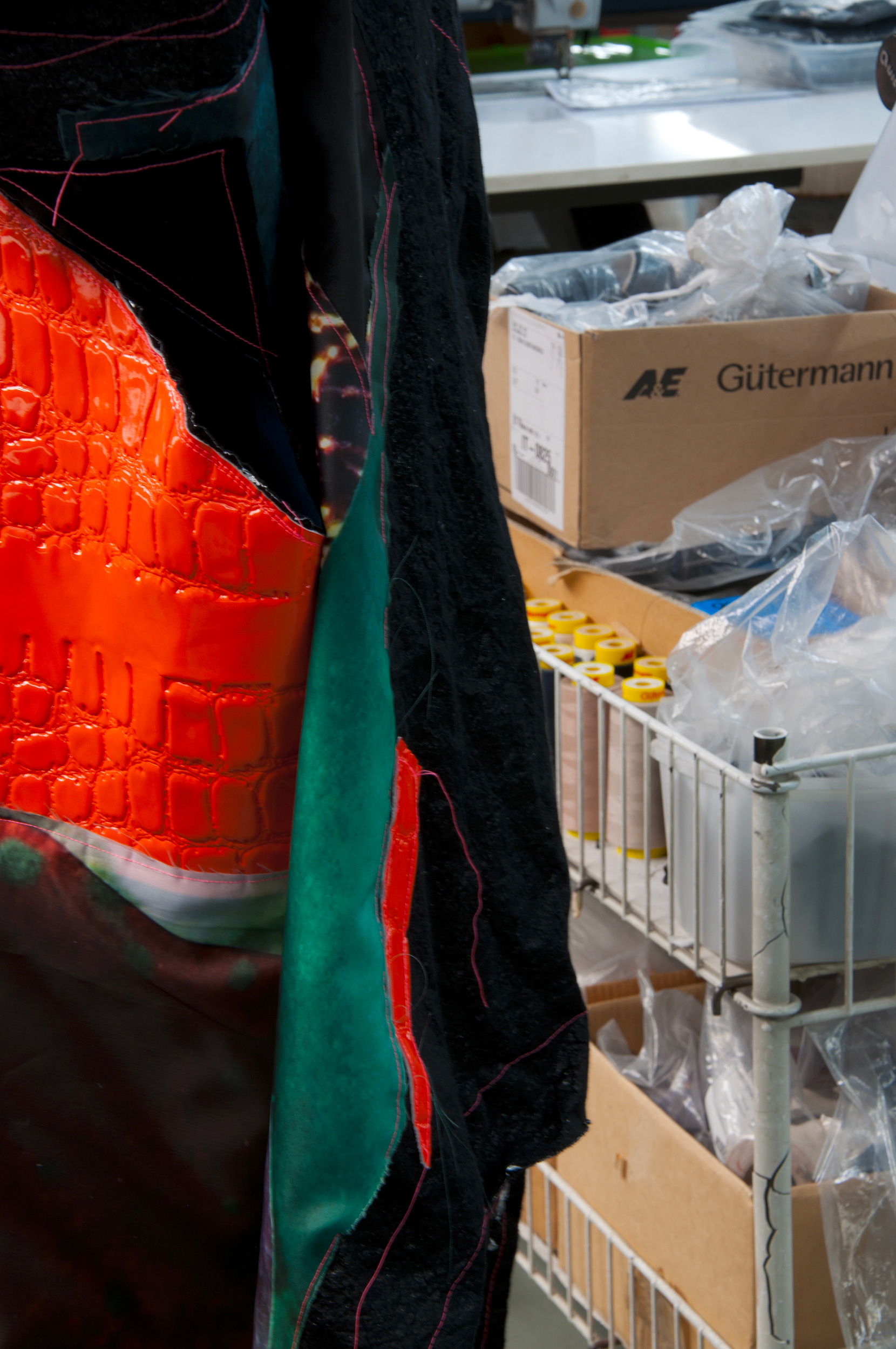
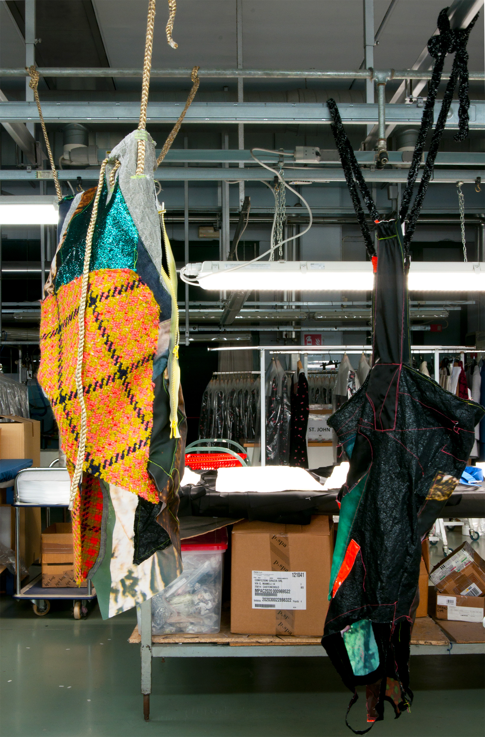
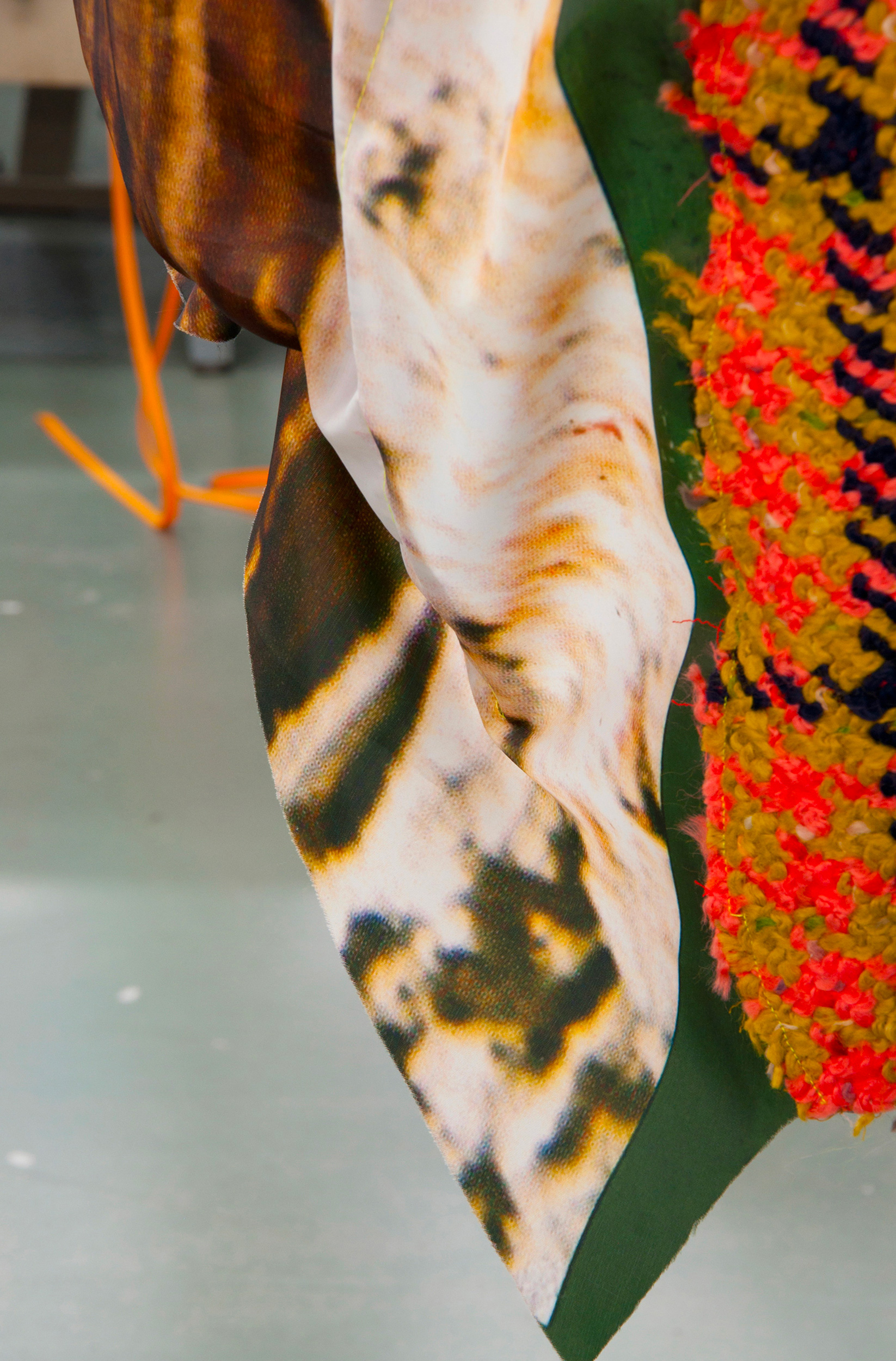
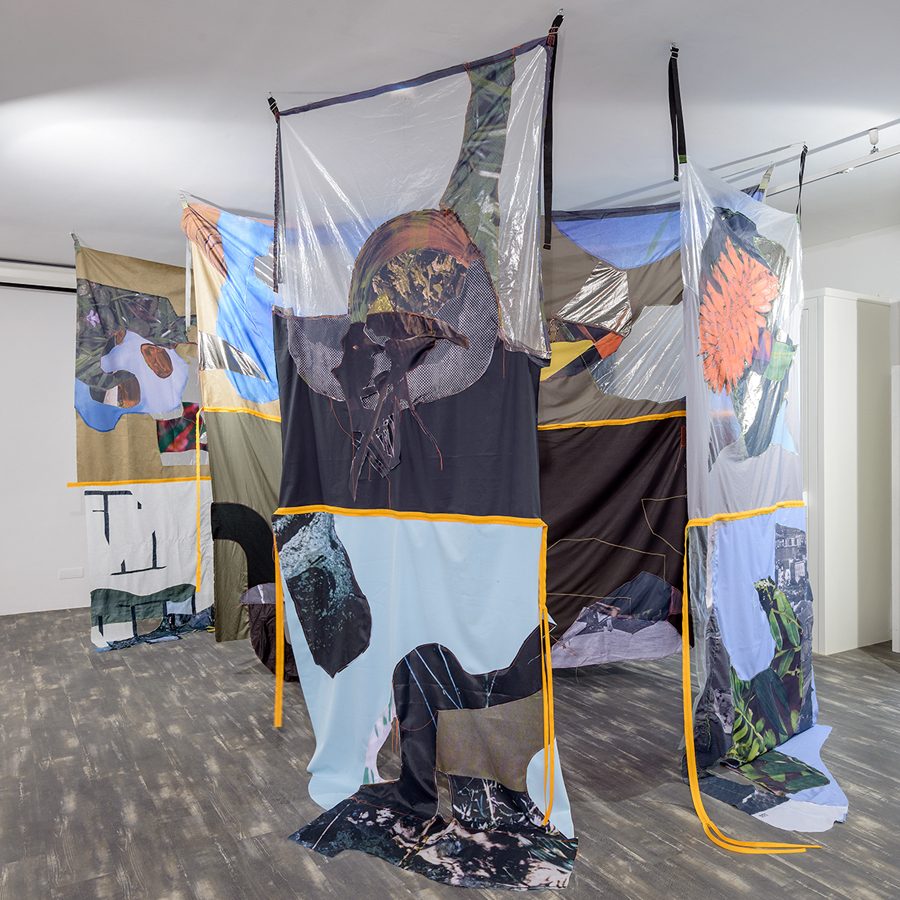
LANVIN PARIS Collaboration with the fashion brand LANVIN on the occasion of Salone del Mobile, Milan
BAFTSS Conference 2022. Crafting and grafting images: Collaboration between visual artists and documentary filmmakers.
Tutor at IUAV for internships, Department of Fashion Design and Multimedia Art
2021 – 2022
Tutor at the Master for Management of Communication and Cultural Policies, Iuav, Venice
2020 – 2021
IUAV University of Venice. Tutor of the Master in Management of Communication and of the Cultural Policies
2019
IED Coordinator for Summer in Contemporary Art and Architecture, Venice
IED Teacher in History of Contemporary Art and Phenomenology of Contemporary Art, Venice
2018
IED Tutor and teacher for Summer in Contemporary Art and Architecture, Venice
IED Teacher in History of Contemporary Art and Phenomenology of Contemporary Art, Venice
2017
IED, Tutor and teacher for Summer in Contemporary Art and Architecture, Venice
THE ART OF WORK. PUERTO CASADO (Paraguay) PORTO MARGHERA (Italy).
In collaboration with Fondazione Bevilacqua La Masa. Project curated by Valentina Bonifacio
WORKSHOP ATRII/Sezione piani curated by Lucia Veronesi and Alice Pedroletti.
Fondazione Bevilacqua La Masa
THE INSTITUTE OF THINGS TO COME curated by Ludovica Carbotta and Valerio del Baglivo in
collaboration with Fondazione Sandretto Re Rebaudengo. Bedwyr Williams and Tai Shani. (February
2017) – Louise Hervé and Chloé Maillet (September 2017)
2016
TTF Torino Film Festival, member of the jury for the section Italia.corti
IED Tutor and teacher for Summer in Contemporary Art and Architecture, Venice
LECTURE “Introduction to Contemporary Painting Practices. NABA University, Milan. Class of Adrian Paci
EASA Conference 2016, Milan
2015
IED Tutor and teacher for Summer in Contemporary Art and Architecture in Venice, Venice
THE SINTOME SCORE by Dora Garcìa. 56. International Art Exhibition La Biennale di Venezia. Performer
LECTURE “Introduction to Contemporary Painting Practices. IUAV University, Venice.
DRAWINGS FROM LIGHTNING, a project curated by Laura Santamaria (Milan – London)
VIDEOREMAKES. Lucia Veronesi in conversation with Daniele Capra, Fabbrica del Vedere, Venice
2014
89. COLLETTIVA GIOVANI ARTISTI Member of the jury, Bevilacqua La Masa, Venice
TRACCE URBANE, University IUAV, Venice.
2013
DEFINITIVELY UNFINISHED, a conversation with Marco Senaldi, Festival Comodamente,
Vittorio Veneto (Tv)
IUAS, 17th World Congress on Visual Anthropology Programme, Manchester, UK.
2012
OUT OF PLACE_AN ONGOING ARCHIVE, curated by 22:37, CORPO 6 Galerie, Berlin
PUBLIC COLLECTION
Mu.Mi, Michetti Museum, Villafranca al Mare, Pescara Italy
Galleria Internazionale d’Arte Moderna, Ca’ Pesaro, Venice, Italy
COMMISSIONED WORKS
2024
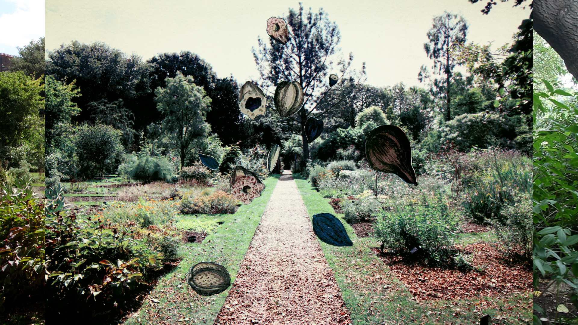
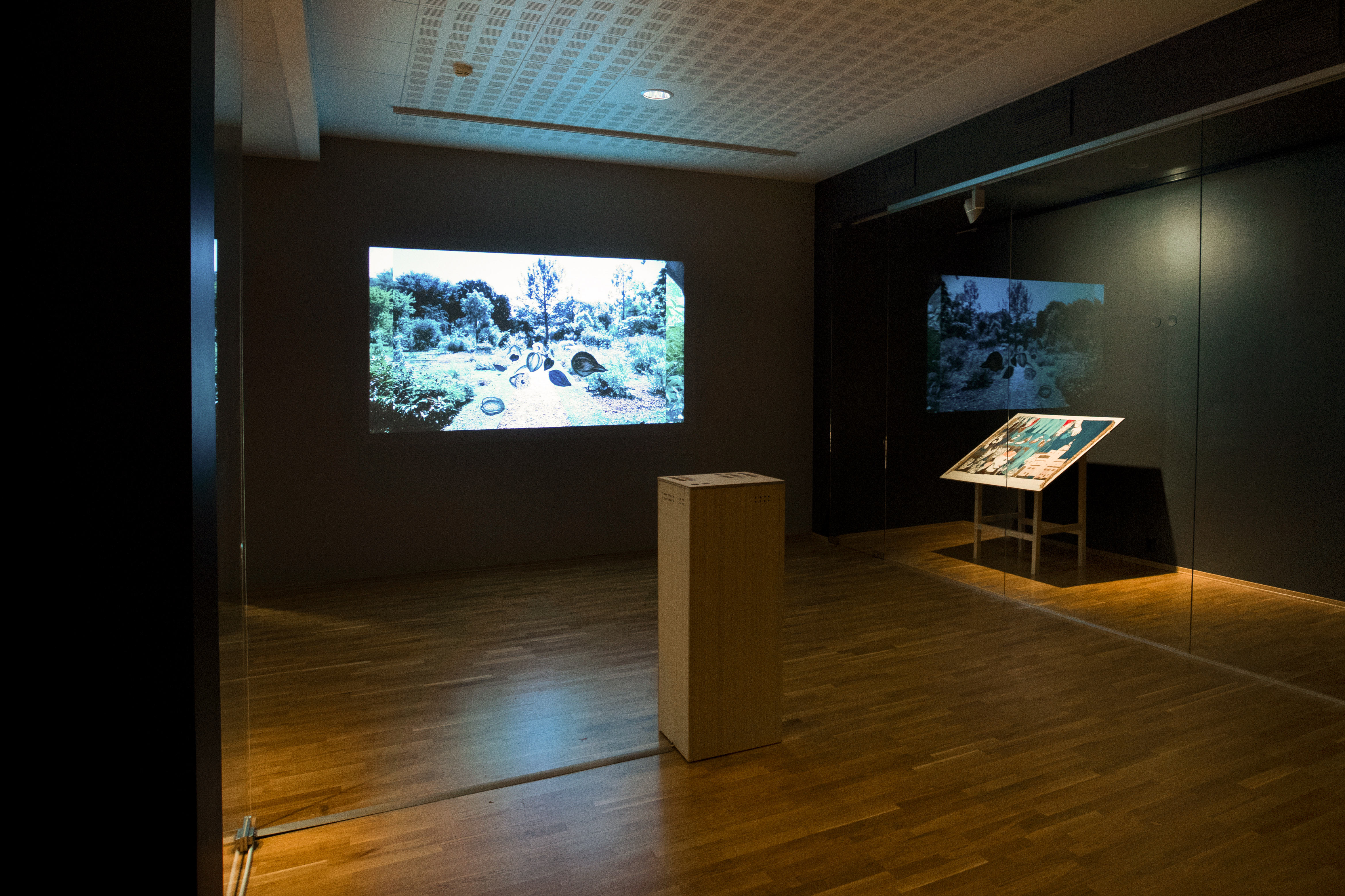
VENICE GARDENS FOUNDATION video animation for the Venice Gardens Foundation, Orto del Redentore, Venice
Commissioned by Adele Re Rebaudengo
2020
OTTILIA: FRAGMENTS OF LIFE, video editing for the show Ottilia Giacometti: un ritratto,
curated by Casimiro Di Crescenzo, Kunsthause, Zurich
2019
LIVING UNDER WATER video animation for the project Living Under Water promoted by Beit,
Venice and curated by Andi Arnowitz. Commissioned by Beit
2017
VENICE GARDENS FOUNDATION video animation for the Venice Gardens Foundation, Giardini Reali, Venice
Commissioned by Adele Re Rebaudengo
LINK
www.yellowyellow.org
www.atrii.it
www.arthub.it
www.visualcontainer.org
www.venicegardensfoundation.com
www.livingunderwater.org